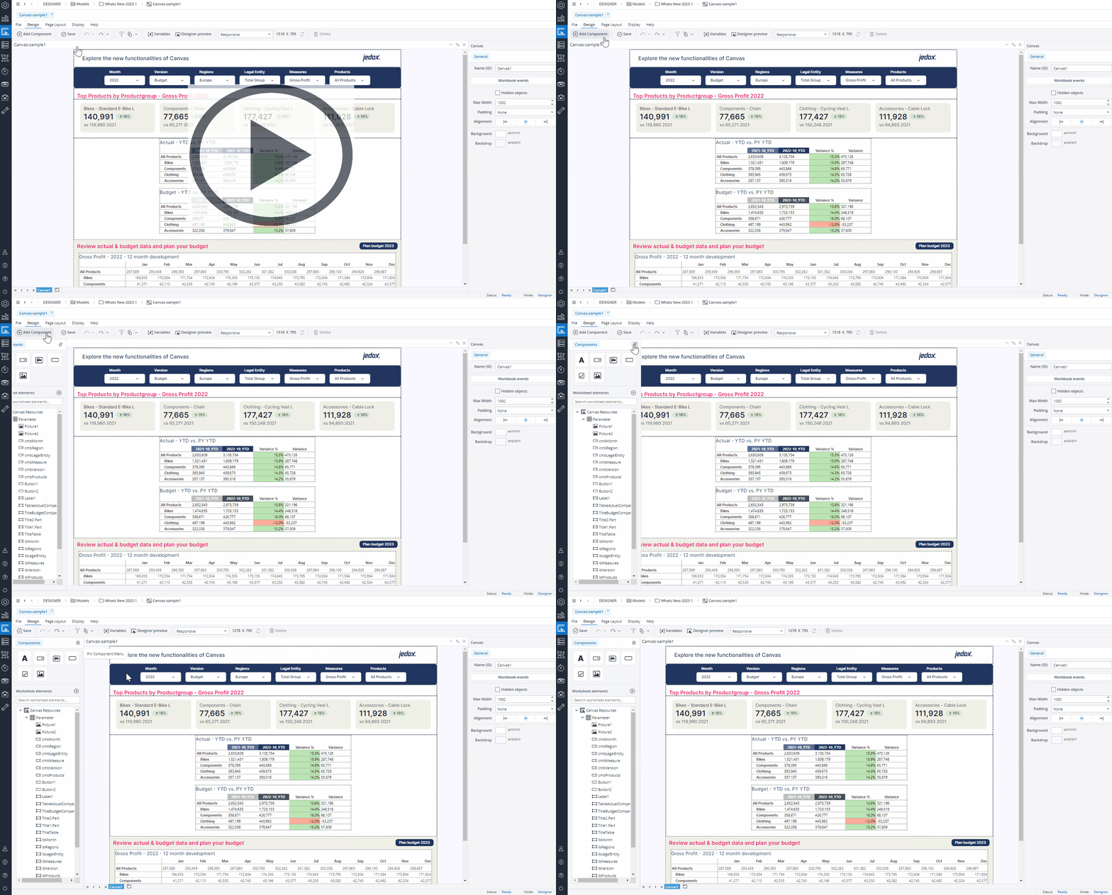
Adding Native Components to Canvas
You can find the native components of Canvas in the Add Component menu. When you click on the Add Component, the menu is temporarily displayed on top of the Canvas (overlaid so the Canvas size is unaffected). To keep the Add Component menu open, click on the pin button.
You can add native components by dragging and dropping them onto the Canvas. The native components you can add to your Canvas are Labels, Comboboxes, KPIs, Buttons, Checkboxes,Images,Dynatables, and Charts.

The Canvas Label allows you to easily add headings and descriptive text directly within the Canvas reports, ensuring that end users have all the important context within their reports.
When you drag and drop a Label onto your Canvas, a Format dialog opens on the right side of the screen. In the Format tab, you can edit properties such as name, width, height, padding, and margin. You can also define your label's background color, visibility, radius, border, font style, and alignment here.
The Visibility feature enables you to control whether a Label should be visible to your end user or not. By default, the Label's visibility is an Expression with the value "=TRUE", but you can use a variable or another Expression, e.g., FALSE, to change (hide) it. When you hide a Label, the remaining components dynamically adjust to occupy the vacant space. If you wish to maintain the hidden Label’s space and preserve your Canvas layout, you can utilize the Keep space option.
To delete your Label, you can either choose the Delete Label option in the Format tab, right-click on your Label and select Delete, or select the Label and press the Delete key on your keyboard.
Editing Labels
Once you have positioned your Label onto your Canvas, you can still edit it in many ways. You can copy/cut and paste your Label onto different frames and stacks, move it around by dragging and dropping it, and undo/redo your formatting and placement of your Label.
Label size limits (Min/Max)
The Labels in Canvas have defined minimum and maximum dimensions, and entering values outside these limits will not resize the Labels. The table below provides detailed information on these height and width limits.
Component | Minimum width | Maximum width | Minimum height | Maximum height |
Label | 8 px | 1600 px | 8 px | 1200 px |

The Canvas Combobox allows you to add and configure filters directly within Canvas reports. The end users can apply filters to dynamically change the charts, KPIs, and data tables presented in their Canvas reports.
Format tab
When you drag and drop a Combobox onto your Canvas, a dialog opens on the right side of the screen. In the Format tab, you change the name, width, visibility, and text color of your Combobox or add an Action, a margin or border to it. The Visibility feature enables you to control whether a Combobox should be visible to your end user or not. By default, the Combobox's visibility is an Expression with the value "=TRUE", but you can use a variable or another Expression, e.g., FALSE, to change (hide) it. When you hide a Combobox, the remaining components dynamically adjust to occupy the vacant space of the hidden Combobox. If you wish to maintain the hidden Label’s space and preserve your Canvas layout, you can utilize the Keep space option.
You can also add a Label to your Combobox through the Show label option, and use a static value, a variable, or an Expression as your Label text. You can change the position and width of the Label text and customize its font style and alignment.
To delete your Combobox, you can either choose the Delete Combobox option in the Format tab, or right-click on your Combobox and select Delete.
Data tab
In the Data tab, you can choose between a Simple data source, an Expression, a Subset, and an ODBC query as the source of your Combobox.
-
You can define a data source in the Simple data source section by quickly and easily selecting a Database, Dimension, Element, and Alias. The "Apply" and "Apply dimension" buttons have different functionalities. If you want to use a simple Subset through the Select Elements dialog of the native Combobox and add an Alias to it, click on the "Apply" button. If you want to use a full dimension as a source and combine it with an Alias, click on the "Apply dimension" button.
Note that only visible elements are selected and added when you use "select all" and click the "Apply" button. But when you use the "Apply dimension" option, all elements (consolidated, base elements, etc.) of the dimension are added to your data source.
You can also set the connection/database for your Combobox source data using variables, named range, and settings key to incorporate your Canvas report into models. Note that in this case, both the connection and database names should be written correctly, for example:localhost/Biker
Notes:
• When using the "Simple Data source" option, the "stored Subset" dropdown is only used to filter the elements on the right-side inspector panel, making it easier to manually select specific elements.
• The stored Subset will not be applied directly to the Combobox. Instead, the Combobox will display either the full set of options or the elements manually selected on the right side.
-
When you select an Expression as a data source, you will see a default Expression. You can use this Expression as an example or edit it as you like.
When you click on the "Edit expression button", a pop-up shows up. You can edit the expression in this pop-up, and your expression's result is shown instantly. -
Subset: see the Subsets Overview article.
-
ODBC query see ODBC Connections in Jedox Web Spreadsheets.
The next time you use a Combobox, the database and cube for the Combobox are pre-populated using the data from the last Combobox you have defined.
Editing Comboboxes
Once you have positioned your Combobox onto your Canvas, you can still edit it in many ways. You can copy/cut and paste your Combobox onto different frames and stacks, move it around by dragging and dropping it, and undo/redo your formatting and placement of your Combobox.
Combobox size limits (Min/Max)
The Comboboxes in Canvas have defined minimum and maximum dimensions, and entering values outside these limits will not resize the Comboboxes. The table below provides detailed information on these height and width limits.
Component | Minimum width | Maximum width | Minimum height | Maximum height |
Combobox | 90 px | 700 px | The minimum height settings remain unchanged, as they cannot be modified by the user. | The maximum height settings remain unchanged, as they cannot be modified by the user. |

The Canvas KPI Card displays the most important summary measures from your data and allows you to evaluate the status of a measure by comparing key indicators to a target or comparison measure. Canvas KPI Card's visual cues allow end users to track and communicate progress toward a measurable goal easily.
Format tab
When you drag and drop a KPI Card onto your Canvas, a dialog with two tabs opens on the right side of the screen. In the Format tab of the KPI Card, you can configure the properties such as name, width, visibility, padding, margin, background color, and radius. The Visibility feature enables you to control whether a KPI Card should be visible to your end user or not. By default, the KPI Card's visibility is an Expression with the value "=TRUE", but you can use a variable or another Expression, e.g., FALSE, to change (hide)it. When you hide a KPI Card, the remaining components dynamically adjust to occupy the vacant space. If you wish to maintain the hidden KPI Card’s space and preserve your Canvas layout, you can utilize the Keep space option.
The lower section of the Format tab enables you to customize the font style and alignment of the different sections of the KPI, i.e., Title, Value, and Comparison. In this section, you can also use the Delete KPI option to delete the KPI. It is also possible to delete the KPI by right-clicking on it and selecting Delete.
Data tab
In the Data tab, you can define the primary measure to display on your KPI Card by selecting a cube and configuring the dimension values. You can select an Element, a variable, or an Expression for each dimension. You can also set the connection/database for your KPI Card source data using variables, named range, and settings key to incorporate your Canvas report into models. Note that in this case, both the connection and database names should be written correctly, for example: localhost/Biker
The Canvas KPI formatting option enables you to select between for formats: Number, Currency, Percentage, and Time.
-
In the Number format, you can decide on the number of decimals and use the Auto Scaling option. Enabling the Auto Scaling option results in dynamic number formatting. This way, the numbers below a million are automatically shown with a "K" (for Kilo, or thousands), the numbers below a billion are shown with an "M" (for Million), and the numbers over a billion are shown with a "B" (for Billion). You can also change the K, M, and B abbreviations.
The Use 1000 separator option makes reading large numbers easier by adding visual indicators to your numbers. -
The Currency format is like the Number format with an additional currency symbol option.
-
The Percentage Format is useful for ratio-relevant topics.
-
The Time format is useful for time-relevant topics.
Comparison value option
You can add a comparison value to display a comparison indicator on your KPI Card. To do this, select the Comparison value option in the KPI Data tab. You can use either a Fixed value or a Data point (an aggregated cube value). For a Fixed Value, you need to add the value manually. You can use the Data point option by dragging and dropping dimensions from your primary measure dimensions or clicking the Add dimension button. You can select an Element, a variable, or an Expression for the comparison.
You can set a Label, choose a type (Value, Variance, % Variance, and Label only), and decide on the number of decimals for the Comparison value.
The Indicator option provides clear visual indicators that show the Comparison value’s relationship to the primary measure of your KPI. You can decide on a color code for each relationship type. You can also add a symbol and variance in percentage by using the Show symbol and Show Variance options.
The next time you use a KPI, the database and cube for the KPI are pre-populated using the data from the last KPI you have defined.
Drill Anywhere in KPI Cards
End users can utilize the Drill Anywhere functionality in Canvas too. Right-click on any KPI Card and hover your cursor over "Drill By…" from the context menu. You will be presented with a list of all the Dimensions that comprise the Cube the KPI Card is built from.
Editing KPI Cards
Once you have positioned your KPI Card onto your Canvas, you can still edit it in many ways. You can copy/cut and paste your KPI Card onto different frames and stacks, move it around by dragging and dropping it, and undo/redo your formatting and placement of your KPI Card.
KPI Cards size limits (Min/Max)
The KPI Cards in Canvas have defined minimum and maximum dimensions, and entering values outside these limits will not resize the KPI Cards. The table below provides detailed information on these height and width limits.
Component | Minimum width | Maximum width | Minimum height | Maximum height |
KPI Card | 60 px | 1600 px | Does not need to be adjusted, as it can only be modified by the user's padding settings. | Does not need to be adjusted, as it can only be modified by the user's padding settings. |

The Canvas native Button simplifies and accelerates the report-building process for you. When you drag and drop a Button onto your Canvas, a Format dialog opens on the right side of the screen. In the Format tab, you can add an Action, a Content, and a Tooltip to your Button. The Content and Tooltip can be a static value, a variable, or an Expression.
You can edit properties (such as name (ID), width, height, padding, and orientation) and define your Button's color, radius, border, font style, and alignment here. You can decide between the Auto or Custom modes when coloring your Button. The Auto mode is quicker, while the Custom mode provides more options. When you choose the Custom mode, you can assign different colors for when Canvas users hover their cursor over the Button or when they click on it.
The Visibility feature enables you to control whether a Button should be visible to your end user or not. By default, the Button's visibility is an Expression with the value "=TRUE", but you can use a variable or another Expression, e.g., FALSE, to change (hide) it. When you hide a Button, the remaining components dynamically adjust to occupy the vacant space. If you wish to maintain the hidden Button’s space and preserve your Canvas layout, you can utilize the Keep space option.
You can also add symbols (GIF, JPG, JPEG, PNG, SVG) to your Canvas Buttons. To do this, use the Add Symbol button. Once the symbol is uploaded, you can see a Symbol inspector at the button of the format tab.
In this section, you can replace the symbol, delete it, and change its position, gap, and size. By default, Canvas symbol sizes are set to maintain the ratio. If you want to turn off this option, click on the chain icon on the right side of the symbol size once. Clicking on the chain icon the second time turns the option back on.
Editing Buttons
Once you have positioned your Button onto your Canvas, you can still edit it in many ways. You can copy/cut and paste your Button onto different frames and stacks, move it around by dragging and dropping it, and undo/redo your formatting and placement of your Button.
Buttons size limits (Min/Max)
The Buttons in Canvas have defined minimum and maximum dimensions, and entering values outside these limits will not resize the Buttons. The table below provides detailed information on these height and width limits.
Component | Minimum width | Maximum width | Minimum height | Maximum height |
Button | 8 px | 1600 px | 8 px | 1200 px |

This native component enables you to incorporate a Checkbox into your Canvas, providing functionality such as creating lists or toggling various settings on and off.
When you drag and drop a Checkbox onto your Canvas, a Format dialog opens on the right side of the screen. In the Format tab, you can add an Action, a Target (named range or variable), and a Tooltip and a Label that can be static or dynamic (via variable or Expression) to your Checkbox and decide on the State of the Checkbox. You can also configure the properties such as Name (ID), width, color of the Checkbox, Box Style, and visibility. The Visibility feature lets you control whether a Checkbox should be visible to your end user. By default, the visibility of a Checkbox is an Expression with the value "=TRUE", but you can use a variable or another Expression, e.g., FALSE, to change (hide) it. When you hide a Checkbox, the remaining components dynamically adjust to occupy the vacant space. If you wish to maintain the hidden Checkbox’s space and preserve your Canvas layout, you can utilize the Keep space option.
You can disable the Checkbox Label by deselecting the "Show label" option. You can also change the position, gap, and width of the Label text and customize its font style and alignment.
Please be aware that the value displayed in the "Width" field of the Checkbox Format dialog represents the combined width of both the Label and the Checkbox. If you disable the Checkbox label, you will no longer be able to adjust the width, and it will remain fixed at 16, representing the Checkbox size.
To delete your Checkbox, you can either choose the Delete Checkbox option in the Format tab, right-click on your Checkbox and select Delete, or select the Checkbox and press the Delete key on your keyboard.
Editing Checkboxes
Once you have positioned your Checkbox onto your Canvas, you can still edit it in many ways. You can copy/cut and paste your Checkbox onto different frames and stacks, move it around by dragging and dropping it, and undo/redo your formatting and placement of your Checkbox.
Component | Minimum width | Maximum width | Minimum height | Maximum height |
Checkbox | 8 px | 1600 px | 8 px | 1050 px |

Canvas Image enables you to directly and easily add images (GIF, JPG, JPEG, PNG, SVG) within the Canvas environment. In the Format tab, you can select a Name (ID) for your Image, replace it, change its visibility and size, and add a radius and border to it.
By default, Canvas Image sizes are set to maintain the ratio. If you want to turn off this option, click on the chain icon on the right side of the Image size once. Clicking on the chain icon the second time turns the option back on.
Editing Images
Once you have positioned your Image onto your Canvas, you can still edit it in many ways. You can copy/cut and paste your Image onto different frames and stacks, move it around by dragging and dropping it, and undo/redo your formatting and placement of your Image.
Images size limits (Min/Max)
The Images in Canvas have defined minimum and maximum dimensions, and entering values outside these limits will not resize the Images. The table below provides detailed information on these height and width limits.
Component | Minimum width | Maximum width | Minimum height | Maximum height |
Image | 8 px | 1600 px | 8 px | 1050 px |

The Canvas Dynatables feature empowers users to build real-time analytics swiftly and efficiently. With its intuitive interface and dynamic data capabilities, users can generate insightful reports and visualizations on the fly, streamlining the decision-making process and enhancing data-driven outcomes.
Adding Dynatables to the Canvas
When you drag and drop a Dynatable onto your Canvas, a dialog box appears, prompting you to select a Dynatable from your saved Dynatables or build a new one. After choosing the desired Dynatable, a preview is displayed. You can then adjust the Dynatable as needed before clicking Apply to confirm your changes.
Format tab
Once your Dynatable is applied to your Canvas, a dialog with two tabs opens on the right side of the screen. In the Format tab, you can configure properties such as padding, size, frame radius, border, and background color. The lower section of the Format tab enables you to delete the Dynatable. It is also possible to delete the Dynatable by right-clicking on it and selecting Delete.
Data tab
You can use the "Edit Dynatable" option in the Data tab to modify, rearrange, and customize your Dynatable to suit your needs.
Editing Dynatables
Once you have positioned your Dynatable onto your Canvas, you can still edit it in many ways. You can copy/cut and paste your Dynatable onto different frames and stacks, move it around by dragging and dropping it, and undo/redo your formatting and placement of your Dynatable.
You can also interact with the Dynatable using the native Combobox feature. By linking a variable to the Combobox, any updates made to the Combobox will automatically reflect in the Dynatable, ensuring real-time synchronization.
Stored Subsets as a source
You can also use a stored subset as a source for a Dynatable dimension in Canvas, allowing you to easily apply a simple or complex combination of elements. This feature enables you to utilize intricate combinations based on subset filters, such as Data, Attribute, and Picklist, giving you quick access to predefined element groups with just a few clicks and eliminating the need to rebuild extensive filters from scratch.
This process can also be executed at a more granular level, allowing you to select specific elements for the dimension that sources its elements from a stored subset. By narrowing down your selection, you can tailor the data to display only the most relevant or critical elements for your analysis.
Component | Minimum width | Maximum width | Minimum height | Maximum height |
Dynatable | 8 px | 1600 px | 8 px | 1200 px |

The Chart component allows you to incorporate charts into your Canvas, providing an intuitive and interactive way to visualize data. Charts can dynamically interact with other native Canvas components, such as Comboboxes, enhancing the user experience.
Creating and formatting a new Canvas chart
When you drag and drop a chart onto your Canvas, a Chart Creation dialog appears.
In this dialog, you can select a database and cube to serve as the data source for your chart. You can also customize how data is displayed by choosing dimensions and elements and arranging them as needed. Dimensions can be dragged and dropped from the Source area into the Page Headers (POV), Row Titles, or Column Titles sections.
To refine element selection, you can click on a dimension to open the Select Elements dialog. Here, you can search for specific elements, select the elements to display, and apply Alias and Alias Formats as needed.
Formatting a new Canvas chart
In the Chart Creation dialog, you can choose between a Bar or Line chart as your chart type. You can further customize your native Canvas chart using the Format tab, which is organized into five sections: Chart Selection, Main Settings, Labels, Style, and Axes.
-
In the Chart Selection section, you can choose between a bar or line chart type.
-
The Main Settings section allows you to add a title and description and define the layout and chart direction (horizontal or vertical).
-
The Labels section provides options to toggle data labels on or off. If enabled, you can configure label position, text color, and background color.
-
The Style section allows you to adjust the visual appearance of the chart, including the font settings, legend position, and bar radius (for bar charts). In this section, you can also customize your chart with a personalized color palette. To do this, first create your custom palette in the Theme section. Once your personalized theme is ready, open the palette drop-down menu and select your new palette from the list.
-
In the Axes section, you can control gridline visibility by enabling or disabling X and Y axis gridlines.
Additionally, you can further customize the chart's name, description, and axis titles. Click on the chart's name, description, or an axis title to open a draggable floating toolbar, where you can change the text color, adjust the font size, underline it, modify the alignment (left, center, or right), and adjust the font weight (regular, bold, medium, or italic).
With these customization options, you can create visually appealing and data-driven charts that effectively communicate insights within your Canvas.
Editing an existing Canvas chart
To modify an existing chart, navigate to the right-side panel and select the Data tab. Then, click the Edit Chart button to open the Edit Chart Dialog, where you can adjust the chart's settings, update data sources, and customize its appearance as needed.
Formatting an existing Canvas chart object
When you click on a native Chart object on your Canvas, a Format dialog opens on the right side of the screen. In the Format tab, you can edit properties such as name, width, height, background color, radius, border, padding, and visibility.
The Visibility feature enables you to control whether a chart should be visible to your end user or not. By default, the chart's visibility is an Expression with the value "=TRUE", but you can use a variable or another Expression, e.g., FALSE, to change (hide) it. When you hide a chart, the remaining components dynamically adjust to occupy the vacant space. If you wish to maintain the hidden chart’s space and preserve your Canvas layout, you can utilize the Keep space option.
To delete your chart, you can either choose the Delete chart option in the Format tab, right-click on your chart and select Delete, or select the chart and press the Delete key on your keyboard.
To edit an existing chart, navigate to the Data tab next to the Format tab and click Edit chart.
Component | Minimum width | Maximum width | Minimum height | Maximum height |
Chart | 8 px | 1600 px | 8 px | 1200 px |
Next step: Canvas Layout
Updated April 25, 2025