The Canvas KPI Card displays the most important summary measures from your data and allows you to evaluate the status of a measure by comparing key indicators to a target or comparison measure. Canvas KPI Card's visual cues allow end users to track and communicate progress toward a measurable goal easily.
Format tab
When you drag and drop a KPI Card onto your Canvas, a dialog with two tabs opens on the right side of the screen. In the Format tab of the KPI Card, you can configure the properties such as name, width, visibility, padding, margin, background color, and radius. The Visibility feature enables you to control whether a KPI Card should be visible to your end user or not. By default, the KPI Card's visibility is an Expression with the value "=TRUE", but you can use a variable or another Expression, e.g., FALSE, to change (hide)it. When you hide a KPI Card, the remaining components dynamically adjust to occupy the vacant space. If you wish to maintain the hidden KPI Card’s space and preserve your Canvas layout, you can utilize the Keep space option.
The lower section of the Format tab enables you to customize the font style and alignment of the different sections of the KPI, i.e., Title, Value, and Comparison. In this section, you can also use the Delete KPI option to delete the KPI. It is also possible to delete the KPI by right-clicking on it and selecting Delete.
Data tab
In the Data tab, you can define the primary measure to display on your KPI Card by selecting a cube and configuring the dimension values. You can select an Element, a variable, or an Expression for each dimension. You can also set the connection/database for your KPI Card source data using variables, named range, and settings key to incorporate your Canvas report into models. Note that in this case, both the connection and database names should be written correctly, for example: localhost/Biker
The Canvas KPI formatting option enables you to select between for formats: Number, Currency, Percentage, and Time.
-
In the Number format, you can decide on the number of decimals and use the Auto Scaling option. Enabling the Auto Scaling option results in dynamic number formatting. This way, the numbers below a million are automatically shown with a "K" (for Kilo, or thousands), the numbers below a billion are shown with an "M" (for Million), and the numbers over a billion are shown with a "B" (for Billion). You can also change the K, M, and B abbreviations.
The Use 1000 separator option makes reading large numbers easier by adding visual indicators to your numbers. -
The Currency format is like the Number format with an additional currency symbol option.
-
The Percentage Format is useful for ratio-relevant topics.
-
The Time format is useful for time-relevant topics.
Comparison value option
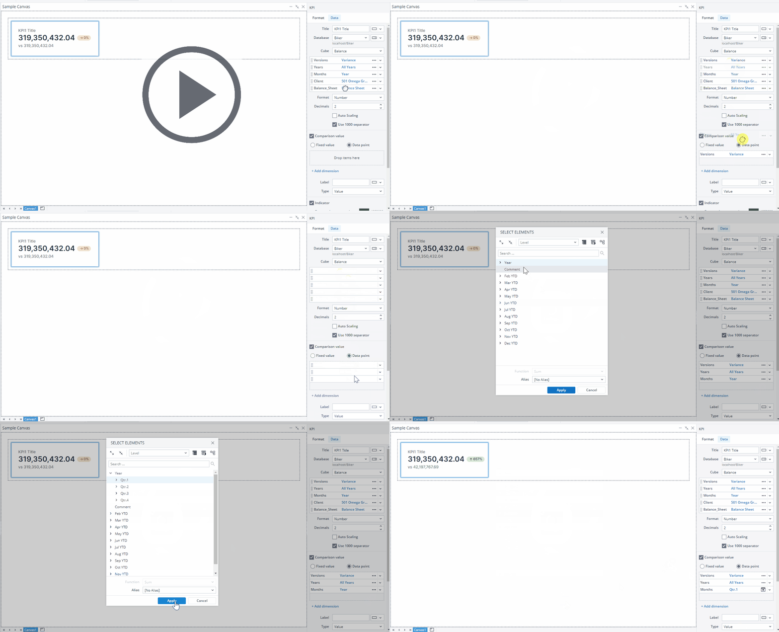
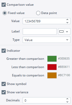
You can add a comparison value to display a comparison indicator on your KPI Card. To do this, select the Comparison value option in the KPI Data tab. You can use either a Fixed value or a Data point (an aggregated cube value). For a Fixed Value, you need to add the value manually. You can use the Data point option by dragging and dropping dimensions from your primary measure dimensions or clicking the Add dimension button. You can select an Element, a variable, or an Expression for the comparison.
You can set a Label, choose a type (Value, Variance, % Variance, and Label only), and decide on the number of decimals for the Comparison value.
The Indicator option provides clear visual indicators that show the Comparison value’s relationship to the primary measure of your KPI. You can decide on a color code for each relationship type. You can also add a symbol and variance in percentage by using the Show symbol and Show Variance options.
The next time you use a KPI, the database and cube for the KPI are pre-populated using the data from the last KPI you have defined.
Drill Anywhere in KPI Cards
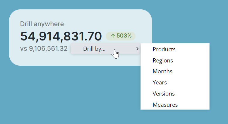
End users can utilize the Drill Anywhere functionality in Canvas too. Right-click on any KPI Card and hover your cursor over "Drill By…" from the context menu. You will be presented with a list of all the Dimensions that comprise the Cube the KPI Card is built from.
Editing KPI Cards
Once you have positioned your KPI Card onto your Canvas, you can still edit it in many ways. You can copy/cut and paste your KPI Card onto different frames and stacks, move it around by dragging and dropping it, and undo/redo your formatting and placement of your KPI Card.
KPI Cards size limits (Min/Max)
The KPI Cards in Canvas have defined minimum and maximum dimensions, and entering values outside these limits will not resize the KPI Cards. The table below provides detailed information on these height and width limits.
| Component | Minimum width | Maximum width | Minimum height | Maximum height |
| KPI Card | 60 px | 1600 px | Does not need to be adjusted, as it can only be modified by the user's padding settings. | Does not need to be adjusted, as it can only be modified by the user's padding settings. |
Updated March 30, 2026


