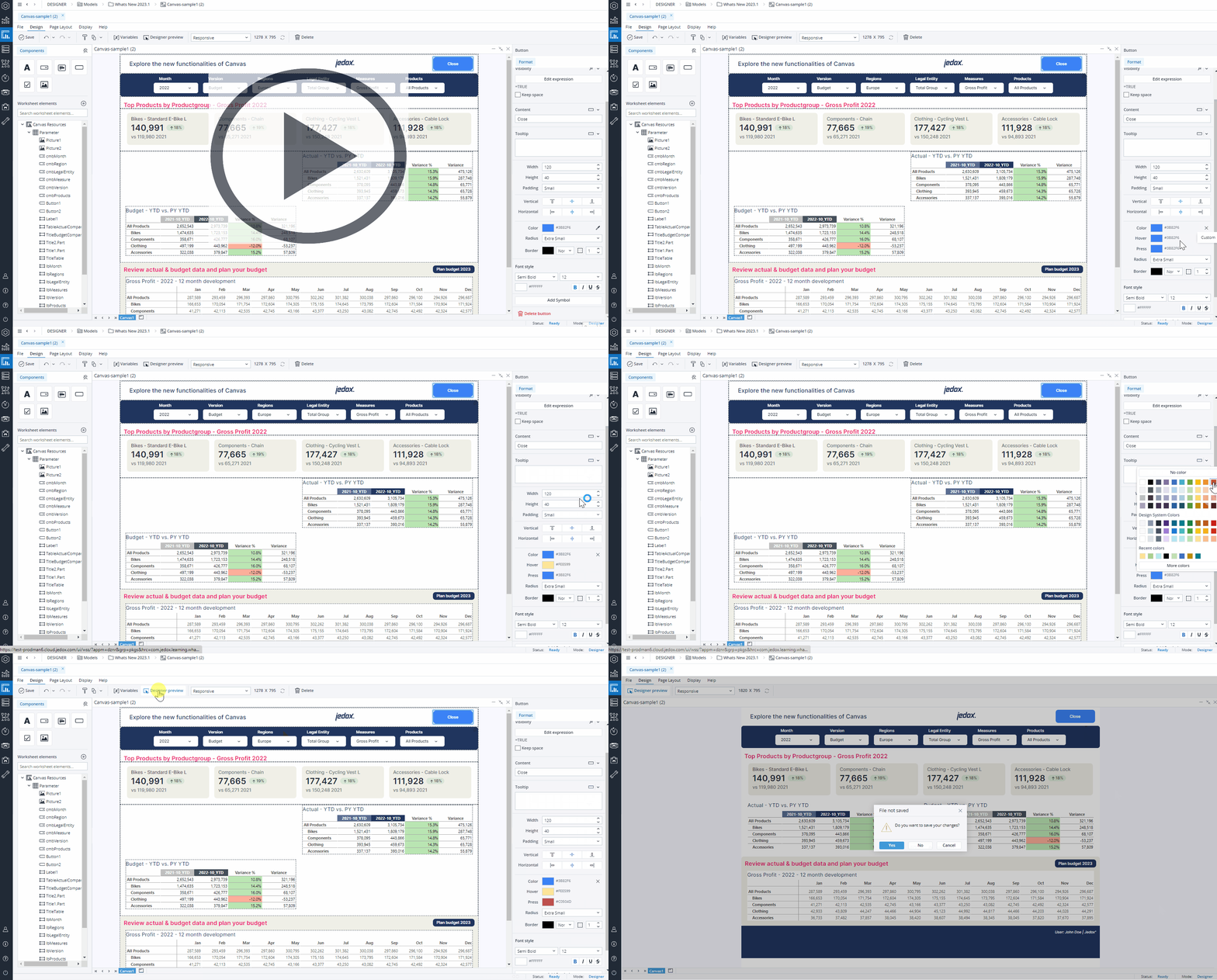
The Canvas native Button simplifies and accelerates the report-building process for you. When you drag and drop a Button onto your Canvas, a Format dialog opens on the right side of the screen. In the Format tab, you can add an Action, a Content, and a Tooltip to your Button. The Content and Tooltip can be a static value, a variable, or an Expression.
You can edit properties (such as name (ID), width, height, padding, and orientation) and define your Button's color, radius, border, font style, and alignment here. You can decide between the Auto or Custom modes when coloring your Button. The Auto mode is quicker, while the Custom mode provides more options. When you choose the Custom mode, you can assign different colors for when Canvas users hover their cursor over the Button or when they click on it.
The Visibility feature enables you to control whether a Button should be visible to your end user or not. By default, the Button's visibility is an Expression with the value "=TRUE", but you can use a variable or another Expression, e.g., FALSE, to change (hide) it. When you hide a Button, the remaining components dynamically adjust to occupy the vacant space. If you wish to maintain the hidden Button’s space and preserve your Canvas layout, you can utilize the Keep space option.
You can also add symbols (GIF, JPG, JPEG, PNG, SVG) to your Canvas Buttons. To do this, use the Add Symbol button. Once the symbol is uploaded, you can see a Symbol inspector at the button of the format tab.
In this section, you can replace the symbol, delete it, and change its position, gap, and size. By default, Canvas symbol sizes are set to maintain the ratio. If you want to turn off this option, click on the chain icon ![]() on the right side of the symbol size once. Clicking on the chain icon the second time turns the option back on.
on the right side of the symbol size once. Clicking on the chain icon the second time turns the option back on.
Editing Buttons
Once you have positioned your Button onto your Canvas, you can still edit it in many ways. You can copy/cut and paste your Button onto different frames and stacks, move it around by dragging and dropping it, and undo/redo your formatting and placement of your Button.
Buttons size limits (Min/Max)
The Buttons in Canvas have defined minimum and maximum dimensions, and entering values outside these limits will not resize the Buttons. The table below provides detailed information on these height and width limits.
| Component | Minimum width | Maximum width | Minimum height | Maximum height |
| Button | 8 px | 1600 px | 8 px | 1200 px |
Updated March 30, 2026


