The Canvas combobox allows you to add and configure filters directly within Canvas reports. The end users can apply filters to dynamically change the charts, KPIs, and data tables presented in their Canvas reports.
Format tab
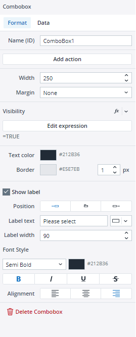
When you drag and drop a combobox onto your Canvas, a dialog opens on the right side of the screen. In the Format tab, you change the name, width, visibility, and text color of your combobox or add an Action, a margin or border to it. The Visibility feature enables you to control whether a combobox should be visible to your end user or not. By default, the combobox's visibility is an Expression with the value "=TRUE", but you can use a variable or another Expression, e.g., FALSE, to change (hide) it. When you hide a combobox, the remaining components dynamically adjust to occupy the vacant space of the hidden combobox. If you wish to maintain the hidden Label’s space and preserve your Canvas layout, you can utilize the Keep space option.
You can also add a Label to your combobox through the Show label option, and use a static value, a variable, or an Expression as your Label text. You can change the position and width of the Label text and customize its font style and alignment.
To delete your combobox, you can either choose the Delete combobox option in the Format tab, or right-click on your combobox and select Delete.
Data tab
In the Data tab, you can choose between a Simple data source, an Expression, a Subset, and an ODBC query as the source of your combobox.
-
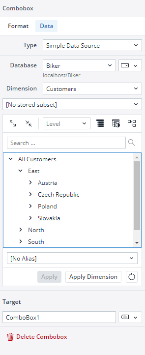
You can define a data source in the Simple data source section by quickly and easily selecting a Database, Dimension, Element, and Alias. The "Apply" and "Apply dimension" buttons have different functionalities. If you want to use a simple Subset through the Select Elements dialog of the native combobox and add an Alias to it, click on the "Apply" button. If you want to use a full dimension as a source and combine it with an Alias, click on the "Apply dimension" button.
Note that only visible elements are selected and added when you use "select all" and click the "Apply" button. But when you use the "Apply dimension" option, all elements (consolidated, base elements, etc.) of the dimension are added to your data source.
You can also set the connection/database for your combobox source data using variables, named range, and settings key to incorporate your Canvas report into models. Note that in this case, both the connection and database names should be written correctly, for example:localhost/Biker
Notes:
• When using the "Simple Data source" option, the "stored Subset" dropdown is only used to filter the elements on the right-side inspector panel, making it easier to manually select specific elements.
• The stored Subset will not be applied directly to the combobox. Instead, the combobox will display either the full set of options or the elements manually selected on the right side.
-
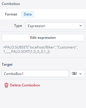
When you select an Expression as a data source, you will see a default Expression. You can use this Expression as an example or edit it as you like.

When you click on the "Edit expression button", a pop-up shows up. You can edit the expression in this pop-up, and your expression's result is shown instantly.
-
Subset: see the Subsets Overview article.
-
ODBC query see ODBC Connections in Jedox Web Spreadsheets.
The next time you use a combobox, the database and cube for the combobox are pre-populated using the data from the last combobox you have defined.
Editing comboboxes
Once you have positioned your combobox onto your Canvas, you can still edit it in many ways. You can copy/cut and paste your combobox onto different frames and stacks, move it around by dragging and dropping it, and undo/redo your formatting and placement of your combobox.
Combobox size limits (Min/Max)
The comboboxes in Canvas have defined minimum and maximum dimensions, and entering values outside these limits will not resize the comboboxes. The table below provides detailed information on these height and width limits.
| Component | Minimum width | Maximum width | Minimum height | Maximum height |
| Combobox | 90 px | 700 px | The minimum height settings remain unchanged, as they cannot be modified by the user. | The maximum height settings remain unchanged, as they cannot be modified by the user. |
Updated March 30, 2026
