The Chart component allows you to incorporate charts into your Canvas, providing an intuitive and interactive way to visualize data. Charts can dynamically interact with other native Canvas components, such as comboboxes, enhancing the user experience.
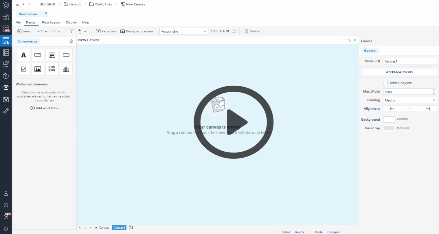
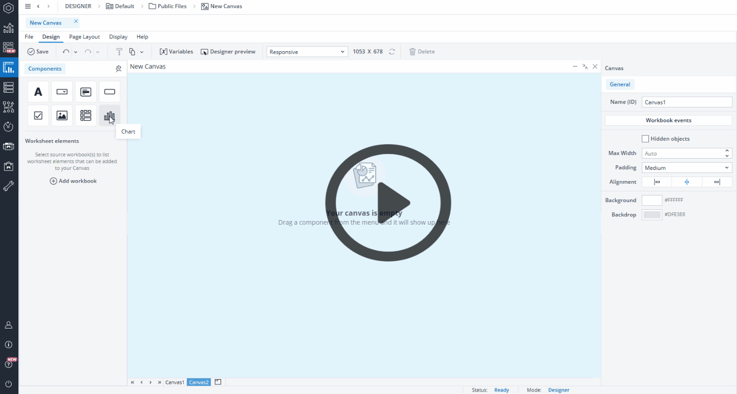
Creating a new Canvas chart
You can choose from several chart types to best visualize your data, including Bar, Line, Waterfall, and Pie charts. Each chart type offers unique ways to highlight trends, comparisons, and relationships within your data. Below, you’ll find detailed information on how to create and format each chart type, along with guidance on when to use them for the most effective presentation of your insights.
 Bar chart
When you drag and drop a chart onto your Canvas, a Chart Creation dialog appears. The Bar chart is selected by default, so you don’t need to make any changes.
In this dialog, you can select a database and cube to serve as the data source for your chart. You can also select a named range as your source. Once the source is set, you can customize how the data is displayed by selecting dimensions and elements and arranging them as needed. Simply drag and drop dimensions from the Source area into the Page Headers (POV), Rows, or Columns sections. To refine which elements are shown, click a dimension to open the Select Elements dialog. Here, you can search for specific elements, choose which ones to display, and apply Alias and Alias Formats as required. See the Select element dialog section for more information.
Additionally, it is possible to interact with the chart using the native combobox feature. By linking the @variables assigned to a combobox with the corresponding POV dimensions in the chart, any changes made through the combobox will automatically update the chart. This ensures real-time synchronization between user selections and chart data.
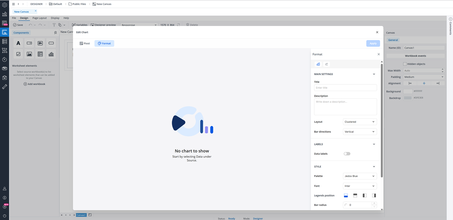
Formatting your chart
You can customize your native Canvas chart using the Format tab, which is organized into five sections: Chart Selection, Main Settings, Labels, Style, and Axis. When you hover your mouse over chart options in the Format tab, you can view tooltips that provide you with some basic information. Below you can see the detailed information of these sections for each chart type.
-
In the Chart Selection section, you can select the bar chart.
-
The Main Settings section allows you to add a title and description and define the layout (clustered or stacked) and bar direction (horizontal or vertical).
-
The Labels section provides options to toggle data labels on or off. If enabled, you can configure label position, text color, and background color. Additionally, you can enable markers to display either circle or square markers on your chart.
-
The Style section allows you to adjust the visual appearance of the chart, including the font settings, legend position and visibility (toggle on or off), and bar radius. In this section, you can also customize your chart with a personalized color palette. To do this, first create your custom palette in the Theme section. Once your personalized theme is ready, click the palette drop-down menu in this section, and select your new palette from the list. Watch the video below for a practical example:
-
In the Axis section, you can control gridline visibility by enabling or disabling X and Y axis gridlines. Furthermore, here you can select a gridline style, and color.
Additionally, you can further customize the chart's title, description, and axis titles. Click on the chart's title, description, or an axis title to open a draggable floating toolbar, where you can change the text color, adjust the font size, underline it, modify the alignment (left, center, or right), and adjust the font weight (regular, bold, medium, or italic).
With these customization options, you can create visually appealing and data-driven charts that effectively communicate insights within your Canvas.
Line chart
When you drag and drop a chart onto your Canvas, a Chart Creation dialog appears. The Bar chart is selected by default. To switch to a Line chart, select the Line chart from the Chart types section.
In this dialog, you can select a database and cube to serve as the data source for your chart. You can also select a named range as your source. Once the source is set, you can customize how the data is displayed by selecting dimensions and elements and arranging them as needed. Simply drag and drop dimensions from the Source area into the Page Headers (POV), Rows, or Columns sections. To refine which elements are shown, click a dimension to open the Select Elements dialog. Here, you can search for specific elements, choose which ones to display, and apply Alias and Alias Formats as required. See the Select elements dialog section for more information.
Additionally, it is possible to interact with the chart using the native combobox feature. By linking the @variables assigned to a combobox with the corresponding POV dimensions in the chart, any changes made through the combobox will automatically update the chart. This ensures real-time synchronization between user selections and chart data.
Formatting your chart
You can customize your native Canvas chart using the Format tab, which is organized into five sections: Chart Selection, Main Settings, Labels, Style, and Axis. When you hover your mouse over chart options in the Format tab, you can view tooltips that provide you with some basic information. Below you can see the detailed information of these sections for each chart type.
-
In the Chart Selection section, you can select the line chart.
-
The Main Settings section allows you to add a title and description and define the line style of the chart (straight or curved).
-
The Labels section provides options to toggle data labels on or off. If enabled, you can configure label position, text color, and background color.
-
The Style section allows you to adjust the visual appearance of the chart, including the font settings, and legend position and visibility (toggle on or off). In this section, you can also customize your chart with a personalized color palette. To do this, first create your custom palette in the Theme section. Once your personalized theme is ready, open the palette drop-down menu and select your new palette from the list. Watch the video below for a practical example:
-
In the Axis section, you can control gridline visibility by enabling or disabling X and Y axis gridlines.
Additionally, you can further customize the chart's title, description, and axis titles. Click on the chart's title, description, or an axis title to open a draggable floating toolbar, where you can change the text color, adjust the font size, underline it, modify the alignment (left, center, or right), and adjust the font weight (regular, bold, medium, or italic).
With these customization options, you can create visually appealing and data-driven charts that effectively communicate insights within your Canvas.
Waterfall chart
When you drag and drop a chart onto your Canvas, a Chart Creation dialog appears. The Bar chart is selected by default. To switch to a waterfall chart, select the Waterfall chart from the Chart type section.
Creating waterfall chart
A waterfall chart is more advanced than a standard bar or line chart. It is used to display how individual values contribute to a total or vary across stages. You can create two types of waterfall charts: Contribution and Variation. The following sections explain how to create each type.
Contribution charts
A Contribution waterfall chart is used when you want to illustrate how specific dimension elements contribute to a final total. In this chart type, the focus is on showing the incremental impact of each element, with a single final column representing the total result.
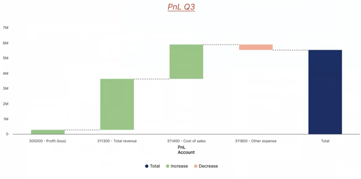
When you select Waterfall as the chart type, a contribution chart is created by default. In the Pivot section, under Calculate, you can switch the chart type from contribution to variation.
Once you have chosen the Contribution chart type, you can select a database and cube to serve as the data source for your chart. You can also select a named range as your source. Once the source is set, you can customize how the data is displayed by selecting dimensions and elements and arranging them as needed. Simply drag and drop dimensions from the Source area into the Category, or Measure sections of a contribution waterfall chart.
- Category: The grouping dimension used to define the categories in the chart (e.g., Product, Region). In this area, you should typically use base-level elements (e.g., specific products or regions), but consolidated elements can also be selected when a summary view is desired (e.g., total product groups, regions).
-
Measure: The numerical value or measure used to calculate contribution or variance (e.g., Sales, Revenue).
To refine which elements are shown, click a dimension to open the Select Elements dialog. Here, you can search for specific elements, choose which ones to display, and apply Alias and Alias Formats as required. See the Select elements dialog section for more information. The ability to select multiple elements is especially useful for the Category area, where you can compare multiple product lines or regions within a single chart. In contrast, the Measure area is typically best suited for a single measure (e.g., Revenue).
Additionally, it is possible to interact with the chart using the native combobox feature. By linking the @variables assigned to a combobox with the corresponding POV dimensions in the chart, any changes made through the combobox will automatically update the chart. This ensures real-time synchronization between user selections and chart data.
Variation charts
A Variation Waterfall Chart is used to illustrate the difference between two dimension elements and to highlight how the variance is distributed across contributing categories. This type of chart can be used, for example, to compare PnL between 2020-11-YTD and 2020-12-YTD.
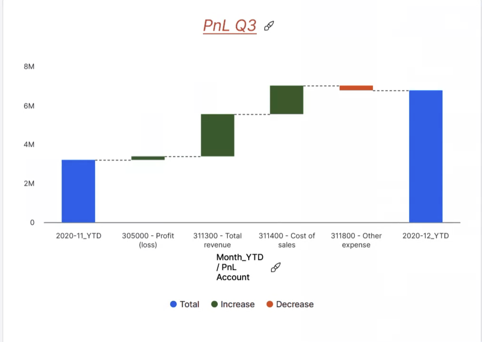
When you select Waterfall as the chart type, a contribution chart is created by default. In the Pivot section, under Calculate, you can switch the chart type from contribution to variation.
Once you have chosen the Variation chart type, you can select a database and cube to serve as the data source for your chart. You can also select a named range as your source. Once the source is set, you can customize how the data is displayed by selecting dimensions and elements and arranging them as needed. Simply drag and drop dimensions from the Source area into the Category, Measure, or Breakdown sections of a contribution waterfall chart.
- Category: The grouping dimension used to define the categories in the chart (e.g., Product, Region). In this area, you should typically use base-level elements (e.g., specific products or regions), but consolidated elements can also be selected when a summary view is desired (e.g., total product groups, regions).
-
Measure: The numerical value or measure used to calculate contribution or variance (e.g., Sales, Revenue).
-
Breakdown: The dimension along which a variance is distributed (e.g., Time, Version, Organization, or Customer Segment). In this area, you should typically use base-level elements (e.g., months, budget vs. actual versions, specific cost centers), but consolidated elements can also be selected when a higher-level overview is desired (e.g., quarters, total versions).
To refine which elements are shown, click a dimension to open the Select Elements dialog. Here, you can search for specific elements, choose which ones to display, and apply Alias and Alias Formats as required. See the Select elements dialog section for more information. The ability to select multiple elements allows you to create more flexible and meaningful analyses. For example, in the Category area, you can compare multiple product lines or regions within a single chart, while in the Breakdown area you can show how variance is distributed across several time periods or versions. In contrast, the Measure area is typically best suited for a single measure (e.g., Revenue).
Additionally, it is possible to interact with the chart using the native combobox feature. By linking the @variables assigned to a combobox with the corresponding POV dimensions in the chart, any changes made through the combobox will automatically update the chart. This ensures real-time synchronization between user selections and chart data.
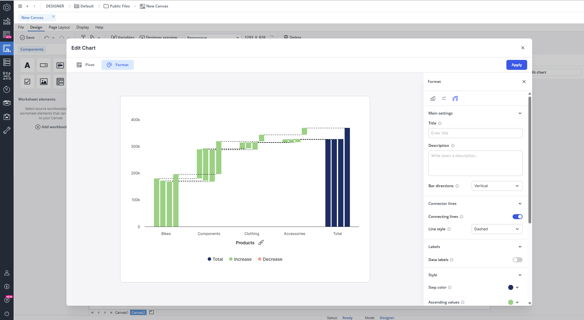
Formatting your chart
You can customize your native Canvas chart using the Format tab, which is organized into five sections: Chart Selection, Main Settings, Labels, Style, and Axis. When you hover your mouse over chart options in the Format tab, you can view tooltips that provide you with some basic information. Below you can see the detailed information of these sections for each chart type.
-
In the Chart Selection section, you can select the waterfall chart.
-
The Main Settings section allows you to add a title and description and define the bar direction (horizontal or vertical).
-
The Connector Lines section allows you to show or hide connecting lines and choose a line style such as dashed, dotted, or solid.
-
The Labels section provides options to toggle data labels on or off. If enabled, you can configure label position, text color, and background color.
-
The Style section allows you to adjust the visual appearance of the chart, including font settings, legend position and visibility (toggle on or off), and bar radius. In this section, you can also customize your chart with a personalized color palette. To do this, first create your custom palette in the Theme section. Once your personalized theme is ready, open the palette drop-down menu and select your new palette from the list. Furthermore, here you can customize the color scheme of your waterfall chart, including the color for steps (totals, intermediate sums, and connecting lines), ascending values (positive contributions), and descending values (negative contributions), allowing for clear visual distinction between different elements in the chart.
-
In the Axis section, you can control gridline visibility by enabling or disabling X and Y axis gridlines.
Additionally, you can further customize the styling of the chart's title, description, and axis titles. Click on the chart's title, description, or an axis title to open a draggable floating toolbar, where you can change the text color, adjust the font size, underline it, modify the alignment (left, center, or right), and adjust the font weight (regular, bold, medium, or italic).
With these customization options, you can create visually appealing and data-driven charts that effectively communicate insights within your Canvas.
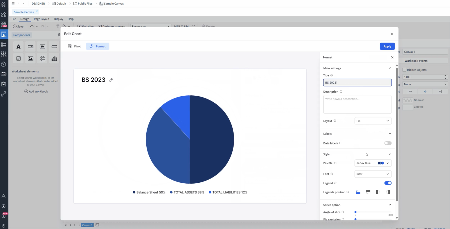
Pie chart
When you drag and drop a chart onto your Canvas, a Chart Creation dialog appears. The Bar chart is selected by default. To change the chart type, select Pie Chart from the available options.
In this dialog, you can select a database and cube to serve as the data source for your chart. You can also select a named range as your source. Once the source is set, you can customize how the data is displayed by selecting dimensions and elements and arranging them as needed. Simply drag and drop dimensions from the Source area into the Page Headers (POV), Category, or Measure sections.
-
POV (Point of View): Area of header dimensions.
-
Category: The grouping dimension used to define the categories in the chart (e.g., Product, Region). In this area, you should typically use base-level elements (e.g., specific products or regions), but consolidated elements can also be selected when a summary view is desired (e.g., total product groups, regions).
-
Measure: The numerical value or measure used to calculate contribution or variance (e.g., Sales, Revenue).
To refine which elements are shown, click a dimension to open the Select Elements dialog. Here, you can search for specific elements, choose which ones to display, and apply Alias and Alias Formats as required. See the Select elements dialog section for more information. The ability to select multiple elements is especially useful for the Category area, where you can compare multiple product lines or regions within a single chart. In contrast, the Measure area is typically best suited for a single measure (e.g., Revenue).
Additionally, it is possible to interact with the chart using the native combobox feature. By linking the @variables assigned to a combobox with the corresponding POV dimensions in the chart, any changes made through the combobox will automatically update the chart. This ensures real-time synchronization between user selections and chart data.
Formatting your chart
You can customize your native Canvas chart using the Format tab, which is organized into four sections: Main Settings, Labels, Style, and Axis. When you hover your mouse over chart options in the Format tab, you can view tooltips that provide you with some basic information. Below you can see the detailed information of these sections for each chart type.
-
The Main Settings section allows you to add a title and description and define the layout (pie or donut).
-
The Labels section provides options to toggle data labels on or off. If enabled, you can configure label position, text color, and background color. Additionally, you can choose to display the chart data as either values or percentages.
-
The Style section allows you to adjust the visual appearance of the chart, including the font settings, legend position and visibility (toggle on or off). In this section, you can also customize your chart with a personalized color palette. To do this, first create your custom palette in the Theme section. Once your personalized theme is ready, click the palette drop-down menu in this section, and select your new palette from the list. Watch the video below for a practical example:
-
In the Series options section, set the "Angle of slice" to define where the first slice begins, and use "Pie explosion" to control how far slices are offset from the center.
Additionally, you can further customize the chart's title, description, and axis titles. Click on the chart's title, description, or an axis title to open a draggable floating toolbar, where you can change the text color, adjust the font size, underline it, modify the alignment (left, center, or right), and adjust the font weight (regular, bold, medium, or italic).
With these customization options, you can create visually appealing and data-driven charts that effectively communicate insights within your Canvas.
Select Elements dialog
The Select elements (Dimension configuration) dialog allows you to define which dimension elements are included in a chart and how they are displayed.
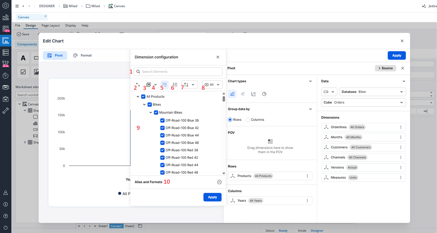
At the top, the search field (1) allows you to quickly locate specific elements within large hierarchies. As you type, the list dynamically filters to show matching elements, making it easier to navigate complex structures without manually expanding multiple branches. Directly below, the toolbar provides a series of controls for managing the element view and selection behavior.
-
The Expand All / Collapse All control (2) lets you open or close the entire hierarchy with a single click. This is particularly useful when working with deep or complex trees, as it removes the need to manually expand or collapse each level one by one.
-
The Select all/ Deselect all option (3) enable quick bulk actions for managing element selection. With a single click, you can select all elements or deselect all currently selected items, which significantly speeds up workflows when dealing with large datasets.
-
The Shortcuts split button (4) provides advanced selection options for more precise control. From the dropdown, you can select an entire branch (all children of a selected parent), select elements by hierarchy level across all branches, or select all base-level elements regardless of their position in the hierarchy.
-
The Flat list/ Hierarchy toggle (5and 6) allows you to switch between a hierarchical and a flat view of the elements. In Flatten mode, all elements are displayed in a simple list without indentation, while Hierarchy restores the original hierarchical structure, making it easier to understand relationships between elements.
-
The Sorting option (7) lets you organize elements according to your needs. You can keep the default structure order, sort elements alphabetically in ascending or descending order, or apply a custom-defined sorting to better align with specific reporting or analysis requirements.
-
The Display mode toggle (8) controls how elements are shown in the window. In “All” mode, the full hierarchy is displayed and all toolbar actions are available. In “Selected” mode, only the chosen elements are shown, allowing users to focus on their selection while limiting available actions to those relevant for refinement. In “Selected” mode, you will only see the Expand/collapse, Hierarchy, Flat list, and Sorting options.
The element tree area (9) displays the hierarchy of elements with checkboxes for selection. You can expand or collapse individual nodes and select or deselect elements at any level. Selecting a parent automatically affects its children unless individual elements are manually adjusted.
The Alias and Formats section (10) at the bottom provides options to select between the available aliases (if any) and choose a format of showing that alias in the chart. The available formats are: Alias, Element name, Element name - alias, Alias - element name, Element name (alias), Alias (element name), Element name alias, and Alias element name.
Finally, the Apply button confirms the selection and applies the chosen elements and settings to the chart configuration. Changes made in the window are only reflected after clicking this button.
Named ranges as a source
As a Canvas Author, you can utilize named ranges (defined in a spreadsheet or at a global scope) as the data source for charts in your Canvas. This allows you to create dynamic, reusable charts that automatically adjust to changing data. You won't need to hardcode data source areas (Database/Cube) or repeatedly define the same queries.
By default, the database selector is set to a static value. To change it to a named range, click on the Database parameters and select the "Named range" option.
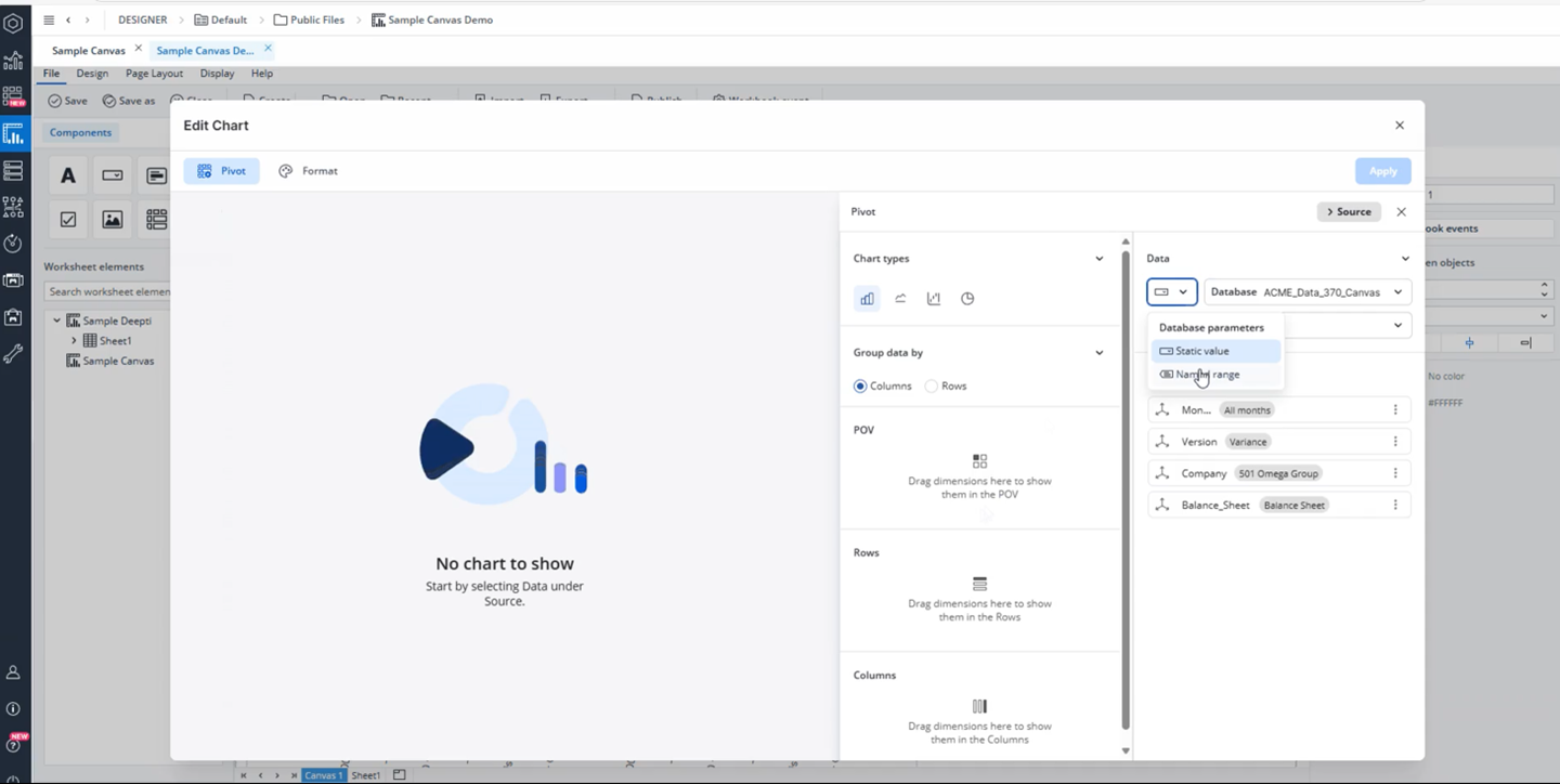
When you switch the parameter from a static value to a named range, the database preselection automatically sets to the first available named range if any are present. You can change to the named range you wish through the Database drop-down menu. Once you have selected your named range, cubes from the connected database will be accessible, and the dimensions will also be displayed, allowing you to start dragging dimensions to build a chart.
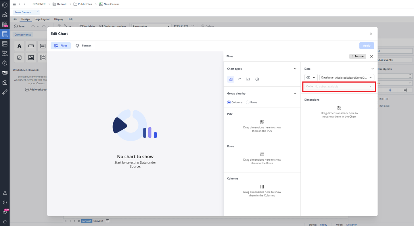
However, if no named ranges are available, the database preselection will be removed, and you will see the message "No Named Range available." Additionally, the cube option will be disabled, displaying the message: "No cubes available."
Furthermore, if you select a named range and the connection fails (for example, due to a spelling error, a change in the database name used in the named range, incorrect spelling of the named range, or its deletion), an error will appear in the cube selection field, accompanied by a message stating "Invalid connection."
Saving and deleting named ranges
When a chart that uses a named range is saved as part of a canvas, the name of the named range is also saved. If you rename the named range later, the connection will be lost, and the chart will not display correctly.
If you delete the named range, the chart will not load and you will see the “Invalid connection (data source lost)” error message.
Named range constraints
If a chart on a Canvas uses a database connection from a named range, any updates made to the database name or the connection in that named range will not take effect immediately. These changes will only be reflected after approximately five minutes or after logging out and then back in. Until that time, the chart will fail to load and will display the error message “Unable to display chart.”
Charts' default naming
When charts are added to the Canvas, they are automatically assigned sequential names, following a numeric pattern for easier identification. The first chart is named "Chart1," the second "Chart2," and so on, with each subsequent chart receiving an incremented identifier. To rename any chart, navigate to the Format tab and change Name (ID).
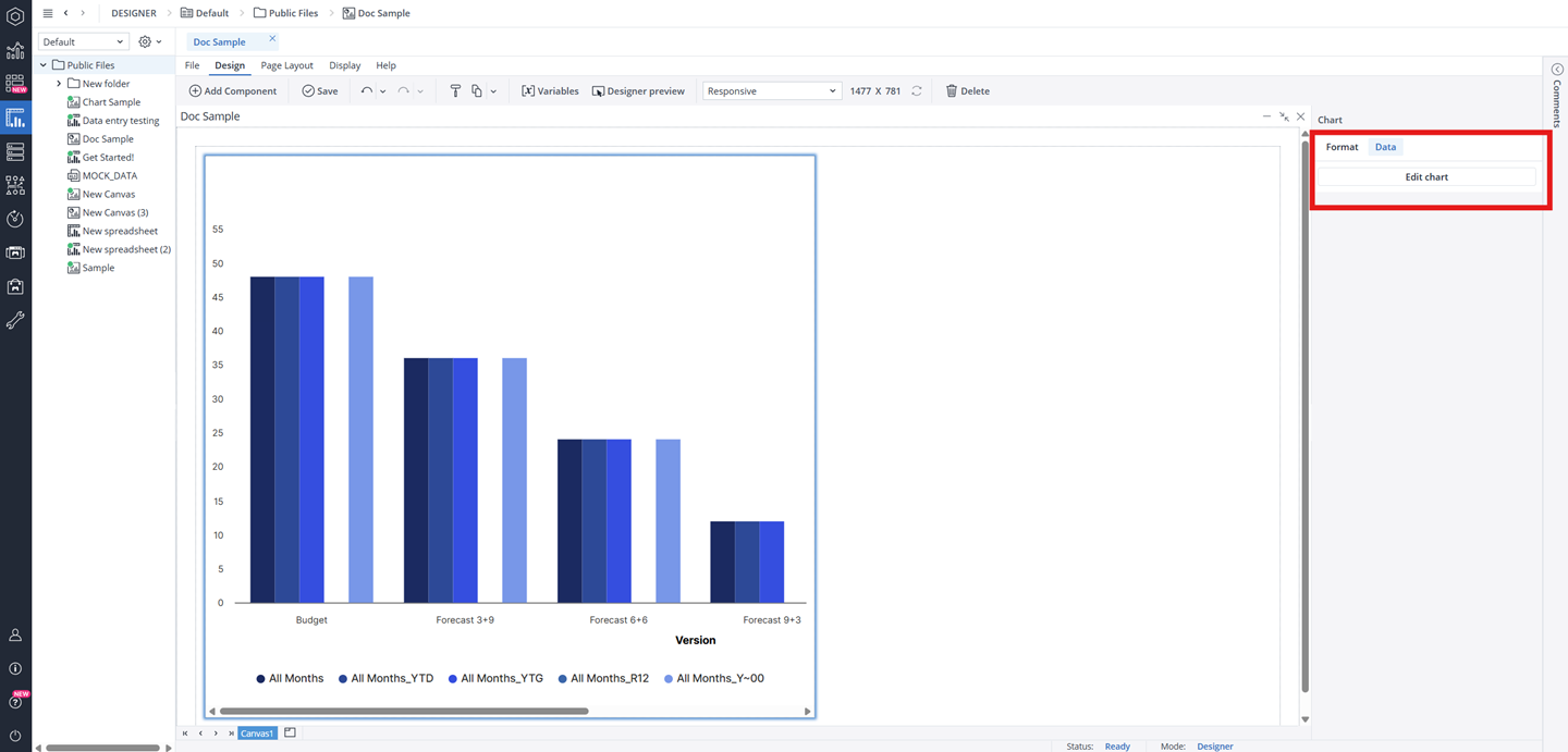
Editing an existing Canvas chart
To modify an existing chart, navigate to the right-side panel and select the Data tab. Then, click the Edit Chart button to open the Edit Chart Dialog, where you can adjust the chart's settings, update data sources, and customize its appearance as needed.
Formatting an existing Canvas chart object
When you click on a native Chart object on your Canvas, a Format dialog opens on the right side of the screen. In the Format tab, you can edit properties such as name, width, height, background color, radius, border, padding, and visibility.
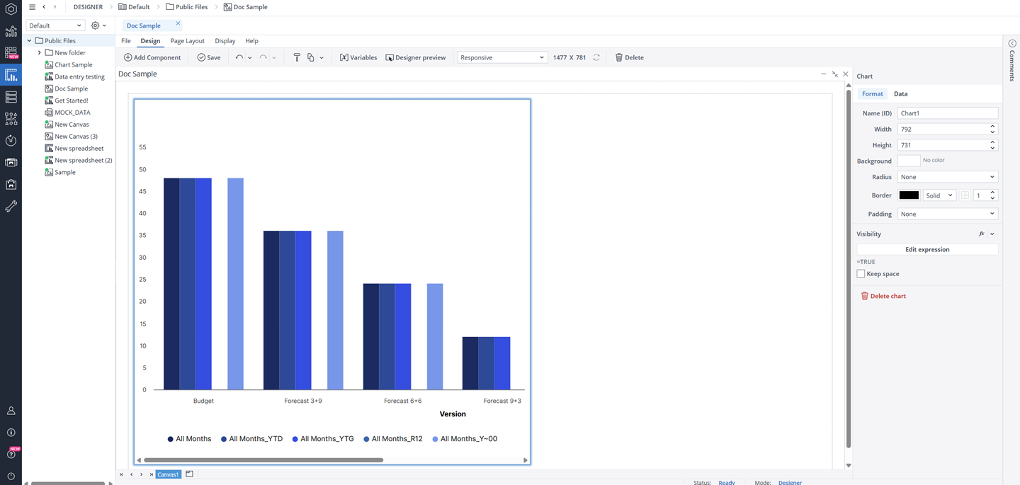
The Visibility feature enables you to control whether a chart should be visible to your end user or not. By default, the chart's visibility is an Expression with the value "=TRUE", but you can use a variable or another Expression, e.g., FALSE, to change (hide) it. When you hide a chart, the remaining components dynamically adjust to occupy the vacant space. If you wish to maintain the hidden chart’s space and preserve your Canvas layout, you can utilize the Keep space option.
To delete your chart, you can either choose the Delete chart option in the Format tab, right-click on your chart and select Delete, or select the chart and press the Delete key on your keyboard. You can also use the right-click to copy, cut, or paste your chart.
When you save your Canvas, any changes made to the charts will also be saved.
Charts size limits (Min/Max)
The Charts in Canvas have defined minimum and maximum dimensions, and entering values outside these limits will not resize the Charts. The table below provides detailed information on these height and width limits.
| Component | Minimum width | Maximum width | Minimum height | Maximum height |
| Chart | 8 px | 1600 px | 8 px | 1200 px |
Video example
Watch the video below for a practical example of what you can do with the charts in Canvas:
Updated June 1, 2026