Canvas
Native component: Checkbox (23.3.3)
Canvas designers can now directly add the Checkbox native component to their Canvas.
Checkbox customization (23.3.3)
Canvas designers can personalize Checkboxes by modifying the Box Style and Color options.
Toggle Checkbox Label (23.3.3)
Using the Show Label option, Canvas designers can enable or disable Checkbox Labels.
Selecting complete dimensions in Canvas Combobox
Canvas designers can now use an entire dimension and an Alias as a data source of a Canvas native Combobox. To do this, select the “Simple Data Source” as the Data Type, select a dimension and an Alias, and click “Apply Dimension”.
Textfield optimization for expressions and variable options
Canvas designers can now directly edit the Expressions and variables in the TextField of the Format tab of a native component. Previously, designers could only edit Expressions and variables in pop-ups.
Enhancement of Canvas Workbook events/Actions
Workbook events are now enhanced for Canvas, enabling the Canvas designers to perform tasks automatically upon Canvas opening, loading, and closing events. This improvement streamlines workflows, reduces manual effort, and increases overall productivity. Canvas designers can assign the following Actions to workbook events.
- Open events: Read/Write value, Set value (previously available)
- Load events: Integrator, Set value, Read/Write value, Scheduler task
- Close events: Integrator, Set value, Hyperlink, Scheduler task
Formatting multiple native components
Canvas designers can now multi-select several components of the same type (Ctrl + click) and apply the same "Format" property to all of them at the same time.
Canvas Combobox Actions
Canvas designers can now use Actions in a native Canvas Combobox. The Combobox Actions provide greater control over the content and enable the designers to create a more interactive and dynamic canvas. Designers can define custom actions like "Set value" with various source and target options such as static value, settings key, variable, or named range.
Show/hide Hidden components
Canvas users can now use the component Visibility feature to control whether a component should be visible to the end user.
Hidden objects option in Inspector
Canvas designers can now use the “Hidden objects” option in the Canvas inspector and toolbar to show or hide the hidden components. This option is unchecked by default, and the hidden components are invisible. To be able to see and edit the hidden components, designers should check this option.
KPI Card: Time format
Canvas designers can now select the Time format for their KPI cards and provide KPIs on time-relevant topics like delivery time from one phase to another.
Canvas native Button
Canvas designers can now directly create buttons within the Canvas environment, apply Actions and symbols (GIF, JPG, JPEG, PNG, SVG) to them. The native Canvas Button component simplifies and accelerates the report-building process for Canvas designers.
Canvas Native Image
Canvas designers can now directly add images (GIF, JPG, JPEG, PNG, SVG) within the Canvas environment. The native Canvas Image component simplifies and accelerates the report-building process for Canvas designers by omitting the need for configuring images in a separate Web spreadsheet.
Web
Audit of database changes
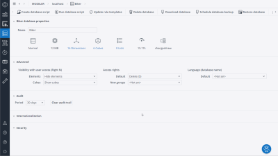
You can now manage database audit and view log entries in the Audit viewer, just as you would for cube data. The log entries show a trail of added, deleted, and renamed dimensions and cubes, cube layout changes as well as cube holds that have been created or released.
The audit entries can be intuitively sorted and exported to CSV or XLSX for custom storage or analysis.
Audit of dimension changes
The Audit viewer has been extended to include dimensions, allowing you to trace changes such as the creation, deletion, and renaming of elements.
Safe splashing
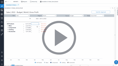
Jedox now has built-in safety mechanisms to prevent performance issues and unintentional data removal. As shown in the video below, the Planning Assistant is launched, providing safer options.
Avoid accidental over-population of cubes with safe splashing
You will now be interrupted when attempting to splash on a large empty or populated area. This safety mechanism helps to prevent accidental over-population, leading to a decrease in performance.
Safer splashing behavior when deleting data
When attempting to delete large data, you will receive a confirmation prompt. This safety mechanism helps to prevent unintended data loss.
Integrator
Integration with Snowflake
A new dedicated connector enables access to data that is hosted in Snowflake Data Cloud. The connection authenticates securely with private key or token authentication methods.
Snowflake connector
Now users can connect seamlessly to Snowflake Data Lake with native integration in Jedox.
"Data preview with options" in Function Editor
variable values can now be changed with fewer clicks using "Data preview with options" in the Function Editor for TreeElement and Field transforms.
Direct navigation to other Integrator components
In TableUnion and TreeJoin transforms, a navigation button next to the components name enables you to jump directly to related components without using the Flow Graph.
Select value from Data Preview
Values in the Data Preview can now be copied and pasted where needed.
Flowgraph no longer collapses in case of error
When an error is introduced in an Integrator job, the Flowgraph remains open and highlights the error. Hovering over the highlighted area shows an error message.
Updated components
In Jedox version 2023.3, the following components were updated:
| Component | Version |
| Apache | 2.4.57 |
| PHP (Apache) | 8.1.22 |
| PHP (SSS) | 7.3.30 |
| PHP (SVS) | 8.1.16 |
| OpenJDK | 17.0.8 |
Updated August 27, 2024

