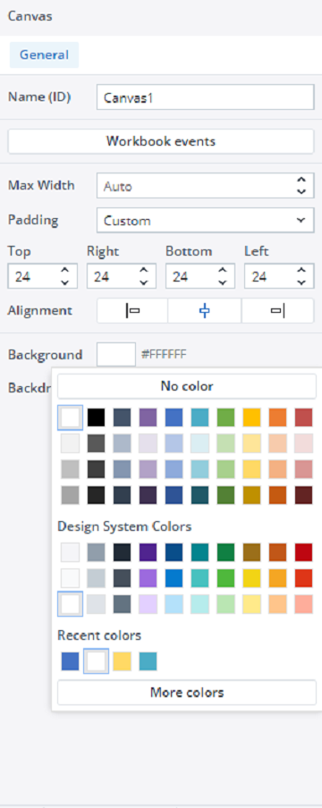
Canvas allows you to customize its appearance to align with your design needs. You can adjust various aspects, such as background colors, borders, and layout settings, to create a visually cohesive and functional workspace. These formatting options are available in the General tab, which appears on the right side of the screen as soon as you build a new Canvas or open an existing one.
This article focuses on formatting and styling the Canvas and its Stacks. If you're looking for customization options for native components like KPI Cards and Labels, refer to the Adding Native Components to Canvas article.
Canvas max width
By default, the max width of a Canvas is set to Auto, automatically aligning the Canvas with different screen widths.
However, it is possible that the aesthetic structure of the Canvas you have designed might change if the Canvas is opened on a screen with a larger resolution. To ensure your Canvas looks the same even on larger resolution screens, you can set a Max Width for it.
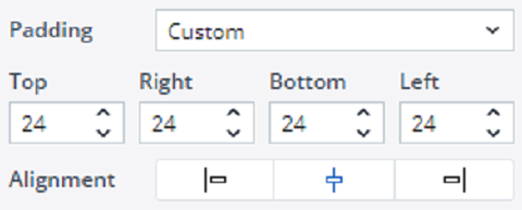
Padding
By default, the padding of the Canvas worksheet, stacks, and individual components is set to None. However, you can change the padding to Small, Medium, Large, or define a Custom padding.
Radius and margins
By default, the radius and margins of stacks and individual components are set to None. However, you can change them to Small, Medium, Large, or define a Custom radius and margin.
Background
To change the background color of the Canvas worksheet, stacks, and components, click on the background color button. A color picker dialog will open, allowing you to select the color you wish to use.
Note that if the background color of components in the source Web Spreadsheet is set to 'No Color,' they will automatically inherit the background color applied to the Canvas.
Borders
In the Border section, you can customize the border style, width, and color. Additionally, you have the option to set borders for each Canvas edge individually. For instance, you can create a design where only the top and/or bottom borders are applied to a stack that spans the entire width of the Canvas, or you can design a stack with only left and right borders, omitting the top and bottom borders.
Format Painter (same type component)
You can use the Format Painter tool to swiftly replicate the formatting of one component to others of the same type. For instance, this tool allows you to copy all formatting properties of a KPI card —such as width, padding, margin, background color, border radius, border, font style, and size— and apply them to one or multiple other KPI cards.
To apply the Format Painter to multiple components of the same type, first select the component with the desired formatting. Then, while holding the Ctrl key, click the Format Painter button. Next, click on each component you want to format. Alternatively, you can select multiple components of the same type at once and apply the formatting to all of them simultaneously.
You can use the Undo button to revert the changes made by the Format Painter.
Canvas inherited properties
When you uncheck the checkbox next to a property on a stack or component, that property is inherited from its parent. The inheritance hierarchy, from highest to lowest level, is: Canvas -> Stack -> Component.
If you modify a property on a specific stack or component, the checkbox for that property will be checked, indicating that the stack or component no longer inherits this property from its parent.
Please note that inheritance does not apply to border radius for aesthetic reasons; you can set the border radius individually for each element.
Notes:
-
When adding native components like KPI Cards and Labels via "Add Component" in Canvas, you can adjust properties like size, padding, margin, colors, visibility, borders, font style, and alignment—but not the font itself. See Adding Native Components to Canvas for a detailed explanation of what you can change in each component.
-
Canvas uses Inter as its default font, which is fixed and cannot be modified.
Updated July 3, 2025


