Adding Components to a Canvas

Canvas reports are built using native components of a Canvas, and/or components from one or more Web Spreadsheet workbooks.

You can use a simple drag and drop to add any component to your Canvas. Each component you add is clearly marked with dotted lines.

Adding native components to Canvas

You can find the native components of Canvas in the Add Component menu. When you click on the Add Component, the menu is temporarily displayed on top of the Canvas (overlaid so the Canvas size is unaffected). To keep the Add Component menu open, click on the pin button.

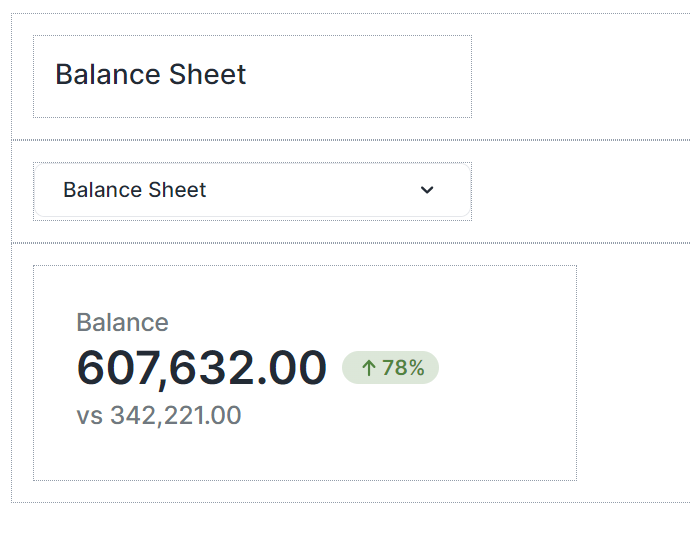
The native components you can add to your Canvas are Labels, ComboBoxes, KPIs, Buttons, and Images.

Native component: Label

The Canvas Label allows you to easily add headings and descriptive text directly within the Canvas reports, ensuring that end users have all the important context within their reports.

When you drag and drop a Label onto your Canvas, a Format dialog opens on the right side of the screen. In the Format tab, you can edit properties such as name, width, height, padding, and margin. You can also define your label's background color, visibility, radius, border, font style, and alignment here.

The Visibility feature enables you to control whether a Label should be visible to your end user or not. By default, the Label's visibility is an Expression with the value "=TRUE", but you can use a Variable or another Expression, e.g., FALSE, to change (hide) it. When you hide a Label, the remaining components dynamically adjust to occupy the vacant space. If you wish to maintain the hidden Label’s space and preserve your Canvas layout, you can utilize the Keep space option.

To delete your label, you can either choose the Delete Label option in the Format tab, right-click on your label and select Delete, or select the Label and press the Delete key on your keyboard.

Native component: ComboBox

The Canvas Combobox allows you to add and configure filters directly within Canvas reports. The end users can apply filters to dynamically change the charts, KPIs, and data tables presented in their Canvas reports.

Format tab

When you drag and drop a ComboBox onto your Canvas, a dialog opens on the right side of the screen. In the Format tab, you change the name, width, visibility, and text color of your ComboBox or add an Action, a margin or border to it. The Visibility feature enables you to control whether a ComboBox should be visible to your end user or not. By default, the ComboBox's visibility is an Expression with the value "=TRUE", but you can use a Variable or another Expression, e.g., FALSE, to change (hide) it. When you hide a ComboBox, the remaining components dynamically adjust to occupy the vacant space of the hidden ComboBox. If you wish to maintain the hidden Label’s space and preserve your Canvas layout, you can utilize the Keep space option.

You can also add a label to your ComboBox through the Show label option, and use a Static Value, a Variable, or an Expression as your Label text. You can change the position and width of the Label text and customize its font style and alignment.

To delete your ComboBox, you can either choose the Delete ComboBox option in the Format tab, or right-click on your ComboBox and select Delete.

Data tab

In the Data tab, you can choose between a Simple data source, an Expression, a Subset, and an ODBC query as the source of your ComboBox.

  • You can define a data source in the Simple data source section by quickly and easily selecting a Database, Dimension, Element, and Alias. The "Apply" and "Apply dimension" buttons have different functionalities. If you want to use a simple subset through the Select Elements dialog of the native ComboBox and add an Alias to it, click on the "Apply" button. If you want to use a full dimension as a source and combine it with an Alias, click on the "Apply dimension" button.
    Note that only visible elements are selected and added when you use "select all" and click the "Apply" button. But when you use the "Apply dimension" option, all elements (consolidated, base elements, etc.) of the dimension are added to your data source.

    You can also set the connection/database for your ComboBox source data using Variables, Named Range, and Settings key to incorporate your Canvas report into models. Note that in this case, both the connection and database names should be written correctly, for example: localhost/Biker

  • When you select an Expression as a data source, you will see a default Expression. You can use this Expression as an example or edit it as you like.

    When you click on the "Edit expression button", a pop-up shows up. You can edit the expression in this pop-up, and your expression's result is shown instantly.

  • Subset: see the Subsets Overview article.

  • ODBC query see ODBC Connections in Jedox Web Spreadsheets.

The next time you use a ComboBox, the database and cube for the ComboBox are pre-populated using the data from the last ComboBox you have defined.

Native KPI Card

The Canvas KPI Card displays the most important summary measures from your data and allows you to evaluate the status of a measure by comparing key indicators to a target or comparison measure. Canvas KPI Card's visual cues allow end users to track and communicate progress toward a measurable goal easily.

Format tab

When you drag and drop a KPI Card onto your Canvas, a dialog with two tabs opens on the right side of the screen. In the Format tab of the KPI Card, you can configure the properties such as name, width, visibility, padding, margin, background color, and radius. The Visibility feature enables you to control whether a KPI Card should be visible to your end user or not. By default, the KPI Card's visibility is an Expression with the value "=TRUE", but you can use a Variable or another Expression, e.g., FALSE, to change (hide)it. When you hide a KPI Card, the remaining components dynamically adjust to occupy the vacant space. If you wish to maintain the hidden KPI Card’s space and preserve your Canvas layout, you can utilize the Keep space option.

The lower section of the Format tab enables you to customize the font style and alignment of the different sections of the KPI, i.e., Title, Value, and Comparison. In this section, you can also use the Delete KPI option to delete the KPI. It is also possible to delete the KPI by right-clicking on it and selecting Delete.

Data tab

In the Data tab, you can define the primary measure to display on your KPI Card by selecting a cube and configuring the dimension values. You can select an Element, a Variable, or an Expression for each dimension. You can also set the connection/database for your KPI Card source data using Variables, Named Range, and Settings key to incorporate your Canvas report into models. Note that in this case, both the connection and database names should be written correctly, for example: localhost/Biker

The Canvas KPI formatting option enables you to select between for formats: Number, Currency, Percentage, and Time.

  • In the Number format, you can decide on the number of decimals and use the Auto Scaling option. Enabling the Auto Scaling option results in dynamic number formatting. This way, the numbers below a million are automatically shown with a "K" (for Kilo, or thousands), the numbers below a billion are shown with an "M" (for Million), and the numbers over a billion are shown with a "B" (for Billion). You can also change the K, M, and B abbreviations.
    The Use 1000 separator option makes reading large numbers easier by adding visual indicators to your numbers.

  • The Currency format is like the Number format with an additional currency symbol option.

  • The Percentage Format is useful for ratio-relevant topics.

  • The Time format is useful for time-relevant topics.

Comparison value option

You can add a comparison value to display a comparison indicator on your KPI Card. To do this, select the Comparison value option in the KPI Data tab. You can use either a Fixed value or a Data point (an aggregated cube value). For a Fixed Value, you need to add the value manually. You can use the Data point option by dragging and dropping dimensions from your primary measure dimensions or clicking the Add dimension button. You can select an Element, a Variable, or an Expression for the comparison.

You can set a label, choose a type (Value, Variance, % Variance, and Label only), and decide on the number of decimals for the Comparison value.

The Indicator option provides clear visual indicators that show the Comparison value’s relationship to the primary measure of your KPI. You can decide on a color code for each relationship type. You can also add a symbol and variance in percentage by using the Show symbol and Show Variance options.

The next time you use a KPI, the database and cube for the KPI are pre-populated using the data from the last KPI you have defined.

Drill Anywhere in KPI Cards

End users can utilize the Drill Anywhere functionality in Canvas too. Right-click on any KPI card and hover your cursor over "Drill By…" from the context menu. You will be presented with a list of all the Dimensions that comprise the Cube the KPI card is built from.

Native Component: Button

The Canvas native Button simplifies and accelerates the report-building process for you. When you drag and drop a Button onto your Canvas, a Format dialog opens on the right side of the screen. In the Format tab, you can add an Action, a Content, and a Tooltip to your Button. The Content and Tooltip can be a Static value, a Variable, or an Expression.

You can edit properties (such as name (ID), width, height, padding, and orientation) and define your Button's color, radius, border, font style, and alignment here. You can decide between the Auto or Custom modes when coloring your Button. The Auto mode is quicker, while the Custom mode provides more options. When you choose the Custom mode, you can assign different colors for when Canvas users hover their cursor over the Button or when they click on it.

The Visibility feature enables you to control whether a Button should be visible to your end user or not. By default, the Button's visibility is an Expression with the value "=TRUE", but you can use a Variable or another Expression, e.g., FALSE, to change (hide) it. When you hide a Button, the remaining components dynamically adjust to occupy the vacant space. If you wish to maintain the hidden Button’s space and preserve your Canvas layout, you can utilize the Keep space option.

You can also add symbols (GIF, JPG, JPEG, PNG, SVG) to your Canvas Buttons. To do this, use the Add Symbol button. Once the symbol is uploaded, you can see a Symbol inspector at the button of the format tab.

In this section, you can replace the symbol, delete it, and change its position, gap, and size. By default, Canvas symbol sizes are set to maintain the ratio. If you want to turn off this option, click on the chain icon on the right side of the symbol size once. Clicking on the chain icon the second time turns the option back on.

Native Component: Checkbox

This native component enables you to incorporate a Checkbox into your Canvas, providing functionality such as creating lists or toggling various settings on and off.

When you drag and drop a Checkbox onto your Canvas, a Format dialog opens on the right side of the screen. In the Format tab, you can add an Action, a Target (Named Range or Variable), and a Tooltip and a Label that can be static or dynamic (via Variable or Expression) to your Checkbox and decide on the State of the Checkbox. You can also configure the properties such as Name (ID), width, color of the Checkbox, Box Style, and visibility. The Visibility feature lets you control whether a Checkbox should be visible to your end user. By default, the visibility of a Checkbox is an Expression with the value "=TRUE", but you can use a Variable or another Expression, e.g., FALSE, to change (hide) it. When you hide a Checkbox, the remaining components dynamically adjust to occupy the vacant space. If you wish to maintain the hidden Checkbox’s space and preserve your Canvas layout, you can utilize the Keep space option.

You can disable the Checkbox label by deselecting the "Show label" option. You can also change the position, gap, and width of the Label text and customize its font style and alignment.

Please be aware that the value displayed in the "Width" field of the Checkbox Format dialog represents the combined width of both the label and the checkbox. If you disable the Checkbox label, you will no longer be able to adjust the width, and it will remain fixed at 16, representing the Checkbox size.

To delete your Checkbox, you can either choose the Delete Checkbox option in the Format tab, right-click on your Checkbox and select Delete, or select the Checkbox and press the Delete key on your keyboard.

Native Component: Image

Canvas Image enables you to directly and easily add images (GIF, JPG, JPEG, PNG, SVG) within the Canvas environment. In the Format tab, you can select a Name (ID) for your image, replace it, change its visibility and size, and add a radius and border to it.

By default, Canvas image sizes are set to maintain the ratio. If you want to turn off this option, click on the chain icon on the right side of the Image size once. Clicking on the chain icon the second time turns the option back on.

Adding components from Web Spreadsheet workbooks

To add Web Spreadsheet workbooks to your Canvas, select Add Workbook from the Components section.

In the following tab, you can select one or more source workbooks to use within your Canvas.

All Canvas components, such as sheets, charts, images, and form elements (ComboBox, Label, etc.) within your source web spreadsheet workbooks will be listed. You can drag and drop each of these components onto your Canvas.

Note that the workbook components you add to your Canvas rely on the corresponding sheet's name for content retrieval. If you change the name of a sheet in the workbook, the connection between the component and the sheet will be broken. In this case, you must use the Inspector to replace the components on your Canvas.

Searching worksheet elements

When there are many components in your web spreadsheets, you can use the Add Component menu’s search bar to quickly find the component you need.

Changing the content of the source workbook

You can also quickly and easily open and change the source content of a Web Spreadsheet workbook from inside a Canvas. To do this, right-click on the worksheet in the Content Source list of the Canvas and select Go to Source.

Executing Macros

You can only execute the macro of a form element if the macro is in the same workbook as the Canvas. Executing the macros of form elements from other workbooks is not currently supported.

Naming Worksheet elements

To prevent confusion when building a Canvas with many Worksheet elements, it is best if you define specific names for the Worksheet elements (charts, images, etc.) in the Jedox Web spreadsheet. This lets you quickly identify the Worksheet elements you wish to add to your Canvas.

You can define Worksheet elements names in two ways. First, change the default name when building a Worksheet element (for example, a chart). Second, once the Worksheet element is built, right-click on it and change its name in the properties menu. (See Naming Web Spreadsheet Objects)

Adding Frames Inside a Web Spreadsheet

To add Web Spreadsheet cell contents to a Canvas, for example, an intricate KPI layout, you must first define the area using a Frame. Frames (or a Named Range with the context set to a specific worksheet) enable you to mark an area of a worksheet that can cover multiple cells and Worksheet elements. Frames you have added to your spreadsheet will be listed in the Canvas Worksheet elements list.

To add a frame to your spreadsheet, choose the content you want to add and then click on Frame in the Insert menu of the Jedox ribbon.

You can provide a label and name for the new Frame. These identifiers should be meaningful and unique, so that you can easily identify them in the Frame list later. You can specify a size for the frame in the dialog, or click OK and drag the green frame around the area you want to identify.

When the underlying content of a Canvas is changed, e.g., expansion or contraction of a DynaRange, changes in a stored View, inserting or deleting rows, resizing rows and columns, then the Stacks and Frames are automatically resized.

Note that the spreadsheet objects (Frames, Charts, etc.) that are used in a Canvas should not overlap. Furthermore, it is essential to arrange these objects in a way that their edges do not overlap concurrently in both rows and columns. The example below shows some correct and incorrect arrangements.

Note that in case you want to capture a DynaRange completely, you must use a frame.

Hiding frames

To temporarily hide the frames in your worksheet, uncheck the “Frames” checkbox in the Display menu.

Deleting workbooks and components

To delete a workbook from the Worksheet elements list, right-click on the workbook, and select Remove Workbook.Note that you can only remove a workbook from the list if it is unused, i.e., there are no objects from it on the Canvas.

When you delete any Web Spreadsheet content (charts, ComboBoxes, frames, etc.), it will be automatically deleted from your Canvas too. In this case, an icon on your Canvas replaces the deleted content, providing a visual indicator for proper actions.

Editing Components in a Canvas

Once you have positioned your components onto your Canvas, you can still edit them in many ways. You can move them around by dragging and dropping them. You can also undo/redo your formatting and component placements or copy/cut and paste your components, frames, and stacks.

Next step: Canvas Layout

Updated March 27, 2024