SUCCESS charts provide a structured approach to visualizing key performance indicators (KPIs) and business metrics, ensuring clarity and actionable insights. Designed to emphasize meaningful data representation, these charts help organizations track progress, identify trends, and support decision-making with clear and intuitive visuals.
By following best practices in chart selection, formatting, and interpretation, SUCCESS charts enable users to communicate complex data effectively. This article explores the key principles of SUCCESS charts, their advantages, and considerations for optimizing their use in reporting and analytics.
You can use the same data sources for SUCCESS charts as you would for standard charts. For more details, see Data Sources.
The following SUCCESS chart types are available:
- Column chart
- Line chart
- Bubble chart
- Waterfall chart
- Vertical waterfall chart
Samples of SUCCESS charts can be found in the Chart Samples Model from Jedox Marketplace. These charts are available in both the Jedox Excel Add-in and Jedox Web, allowing seamless transfer between the two. Additionally, SUCCESS charts from XLSX snapshots can be viewed in Excel without requiring the Excel Add-in.
The examples below demonstrate how to create SUCCESS charts in both Excel and Jedox Spreadsheets. However, in workbooks with static data—where no Excel formulas are used—SUCCESS charts do not update automatically when the data source changes. This occurs because Excel does not trigger recalculations in static workbooks. To ensure updates, we recommend adding a simple formula, such as TODAY() function, in any cell.
Formatting a SUCCESS Chart
After inserting a SUCCESS chart into a workbook, you can format and customize each category to suit your needs.
-
In Excel, select the chart and click SUCCESS Charts to access the formatting options.
-
In a Jedox Spreadsheet, right-click the chart and select Format Chart Properties to display the customization options.

You can configure the following elements of the SUCCESS Chart:
| Chart | Allows you to change the size (width and height) and position (left and top) of the chart. |
| Plot Area | Allows you to change the size (width and height) and position (left and top) of the plot area. Can be set to autosize. |
| Message | Allows you to configure the title of the chart and the information displayed in the header. You can select the data source from the workbook or type in the information you want. You can also configure the font. |
| Footer | Allows you to configure the information available in the footer. You can select the data source from the workbook or type in the information you want. You can also configure the font. |
| Axes | Allows you to configure the range of the axes. You can set the minimum and maximum range to auto or use a fixed range. |
| Marker Line | Allows you to set the start and end position for the marker line. |
| Separator Line | Allows you to set the position of the separator line in a chart. Additionally, you can set the color and the size of the separator line. Only available in Deviation Column SUCCESS Charts or in Line SUCCESS Charts. |
| Base Line | Allows you to select the width and color of the base line. |
| Bar | Allows you to select the width and font for the bars of a chart. Additionally, you can select the colors of the bars. |
Creating SUCCESS Charts in Jedox
SUCCESS charts in Jedox offer a variety of visualization options to effectively represent business data and key performance indicators. Users can create and customize different chart types, including column charts, line charts, bubble charts, waterfall charts, and vertical waterfall charts, to highlight trends, comparisons, and cumulative changes.
 Creating column charts
Jedox offers two types of SUCCESS column charts for visualizing data effectively:
Creating a Deviation Column Chart
This chart highlights positive and negative variances by displaying columns that extend above or below a baseline. It is useful for comparing actual values against targets or previous periods, making it ideal for variance analysis.
To create a Single Column Chart, follow these steps:
- In the data source, select the F9:V11 area.

- On the Jedox ribbon, select the Success Chart button.
- Choose the Deviation Column chart type and click Create. The chart is displayed.

- Select G5 for Message and G6 for Title in the Header section. You can also choose different font settings by clicking the button on the right.
- In the Footer section, type "Bikers Best AG".
- Configure the separator line as follows: Position: G17, Height: 30, Width: 3, Color: Gray
- In the Bar category, select the deviation pattern after separator to be displayed as diagonally striped.
- in Marker Line, set the start and end positions to 9 and 10, respectively.
- Click Update. The Deviation Column SUCCESS chart is displayed.

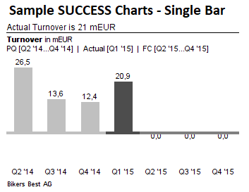
Creating a Single Column Chart
A straightforward column chart that represents individual values for each category. It is commonly used for displaying performance metrics, trends, or comparisons across different data points.
To create a Single Column Chart, follow these steps:
- In the data source, select the F6:M7 area.

- On the Jedox ribbon, select the Success Chart button.
- Choose the Single Column chart type and click Create. The chart is displayed.
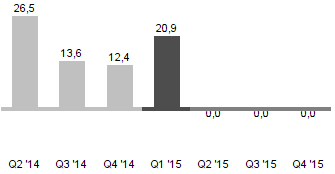
- Select G8 for Message and G9 for Title in the Header section. You can also choose different font settings by clicking the button on the right.
- In the Footer section, type "Bikers Best AG".
- In the Bar category, set the actual areas from G25 to G26.
- Set the design for previous, actual and forecast data.
- Click Update. The SUCCESS chart is displayed.
Creating a Line Chart
To create a Single Column Chart, follow these steps:
- In the data source, select the F10:R12 area.

- On the Jedox ribbon, select the Success Chart button.
- Choose the Line chart type and click Create. The chart is displayed.

- Select G5 for Message and G6 for Title in the Header section. You can also choose different font settings by clicking the button on the right.
- In the Footer section, type "Bikers Best AG".
- Configure the separator line as follows: Position: G17, Height: 5, Width: 2, Color: Gray
- Click Update. The Line SUCCESS Chart is displayed.

Creating a Bubble Chart
To create a Bubble Chart, follow these steps:
- In the data source, select the G7:J17 area.

- On the Jedox ribbon, select the Success Chart button.
- Choose the Bubble chart type and click Create. The chart is displayed.

- Select G5 for Message and G6 for Title in the Header section. You can also choose different font settings by clicking the button on the right.
- In the Footer section, type "Bikers Best AG".
- In the Marker Line section, set the X and Y position of the marker line to 0.50 and 0.10 respectively. Set both lines as dash lines.
- Click Update. The SUCCESS Bubble Chart is displayed:

Creating a Waterfall Chart
To create a Waterfall Chart, follow these steps:
- In the data source, select the G8:T9 area:

- On the Jedox ribbon, select the Success Chart button.
- Choose the Waterfall chart type and click Create. The chart is displayed.

- Select the chart and click on the SUCCESS Charts one more time. The following SUCCESS Charts window is displayed, allowing you to make setting for various areas of the chart.
- Select G5 for Message and G6 for Title in the Header section. You can also choose different font settings by clicking the button on the right.
- In the Footer section, select G14 as data source.
- Click Update. The result looks like in the example below:

Creating a Vertical Waterfall Chart
To create a Vertical Waterfall Chart, follow these steps:
- In the data source, select the F9:G27 area.

- On the Jedox ribbon, select the Success Chart button.
- Choose the Waterfall chart type and click Create. The chart is displayed.

- Select the chart and click on the SUCCESS Charts one more time. The following SUCCESS Charts window is displayed, allowing you to make setting for various areas of the chart.
- Select G5 for Message and G6 for Title in the Header section. You can also choose different font settings by clicking the button on the right.
- In the Footer section, type "Bikers Best AG".
- In the Subtotal section, select J23 as a source for the Subtotal Bars.
- In the Marker Line section, set the start and end position of the marker line to 10 and 12 respectively.
- Click Update. The Vertical Waterfall SUCCESS chart is displayed:

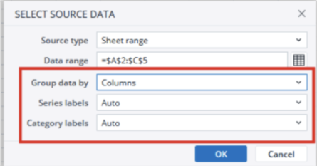
Note: After creating the SUCCESS chart, you can modify its source data by right-clicking the chart and choosing “Select source data.” However, unlike dynamic charts, the ‘Group data by’ option in this dialog does not affect the SUCCESS chart.
Updated April 29, 2026