An XY (scatter) chart is a type of chart that uses Cartesian coordinates to display data points. Each data point is represented by a dot positioned according to its X-axis (horizontal) and Y-axis (vertical) values. Unlike line charts, scatter charts focus on showing the relationship between two variables without necessarily connecting the dots with lines.
For Jedox users, line charts can be particularly useful for (but not limited to) analyzing data relationships, identifying trends and outliers, enhanced decision-making, comparing performance metrics.
Setting up a XY (scatter) chart
To create a XY (scatter) chart in the Designer, follow these steps:
-
Build a new Jedox Web Spreadsheet or open an already existing one.
-
From the toolbar at the top of the interface, Click on the Insert option in the toolbar, and from the dropdown menu, select Charts
 . This will display a variety of chart types that are available for selection.
-
From the chart options, find and select the XY (scatter)chart type. You can choose between Scatter with only markers, Scatter with smooth line and markers, Scatter with smooth lines, Scatter with straight lines and markers, or Scatter with straight lines chart variations based on your needs.
-
Define the data series and dimensions for the x-axis (e.g., time or categories) and y-axis (e.g., values or metrics). To do this, you can use the Data Source section. In this section, you can select your Source type from Sheet range, Ad hoc View, Stored View, or SQL query.
-
Use the customization options to adjust labels, legends, size and position, and the chart's visibility.
-
Click on OK to incorporate the chart into your report. You can now preview the final output to ensure it meets your requirements.
By following these steps, you can effectively create and customize a XY (scatter) chart to visualize your data trends and insights. For more information on how to fill the Insert Chart menu, check the Creating a Chart article.
XY (scatter) charts examples
XY (scatter) charts are used to visualize relationships between two numerical variables, making them ideal for identifying correlations and trends. Below are two common examples:
 Example 1: Data grouped by rows
The x and y values have to be entered one below the other, as in the screenshot below:

Data area for the chart: A1:B7
Chart type: XY (Scatter) ![]()
Data grouped by: Rows
Series labels: Auto
Category labels: Auto
Format numbers x axis: Percent
Format data series: changed colors
Entry for chart title: Turnover
Result: XY Scatter chart above.
Example 2: Data grouped by columns
The x and y values have to be entered one after the other, as in screenshot below:

Data area for the chart: A1:G2
Chart type: XY (Scatter) ![]()
Data grouped by: Columns
Series labels: Auto
Category labels: Auto
Format numbers x axis: Percent
Format data series: Changed colors
Entry for chart title: Turnover
Result: XY Scatter chart above.
XY (scatter) charts types in Jedox
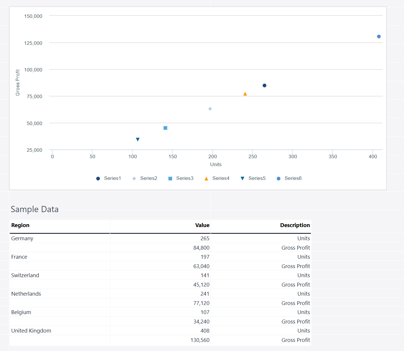
Scatter with only markers
The scatter with only markers chart in Jedox displays data points without connecting lines, making it ideal for visualizing relationships between two numerical variables. Each marker represents an individual data point, helping to identify trends, clusters, or outliers in datasets. This chart type is useful for correlation analysis, scientific measurements, and performance comparisons.
Using the Measures and Regions dimensions, the stacked column chart below shows the actual sales data.
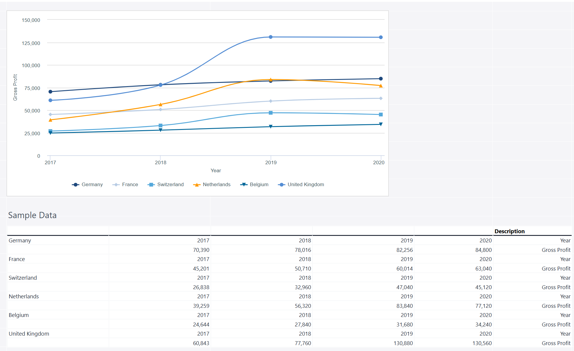
Scatter with smooth line and markers
A scatter chart with a smooth line and markers combines individual data points with a curved line to highlight trends and relationships between variables. The smooth line helps visualize patterns more clearly, while the markers indicate exact data values. This chart type is useful for analyzing continuous data trends, such as stock price movements, temperature variations, or performance metrics over time.
Using the Measures and Regions dimensions, the stacked column chart below shows the actual sales data.
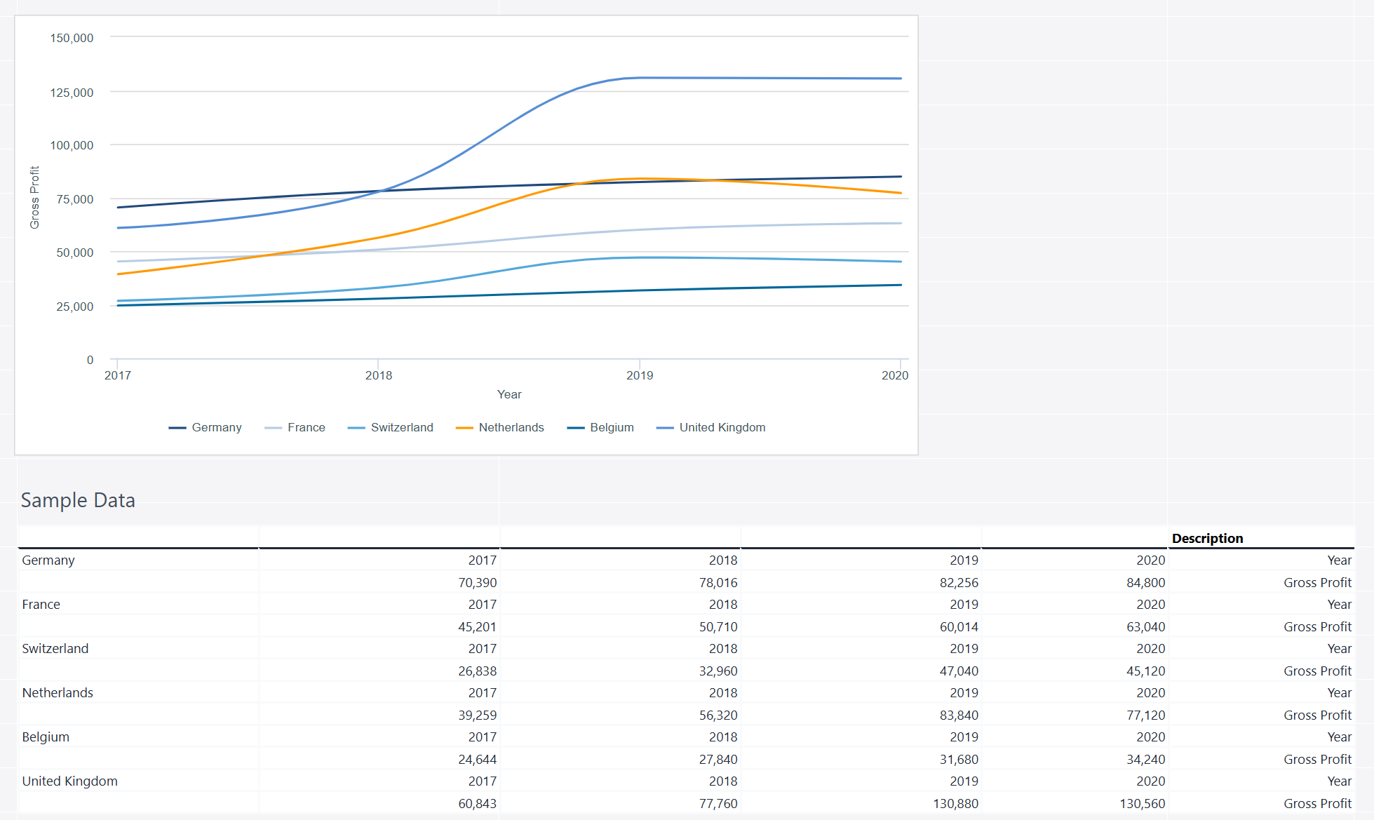
Scatter with smooth lines
A scatter with smooth lines chart is a variation of the scatter plot where data points are connected by a smooth curve instead of straight lines. This chart is useful for visualizing trends, patterns, and relationships between two numerical variables, especially when the data follows a continuous flow rather than discrete points. It is commonly used in scientific research, financial analysis, and performance tracking.
Using the Measures and Regions dimensions, the stacked column chart below shows the actual sales data.
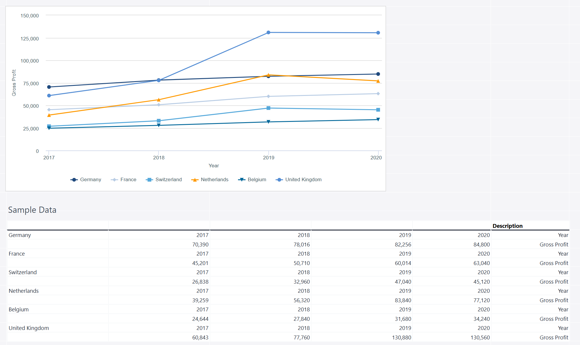
Scatter with straight lines and markers
A scatter with straight lines and markers chart connects individual data points with straight lines while displaying markers at each point. This chart type is useful for visualizing trends, relationships, and patterns over time or across variables while maintaining clear data visibility. It is often used in scientific analysis, financial trends, and performance tracking.
Using the Measures and Regions dimensions, the stacked column chart below shows the actual sales data.
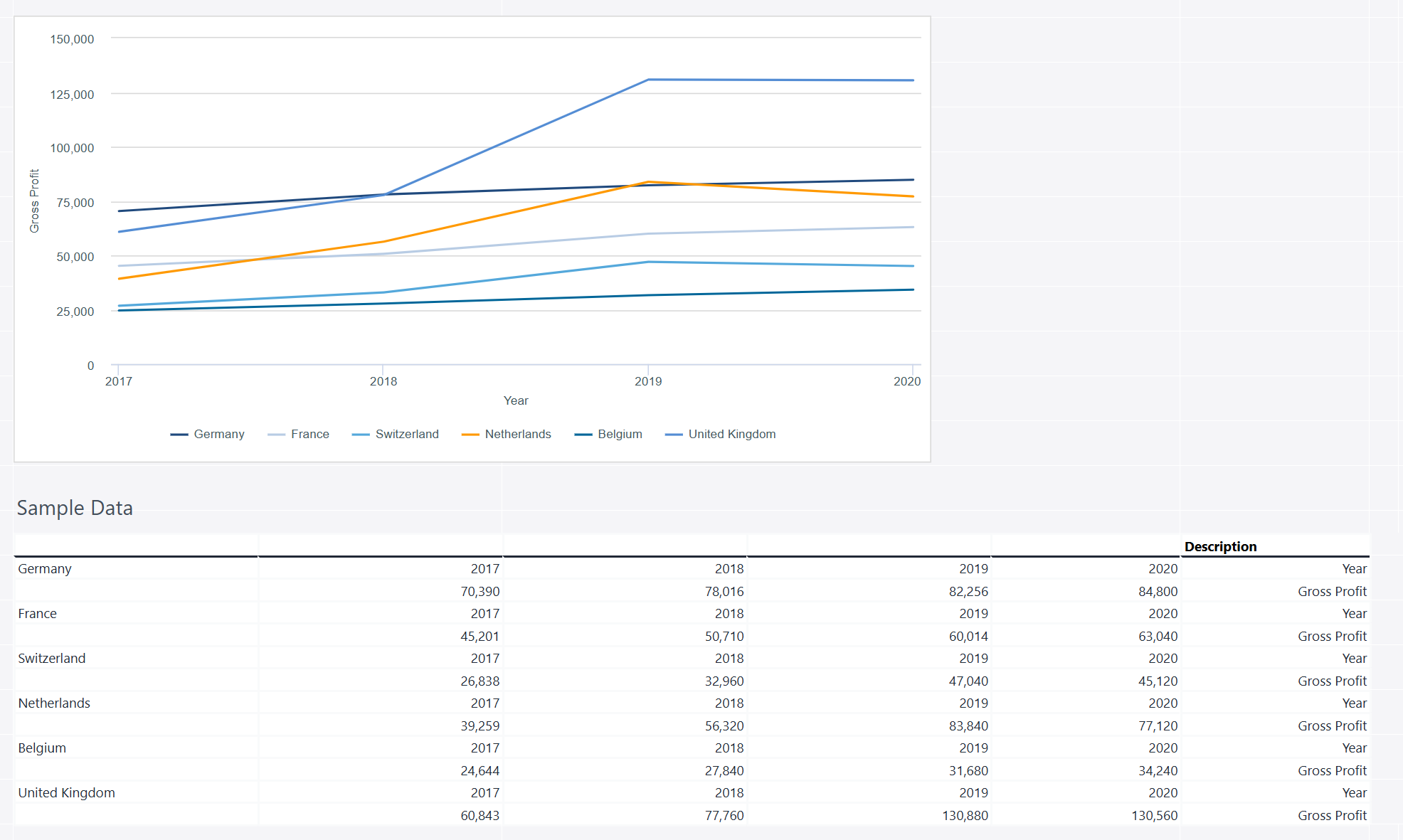
Scatter with straight lines
A scatter chart with straight lines connects data points with straight lines, making it useful for visualizing trends and relationships between two numerical variables. Unlike a standard scatter plot, this format helps highlight patterns, continuity, and directional changes in the data while maintaining the flexibility of individual data point distribution.
Using the Measures and Regions dimensions, the stacked column chart below shows the actual sales data.
Updated March 30, 2026