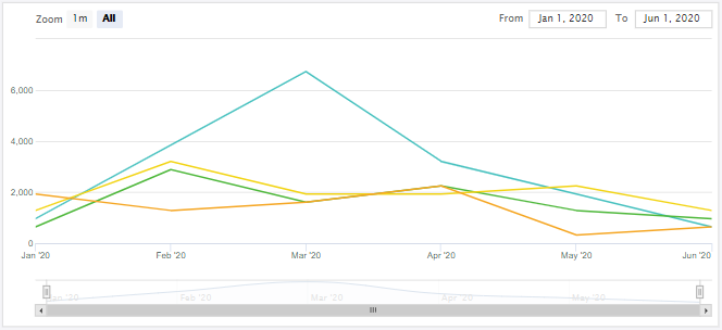
A stock chart is a type of financial chart used to represent the price movements of a stock or other financial instruments over a specific period. It provides a visual summary of key price data—typically including the opening, closing, high, and low prices for each time interval (e.g., daily, weekly). These charts are often used to analyze trends and patterns in financial markets.
Stock charts can be used for data that consists of time values. The time values usually cover the x-axis of the chart, and have to be valid date-time stamps. If daily time values are absent, it is possible to use other valid date-time stamps, such as the first day of every month. The time values should occupy the first column of the chart's data source.
The zoom area on the x-axis of a stock chart has a minimum size of 5 times the smallest interval of the data points. For example, if the smallest interval of data is 1 day, then the chart can be zoomed down to a range of 5 days as a minimum.
In User Mode, dragging and dropping on the Stock chart triggers scrolling inside the chart. However, dragging and dropping on the Stock chart in the Designer Mode moves the entire chart and does not trigger scrolling inside the chart. To scroll inside the Stock chart in the Designer Mode, right-click on the chart and select the "Lock" option.
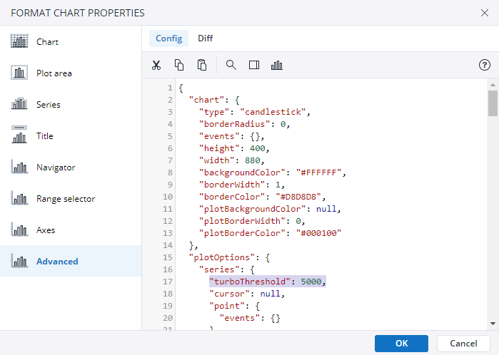
By default, the maximum amount of data points a Stock Chart can display is set to 5000. You can change this threshold by modifying the value of the "turboTreshold" key in the "series" section of the Advanced Chart Properties. Setting this value to 0 disables the threshold. An increased amount of data points can have detrimental effects on the rendering performance of Stock Charts.
Setting up a stock chart
To create a stock chart in the Designer, follow these steps:
-
Build a new Jedox Web Spreadsheet or open an already existing one.
-
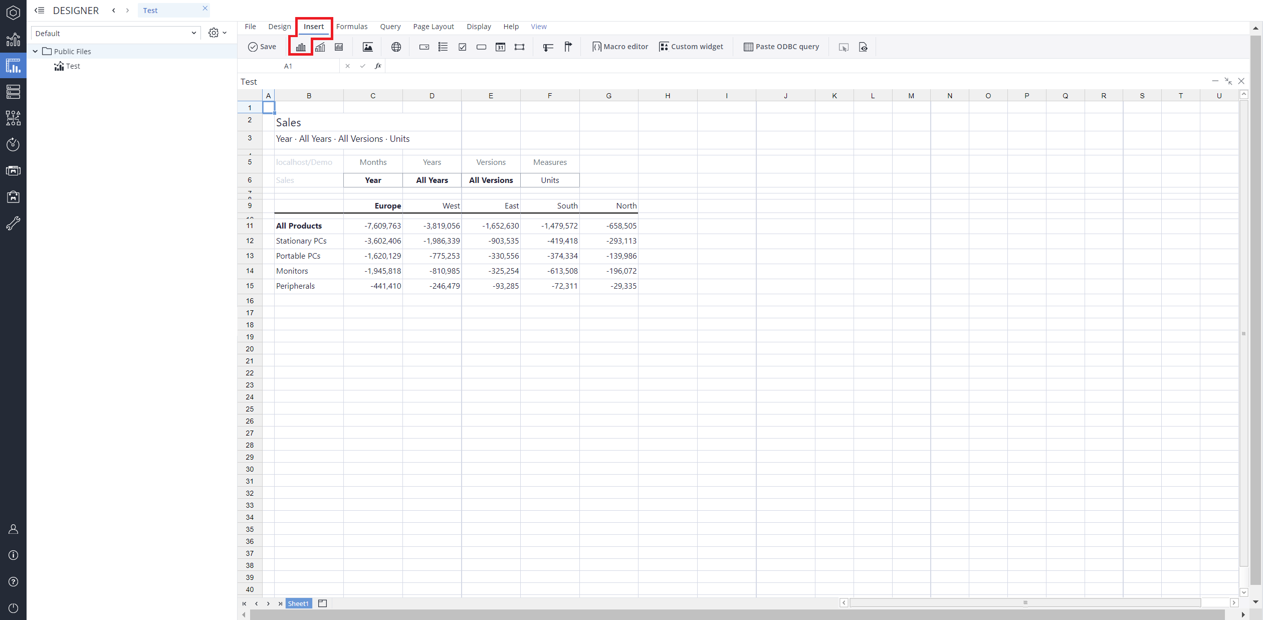
From the toolbar at the top of the interface, Click on the Insert option in the toolbar, and from the dropdown menu, select Charts
 . This will display a variety of chart types that are available for selection.
-
From the chart options, find and select the Stock chart type. You can choose between Candle stick , Open-high-low-close, Stock line, Stock line with markers, Stock smooth line, Stock smooth line with markers, Stock step lines, Stock column, Stock column range, Stock line area, Stock line area with markers, Stock smooth line area, Stock smooth line area with markers, Stock line area range, Stock area smooth lines range, or Stock points chart variations based on your needs.
-
Define the data series and dimensions for the x-axis (e.g., time or categories) and y-axis (e.g., values or metrics). To do this, you can use the Data Source section. In this section, you can select your Source type from Sheet range, Ad hoc View, Stored View, or SQL query.
-
Use the customization options to adjust labels, legends, size and position, and the chart's visibility.
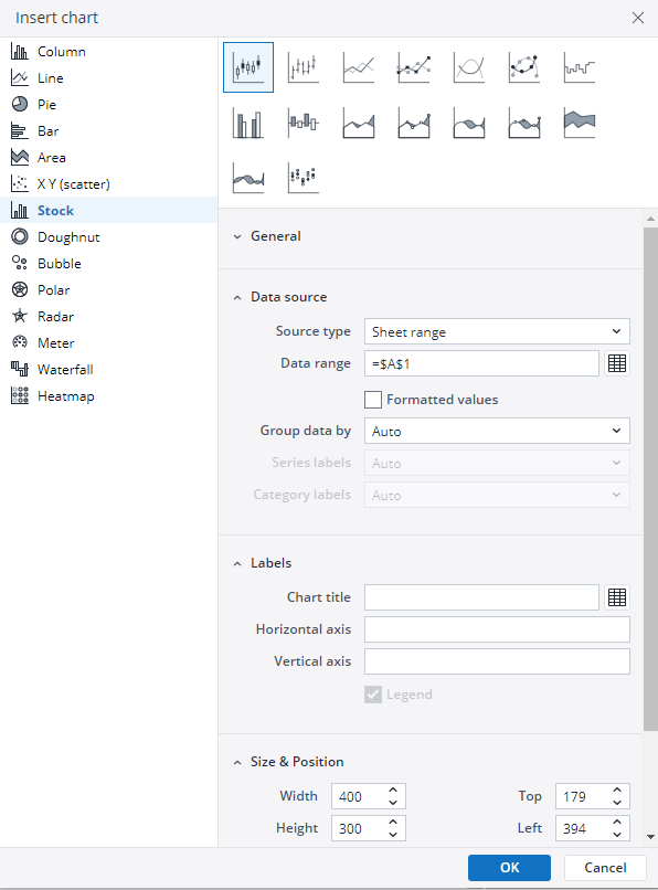
-
Click on OK to incorporate the chart into your report. You can now preview the final output to ensure it meets your requirements.
By following these steps, you can effectively create and customize a stock chart to visualize your data trends and insights. For more information on how to fill the Insert Chart menu, check the Creating a Chart article.
Stock charts types in Jedox
 Candle stick chart
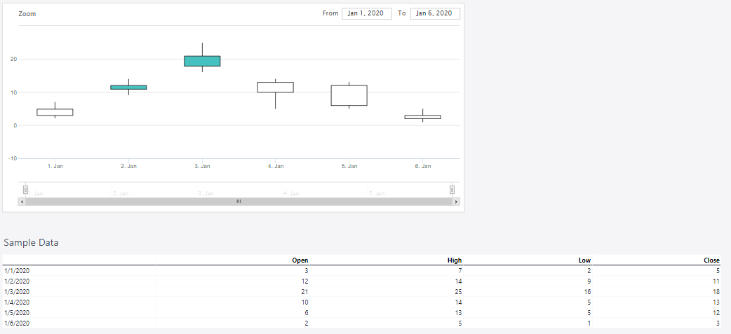
A candlestick chart visually represents price movements using candlesticks, each showing the opening, closing, high, and low prices. Traders use them to identify patterns that signal trends or reversals.
The candle stick chart below shows the inventory changes on a given day with the opened, highest, lowest, and closed values.
 Open-high-low-close chart
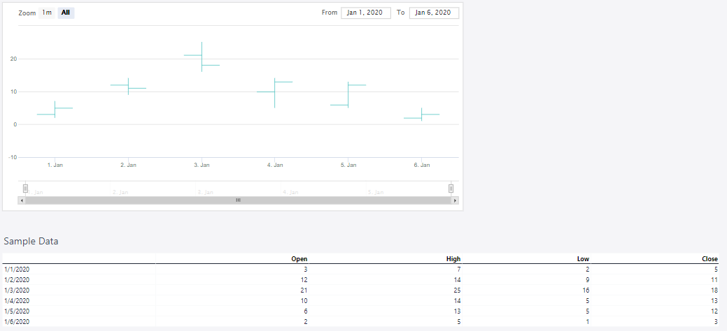
The open-high-low-close chart displays price movements using bars, each representing the opening, highest, lowest, and closing prices for a given period. It helps traders analyze trends and market volatility.
The open-high-low-close chart below shows the inventory changes on a given day with the opened, highest, lowest, and closed values.
 Stock line chart
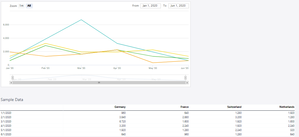
A stock line chart is a simple yet effective way to track price movements over time. It connects closing prices with a continuous line, making trends and overall direction easy to spot. This type is ideal for long-term analysis and broad market insights.
The stock line chart below shows the behavior of turnover in various countries over several months.
 Stock line with markers chart
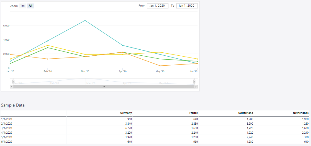
This chart displays price movements as a continuous line, with markers indicating key data points like opening, closing, high, or low prices. It provides a clear trend overview, making it useful for quick analysis.
The stock line with markers chart below shows the behavior of turnover in various countries over several months.
 Stock smooth line chart
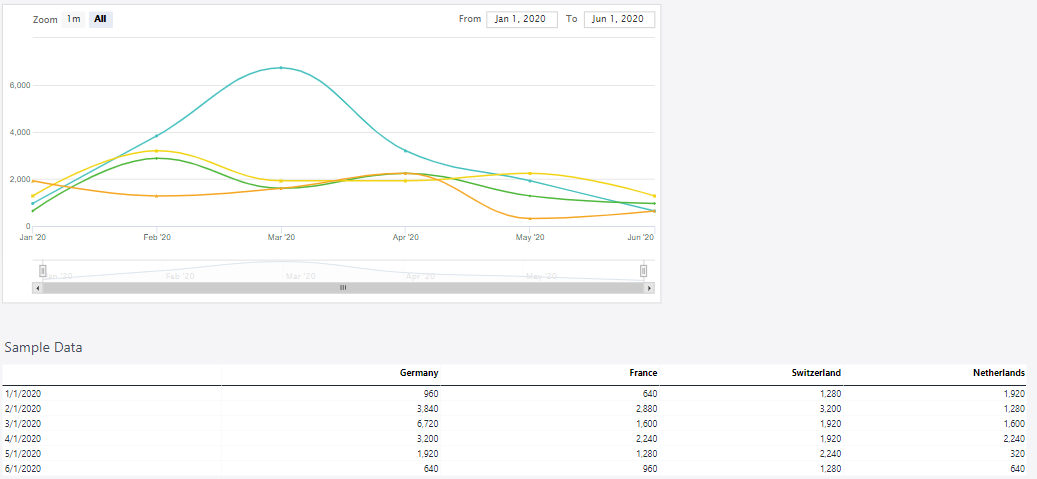
A Stock Smooth Line Chart can connect various price points, such as closing, opening, high, or low prices, depending on the chosen data series. It smooths out fluctuations by drawing a curved line between points, making it easier to observe overall trends without sharp movements.
The stock smooth line chart below shows the behavior of turnover in various countries over several months.
 Stock smooth line with markers chart
This chart displays stock price trends as a smooth, flowing line with markers highlighting key data points. It helps visualize overall price movement while retaining important highs and lows.
The stock smooth line with markers chart below shows the behavior of turnover in various countries over several months.
 Stock step lines chart
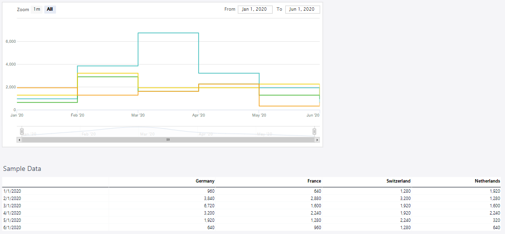
This chart type connects data points with horizontal and vertical lines, creating a step-like pattern. It highlights price changes at specific intervals, making it useful for tracking sudden shifts and stable periods in stock movements.
The stock step line chart below shows the behavior of turnover in various countries over several months.
 Stock column chart
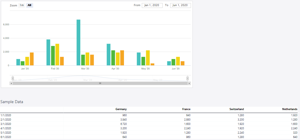
A stock column chart represents price movements using vertical bars, with each bar typically showing the range between the high and low prices for a given period. It provides a straightforward view of market trends and volatility.
The stock column chart below shows the behavior of turnover in various countries over several months.
 Stock column range chart
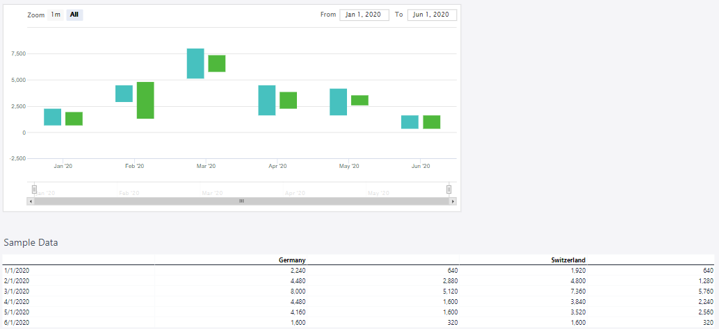
A stock column range chart displays the high and low prices for each time interval as vertical bars. Unlike candlestick charts, it omits opening and closing prices, focusing solely on price fluctuations within a period.
The stock column range chart below shows the behavior of turnover in various countries over several months.
 Stock line area chart
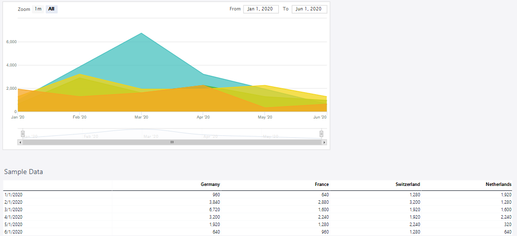
A stock line area chart visualizes stock price trends over time by shading the area beneath a line representing price movements. Unlike candlestick or column range charts, it emphasizes overall price trends rather than individual high and low values, making it useful for tracking market performance at a glance.
The stock line area chart below shows the behavior of turnover in various countries over several months.
 Stock line area with markers chart
A stock line area chart with markers visualizes stock price trends over time by displaying data points connected by a line, with shaded areas beneath the line emphasizing fluctuations. Markers highlight individual data points, making it easier to track key values. This chart is useful for showing overall price movements while maintaining visibility of specific data points within a given period.
The stock line area with markers chart below shows the behavior of turnover in various countries over several months.
 Stock smooth line area chart
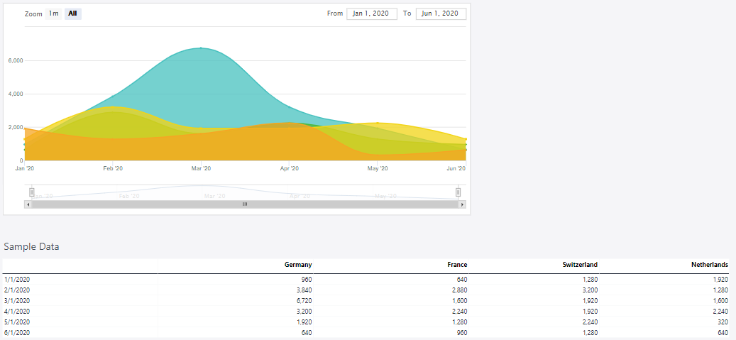
A stock smooth line area chart visualizes stock price trends over time using a smooth, curved line with a shaded area beneath it. This chart type highlights overall price movements, making it easier to observe trends and volatility. Unlike candlestick charts, it does not show individual opening and closing prices but focuses on the general direction and range of price fluctuations.
The stock smooth line area chart below shows the behavior of turnover in various countries over several months.
 Stock smooth line area with markers chart
A stock smooth line area chart with markers visualizes stock price trends over time using a smoothed line with shaded areas beneath it. The markers highlight specific data points, making it easier to track fluctuations at key intervals. This chart is useful for identifying overall trends while emphasizing individual price movements within a given period.
The stock smooth line area with markers chart below shows the behavior of turnover in various countries over several months.
 Stock line area range chart
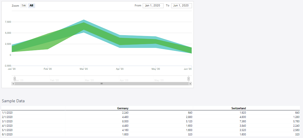
A stock line area range chart visualizes the high and low prices for each time interval using a shaded area between two lines. Unlike candlestick charts, it does not include opening and closing prices, focusing solely on the price range within a given period. This chart type is useful for highlighting volatility and trends over time in a clear and intuitive manner.
The stock line area range chart below shows the behavior of turnover in various countries over several months.
 Stock area smooth lines range chart
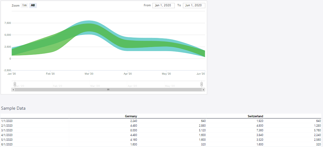
A stock area smooth lines range chart visualizes the high and low prices for each time interval using a smooth, shaded area between two lines. Unlike candlestick charts, it does not include opening and closing prices, focusing instead on the overall price range within a period. The smooth curves help highlight trends and fluctuations over time, making it useful for analyzing market volatility and price movements.
The stock area smooth lines range chart below shows the behavior of turnover in various countries over several months.
 Stock points chart
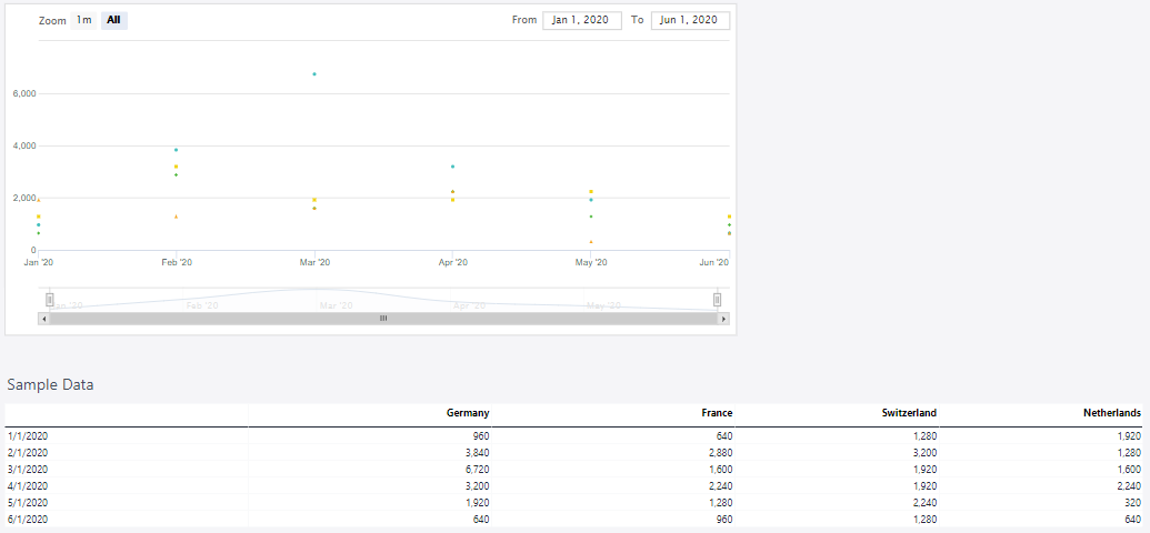
A stock points chart visualizes key stock price data by plotting individual points for specific values, such as opening, closing, high, or low prices, over a given time period. Unlike candlestick or column range charts, it does not use bars or filled areas but instead highlights key price levels as discrete points, making it useful for tracking trends and identifying significant price movements.
The stock points chart below shows the behavior of turnover in various countries over several months.
Updated March 30, 2026
