A polar chart (or radial chart) is a type of data visualization where data points are plotted on a circular grid rather than a Cartesian (x-y axis) grid. It uses angles and radii to display values, making it ideal for highlighting patterns, relationships, and comparisons within datasets.
For Jedox users, line charts can be particularly useful for (but not limited to) multi-dimensional analysis, performance benchmarking, highlighting patterns, time-based comparisons, enhanced dashboards, and resource allocation analysis.
Setting up a polar chart
To create a polar chart in the Designer, follow these steps:
-
Build a new Jedox Web Spreadsheet or open an already existing one.
-
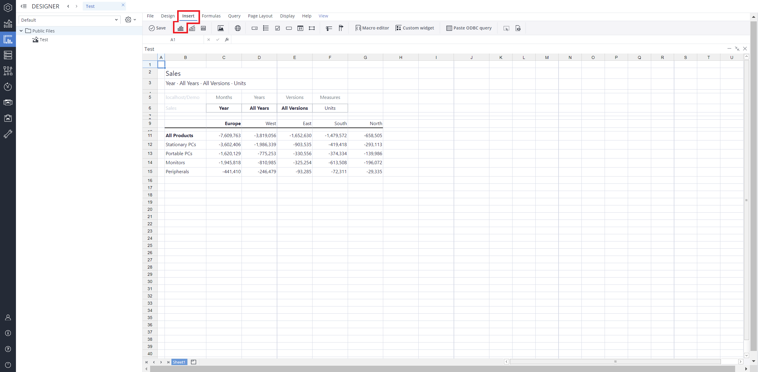
From the toolbar at the top of the interface, Click on the Insert option in the toolbar, and from the dropdown menu, select Charts
 . This will display a variety of chart types that are available for selection.
-
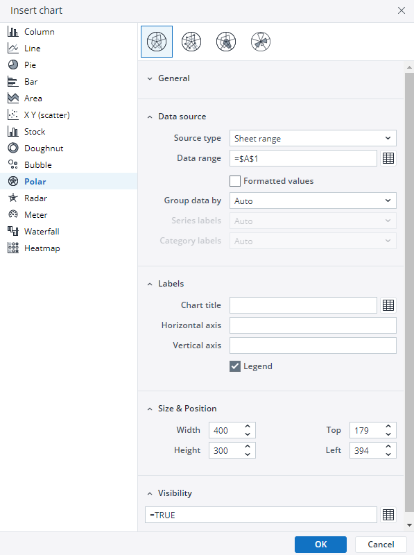
From the chart options, find and select the Polar chart type. You can choose between Polar, Polar with markers, Polar filled, or Wind rose chart variations based on your needs.
-
Define the data series and dimensions for the x-axis (e.g., time or categories) and y-axis (e.g., values or metrics). To do this, you can use the Data Source section. In this section, you can select your Source type from Sheet range, Ad hoc View, Stored View, or SQL query.
-
Use the customization options to adjust labels, legends, size and position, and the chart's visibility.
-
Click on OK to incorporate the chart into your report. You can now preview the final output to ensure it meets your requirements.
By following these steps, you can effectively create and customize a polar chart to visualize your data trends and insights. For more information on how to fill the Insert Chart menu, check the Creating a Chart article.
Polar charts types in Jedox
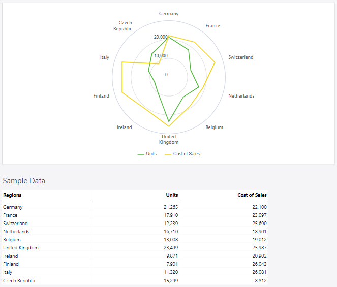
 Polar chart
As mentioned in the introduction, the standard polar chart plots data points on a circular grid using angles to represent categories and radii to depict values. This format is particularly effective for uncovering patterns and relationships in datasets, offering a clear visual summary of trends across multiple dimensions.
Using the Measures and Regions dimensions, the polar chart below shows the number of units and the costs of sales.
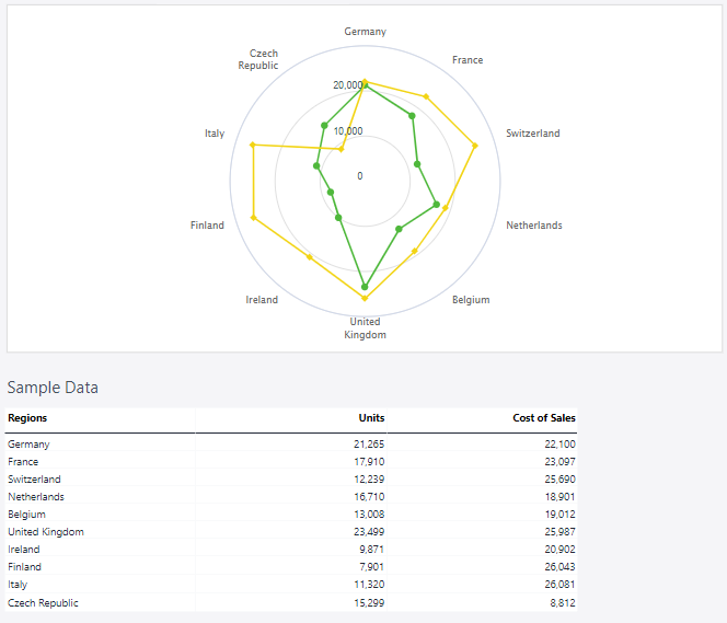
 Polar chart with markers
A polar chart with markers enhances the standard polar chart by adding distinct symbols at data points, improving visibility and precision. This variation is particularly useful for emphasizing key values, comparing specific data points, or identifying trends more clearly within multi-dimensional datasets.
Using the Measures and Regions dimensions, the polar chart below shows the number of units and the costs of sales.
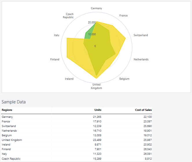
 Polar filled
Expanding on the standard polar chart, the polar filled chart enhances visualization by shading the area beneath the plotted lines. This approach emphasizes magnitude differences more distinctly, making it useful for comparing values across categories and highlighting dominant trends within a dataset.
Using the Measures and Regions dimensions, the polar chart below shows the number of units and the costs of sales.
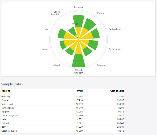
 Wind rose
A Wind Rose is a specialized type of polar chart used to visualize the frequency and intensity of wind directions over a set period. It segments data into directional bins, with radial length representing frequency or magnitude. This format is commonly used in meteorology and environmental analysis to identify prevailing wind patterns.
Using the Measures and Regions dimensions, the polar chart below shows the number of units and the costs of sales.
Updated March 30, 2026
