A pie chart is a circular statistical graphic divided into slices to illustrate numerical proportions. Each slice represents a category, and its size corresponds to the proportion or percentage that the category contributes to the total.
For Jedox users, line charts can be particularly useful for (but not limited to) budget allocation, revenue breakdown, expense analysis, data summaries, and performance metrics.
Setting up a pie chart
To create a pie chart in the Designer, follow these steps:
-
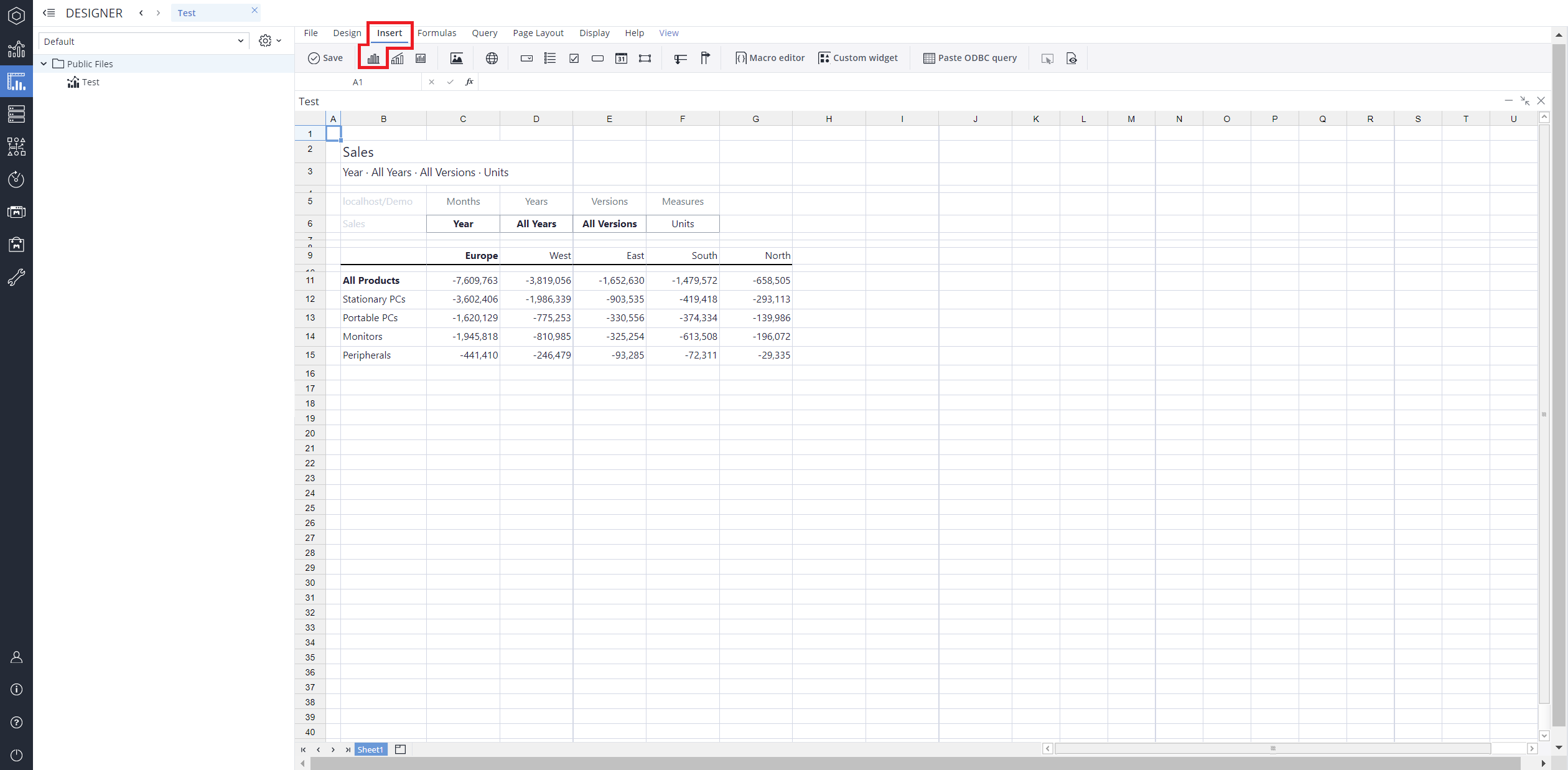
Build a new Jedox Web Spreadsheet or open an already existing one.
-
From the toolbar at the top of the interface, Click on the Insert option in the toolbar, and from the dropdown menu, select Charts
 . This will display a variety of chart types that are available for selection.
-
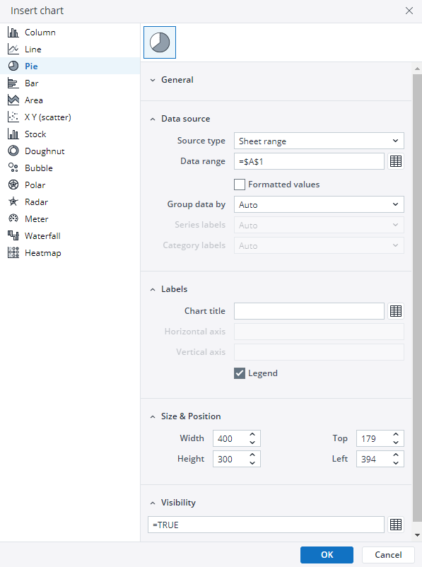
From the chart options, find and select the Pie chart type.
-
Define the data series and dimensions for the x-axis (e.g., time or categories) and y-axis (e.g., values or metrics). To do this, you can use the Data Source section. In this section, you can select your Source type from Sheet range, Ad hoc View, Stored View, or SQL query.
-
Use the customization options to adjust labels, legends, size and position, and the chart's visibility.

-
Click on OK to incorporate the chart into your report. You can now preview the final output to ensure it meets your requirements.
By following these steps, you can effectively create and customize a pie chart to visualize your data trends and insights. For more information on how to fill the Insert Chart menu, check the Creating a Chart article.
Pie chart example
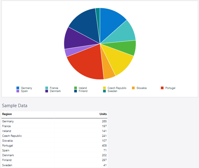
Using the Measures and Regions dimensions, the pie chart below shows the distribution of units sold in the selected countries.
Updated March 30, 2026
