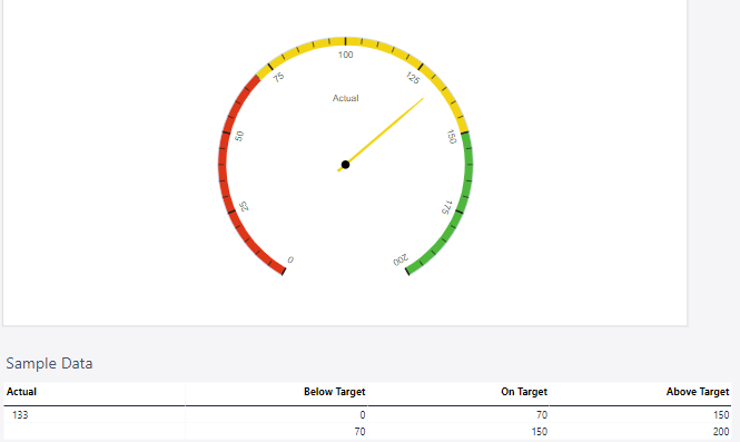
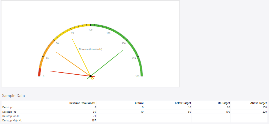
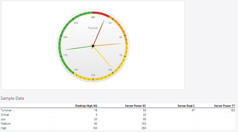
A Meter Chart is a type of chart designed to visualize performance or progress against a set goal or threshold, resembling a speedometer or gauge. It is particularly effective for displaying key performance indicators (KPIs) and is widely used in dashboards to provide an at-a-glance understanding of metrics.
For Jedox users, meter charts can be particularly useful for (but not limited to) visualizing KPIs, goal tracking, user-friendly representation, enhanced dashboards, or actionable insights.
Setting up a meter chart
To create a meter chart in the Designer, follow these steps:
-
Build a new Jedox Web Spreadsheet or open an already existing one.
-
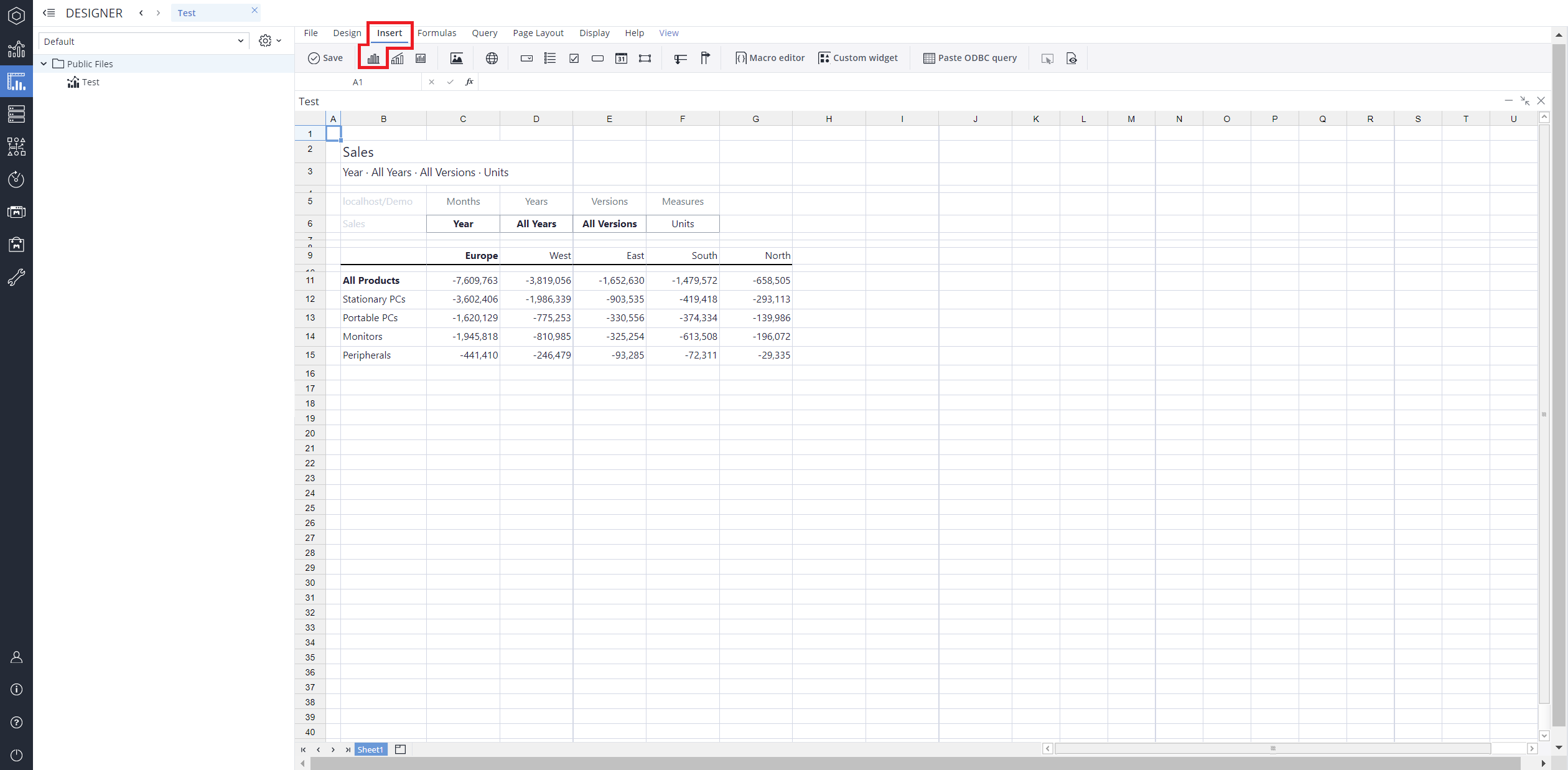
From the toolbar at the top of the interface, Click on the Insert option in the toolbar, and from the dropdown menu, select Charts
 . This will display a variety of chart types that are available for selection.
-
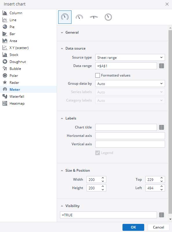
From the chart options, find and select the Meter chart type. You can choose between Odometer full, Odometer half, Wide angular meter, orOdometer full with dual axes chart variations based on your needs.
-
Define the data series and dimensions for the x-axis (e.g., time or categories) and y-axis (e.g., values or metrics). To do this, you can use the Data Source section. In this section, you can select your Source type from Sheet range, Ad hoc View, Stored View, or SQL query.
-
Use the customization options to adjust labels, legends, size and position, and the chart's visibility.
-
Click on OK to incorporate the chart into your report. You can now preview the final output to ensure it meets your requirements.
By following these steps, you can effectively create and customize a meter chart to visualize your data trends and insights. For more information on how to fill the Insert Chart menu, check the Creating a Chart article.
Meter chart types in Jedox
Updated March 30, 2026
 Odometer full chart