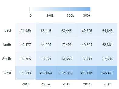
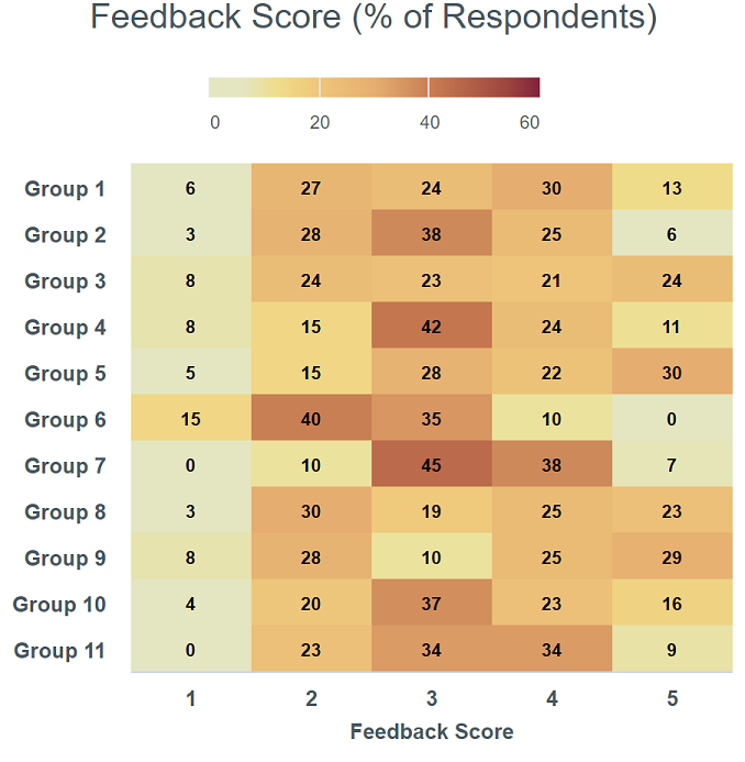
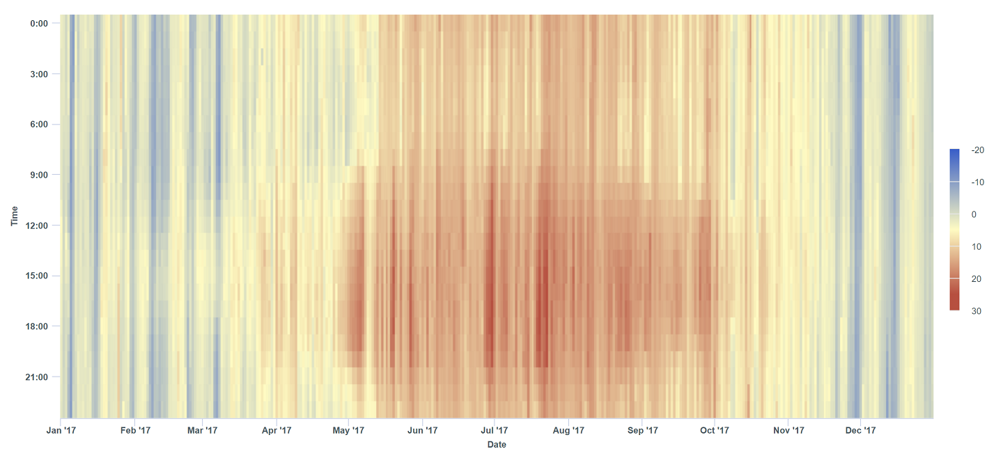
A heatmap chart is a data visualization tool that uses a matrix or grid to display data, where individual values are represented by varying colors. The intensity or hue of the colors corresponds to the magnitude of the data, making it easy to identify patterns, correlations, or outliers at a glance.
For Jedox users, heatmap charts can be particularly useful for (but not limited to) performance analysis across dimensions, budget and forecast variance, resource allocation, profitability analysis, customer behavior insights, workflow monitoring, trend detection in time-series data, or hierarchical data comparison.
Setting up a heatmap chart
To create a heatmap chart in the Designer, follow these steps:
-
Build a new Jedox Web Spreadsheet or open an already existing one.
-
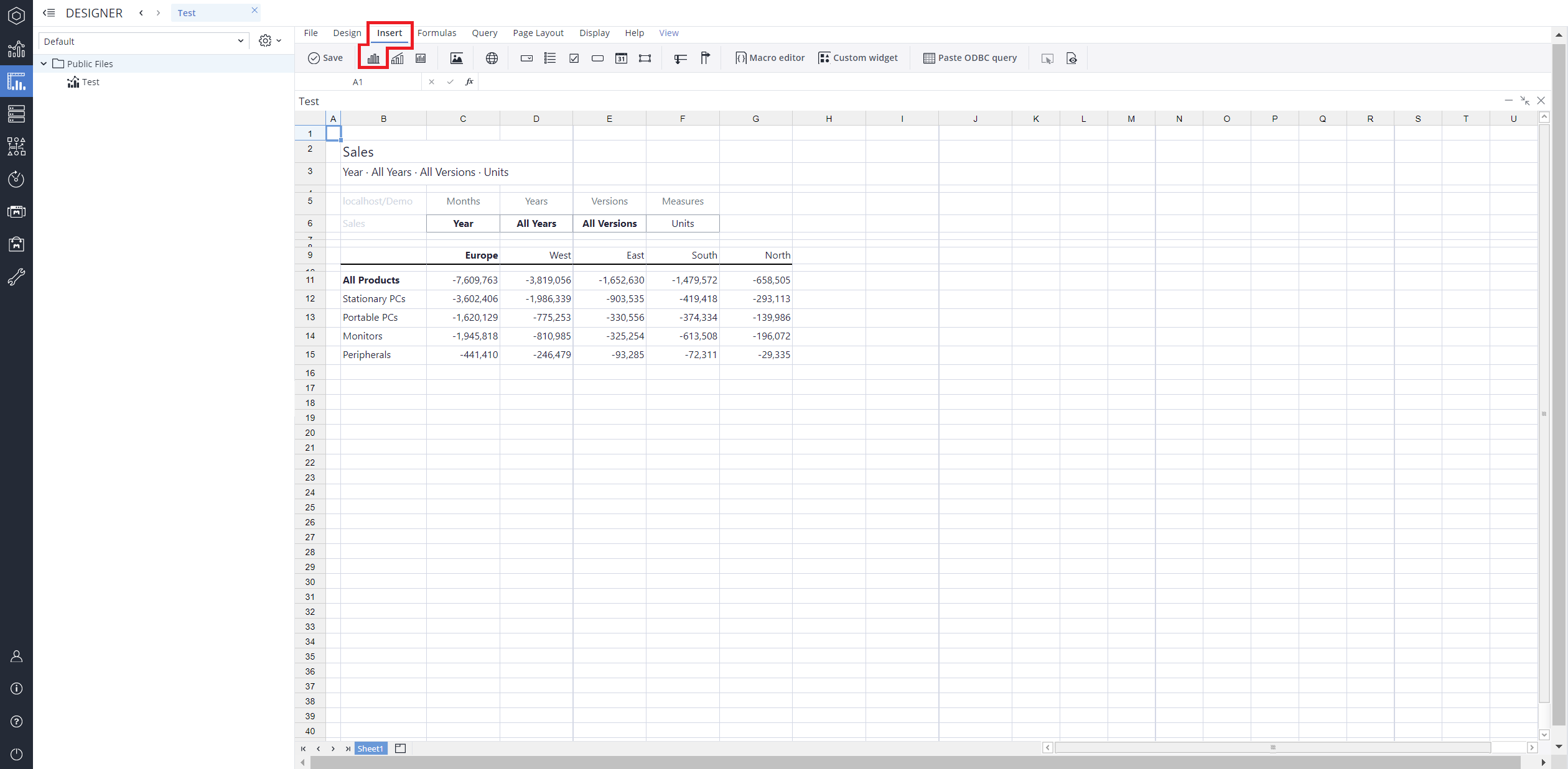
From the toolbar at the top of the interface, Click on the Insert option in the toolbar, and from the dropdown menu, select Charts
 . This will display a variety of chart types that are available for selection.
-
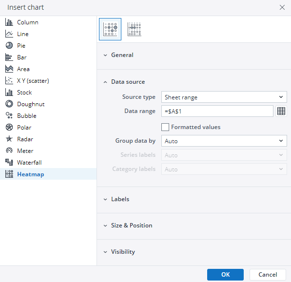
From the chart options, find and select the Heatmap chart type. You can choose between Heatmap, or Large heatmap , chart variations based on your needs.
-
Define the data series and dimensions for the x-axis (e.g., time or categories) and y-axis (e.g., values or metrics). To do this, you can use the Data Source section. In this section, you can select your Source type from Sheet range, Ad hoc View, Stored View, or SQL query.
-
Use the customization options to adjust labels, legends, size and position, and the chart's visibility.
-
Click on OK to incorporate the chart into your report. You can now preview the final output to ensure it meets your requirements.
By following these steps, you can effectively create and customize a heatmap chart to visualize your data trends and insights. For more information on how to fill the Insert Chart menu, check the Creating a Chart article.
Color scaling the heatmap chart
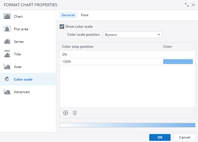
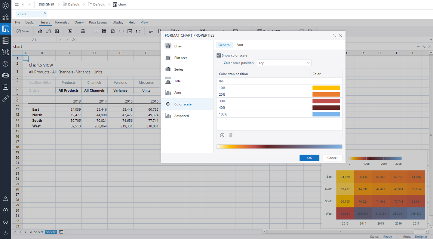
You can change the heatmap colors and fine tune the color scale. To do this, right-click on the chart, select the Format Chart Properties, and then choose the Color Scale option.
By default the heatmap will have two colors defined, one for the smallest number (Color stop position = 0%) and one for the largest number (Color stop position = 100%) You can modify the colors and add additional color stop positions to refine the color scale and visually enhance your heatmap chart.
To add a new stop position, click on the ![]() icon and to delete a stop position select the position and then click on the
icon and to delete a stop position select the position and then click on the ![]() icon.
icon.
In the Color scale position section, you can change the position of the color scale guide on your chart. For example, you can select the "top" position.
Adding a scrollbar to a heatmap chart
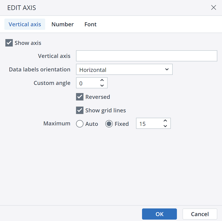
When you have a larger data set, you can add horizontal or vertical scrollbars to your heatmap. This way, you can still see the details and values within each square of the heatmap. To add scrollbars to your chart, right-click on the horizontal or vertical axis and select the Format axis. You can also configure your scrollbar in the Format axis menu.
Heatmap chart types in Jedox
 Standard heatmap
As mentioned in the introduction, a standard heatmap chart uses a grid where colors represent data magnitude. This type is ideal for identifying patterns or trends across two dimensions, such as time and categories, or regions and performance metrics. It's a versatile option for a broad range of data analysis tasks, making it a go-to choice for many Jedox users.
The standard heatmap chart can be used when you have a moderate amount of data.
 Large heatmap
A large heatmap chart is designed to handle extensive datasets, allowing users to visualize high volumes of data points across multiple dimensions. It is particularly effective for exploring complex relationships or trends in hierarchical or multi-level data, ensuring that even the most granular details remain accessible.
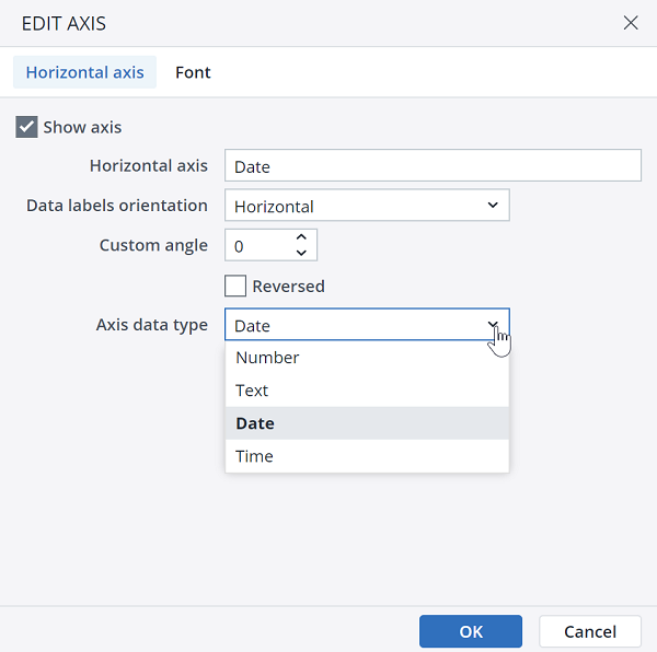
You can also modify the data type on the axes of a large heatmap chart, changing the date/time format. To do this, right-click on any axis and select the Format axis…
Updated March 30, 2026
