Jedox offers a wide range of editing and formatting capabilities to help you create visually compelling and insightful charts. Whether you're looking to adjust chart types, customize colors, or fine-tune data labels, Jedox provides intuitive tools to meet your needs. You can easily modify axes, legends, and gridlines to highlight key information, ensuring your charts effectively communicate your data story. With these versatile options, Jedox empowers you to transform raw data into polished visualizations that align perfectly with your reporting requirements and organizational standards.
Formatting charts
To format your chart, open the 'Format Chart Properties' dialog. You can access this menu in two ways: either by double-clicking on the chart area or by right-clicking on the chart and selecting 'Format Chart Properties' from the context menu. In the Format Chart Properties dialog, you can customize various chart elements, including the plot area, data series, titles, legends, axes, and advanced settings.
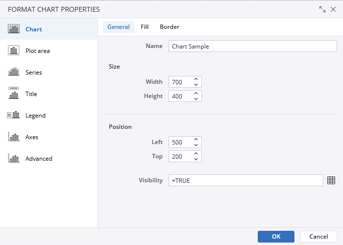
Chart
In the Chart section, you can access general chart options to customize its name, size, position, and visibility. The Fill section lets you choose between a solid fill or no fill and allows you to select your desired fill color. In the Border section, you can decide whether to use no border or a solid line, and customize the border color to suit your preferences.
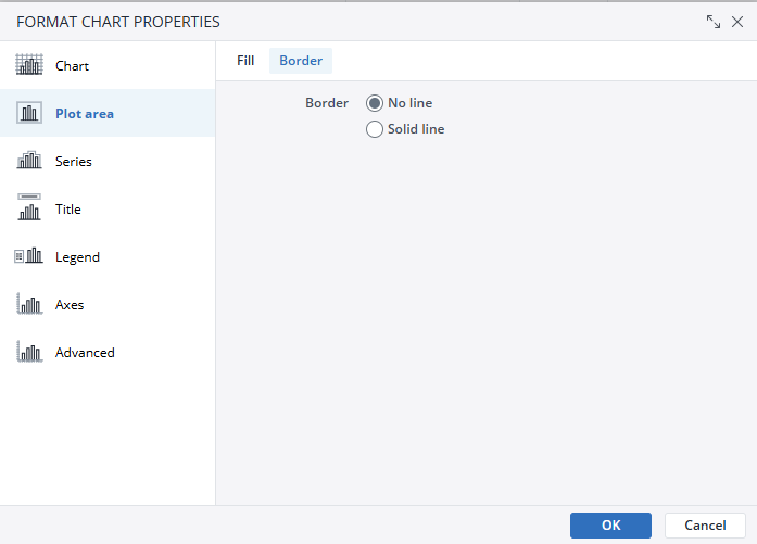
Plot area
The plot area of a chart refers to the section where the actual data visualization occurs. This is the central part of the chart where graphical elements like bars, lines, pie slices, or other visual data representations are displayed. In the Plot area, you can customize the plot area’s fill and border. The Fill section lets you choose between a solid fill or no fill and allows you to select your desired fill color. In the Border section, you can decide whether to use no border or a solid line and customize the border color to suit your preferences.
Series
In a chart, a series refers to a set of related data points that are plotted together. It typically represents a specific category or variable that you want to visualize within the chart. A chart can include multiple series to compare data across different groups or time periods.
In the Series section, you have access to the General, Labels, Number, and Font options, each allowing you to customize different aspects of your chart.
-
General: Customize your chart's Palette and set borders for each data series.
-
Labels: Choose whether to display or hide labels. If you opt to display labels, you can specify their position (inside or outside) and adjust their orientation for better readability.
-
Number: Format how your numerical data is displayed.
-
The General format shows standard numbers.
-
The Number option allows you to adjust decimal places, enable the use of a 1000 separator, and select display units such as None, K (1,000), or M (1,000,000).
-
The Currency option lets you display data as currencies, with the ability to select different currency symbols.
-
The Percentage option formats your data as percentages.
-
-
Font: Customize the appearance of your text by selecting fonts, styles, sizes, colors, and effects to suit your chart design.
Title
In the Title section, you can either manually enter a title or select a range to use as your title. Additionally, the Font section allows you to customize your title's appearance by adjusting the font, style, size, color, and applying various effects.
Legend
Chart legends are visual guides that help users interpret the data represented in a chart. They provide a clear reference to what each color, pattern, or symbol in the chart corresponds to in the dataset. Legends are especially useful in charts with multiple data series or categories, as they ensure viewers can easily understand the chart's elements.
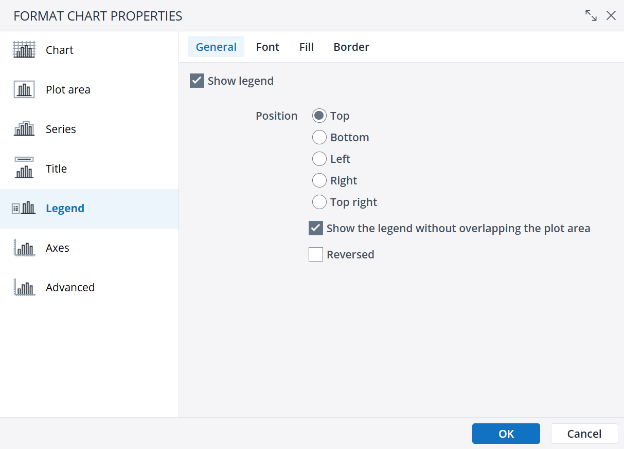
The Legend section of the 'Format Chart Properties' dialog offers four subcategories: General, Font, Fill, and Border. In the General subcategory, you can set the legend's position, determine whether it overlaps with the plotting area, and reverse the order of the legend items. The Font subcategory allows you to customize the font by selecting its type, style, size, color, and applying effects. The Fill and Border subcategories let you personalize the legend's background and border styles, respectively.
Axes
Chart axes are the reference lines in a chart that define the structure for plotting and interpreting data.
To adjust the axes in a Jedox chart, navigate to the Axes option under the 'Format Chart Properties'. Select the axis you want to modify and use the direction arrows to reposition it to the right, left, up, or down.
Advanced
The Advanced section of the Format Chart Properties is designed for experienced users and is intended for those familiar with working in XML. It is advisable not to modify these options unless you have the necessary expertise. For detailed guidance on adjusting these settings, refer to the Advanced Chart Properties documentation.
Additional formatting options for dynamic charts
Dynamic charts provide a range of additional formatting options, allowing you to customize their appearance and functionality.
Data Series Formatting
You can modify both the format and chart type of individual data series in a chart. This allows you to combine multiple chart types within a single chart. For example, you can create a Pareto chart by combining a column data series with a line data series. To format the data series in a dynamic chart, follow these steps:"
- Right-click the chart element you want to format.
- Select Format Data Series. A dialog box will appear, providing options to configure general settings, labels, numbers, and fonts.
- Click OK to apply your changes.
Editing the Axis settings
You can reverse the order of categories on the axis when creating stacked charts. To do this, follow these steps:
- Right-click the chart axis.
- From the context menu, select Format Axis. The Edit Axis dialog box will appear.
- In the Edit Axis dialog box, select one of the following options:
Reversed
Flips the axis direction, placing the highest value closest to the origin.
Reversed Stacks
When enabled, positions the first series in a stack at the top for a positive, non-reversed Y-axis. If not enabled, the first series remains at the base of the stack.

Editing the Legend settings
You can reverse the order of the elements when you create stacked charts. To do this, follow these steps:
- Right-click the chart.
- Select Format Chart Properties. The formatting dialog is displayed.
- Go to Legend and select Reversed. This reverses the order of the legend elements to match the order of the series displayed in the chart.

Tooltip formatting
To format the tooltip in a dynamic chart, follow these steps:
- Right-click on the tooltip.
- Select Format Axis. A dialog is displayed, allowing you to select options for the scale, numbers and font.
- Click OK. The changes are visible in the dynamic chart.
Updated March 30, 2026