See also Jedox Chart Palettes
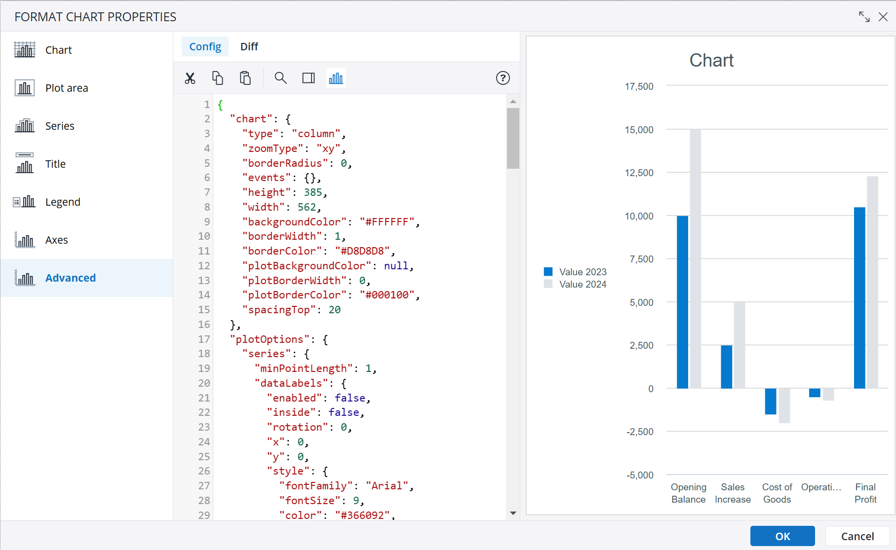
You can customize advanced chart properties by navigating to Format Chart Properties > Advanced. This tab displays the JSON object that defines your chart's structure and settings. JSON is a structured text format that represents the properties you configured using the other panels in the Chart Properties dialog. By modifying this JSON object, you can adjust or add features that are not available through the standard UI. These JSON objects follow the highcharts API., allowing for greater flexibility in chart customization.
The Config tab displays the current JSON configuration of the chart, allowing you to search, edit, cut, copy, and paste text. It also provides an option to preview the chart. Keep in mind that JSON properties are case-sensitive.
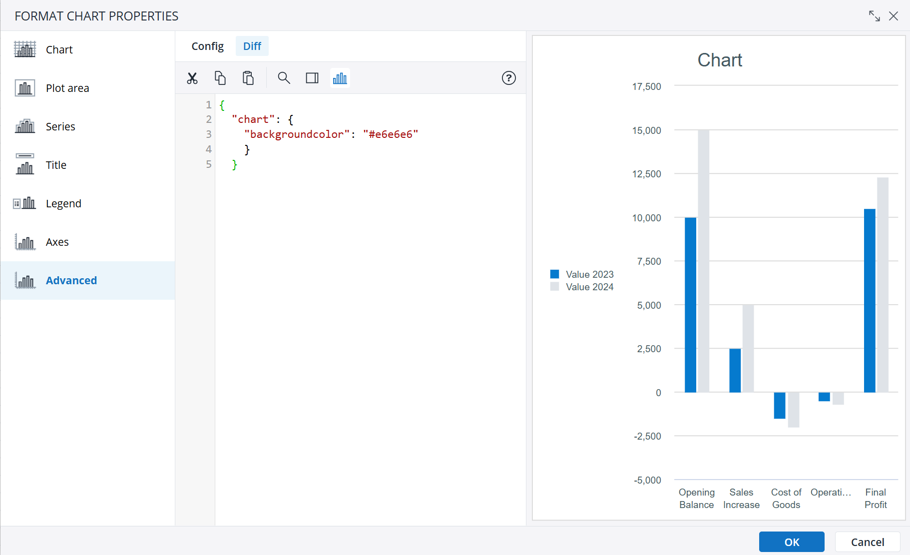
The Diff tab highlights the properties that have been modified in the JSON compared to the settings in the standard chart properties UI, making it easy to track changes.
The JSON code includes syntax checking. Incorrect syntax is marked as an error. If you move the mouse over the error symbol, a tooltip with detailed information is displayed.
The examples below show different ways of customizing a chart using the Advanced properties.
Using a different color for negative values in a column chart
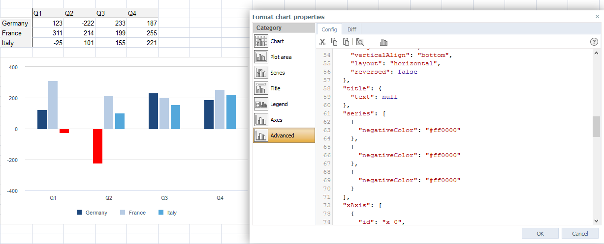
In this chart, the values below 0 are red:
- Create a column chart.
- In Format Chart Properties > Advanced, add the following property to the series[] object for which you want to enable the negative color:
"negativeColor": "#ff0000" - Use a red hex code for the negative values.
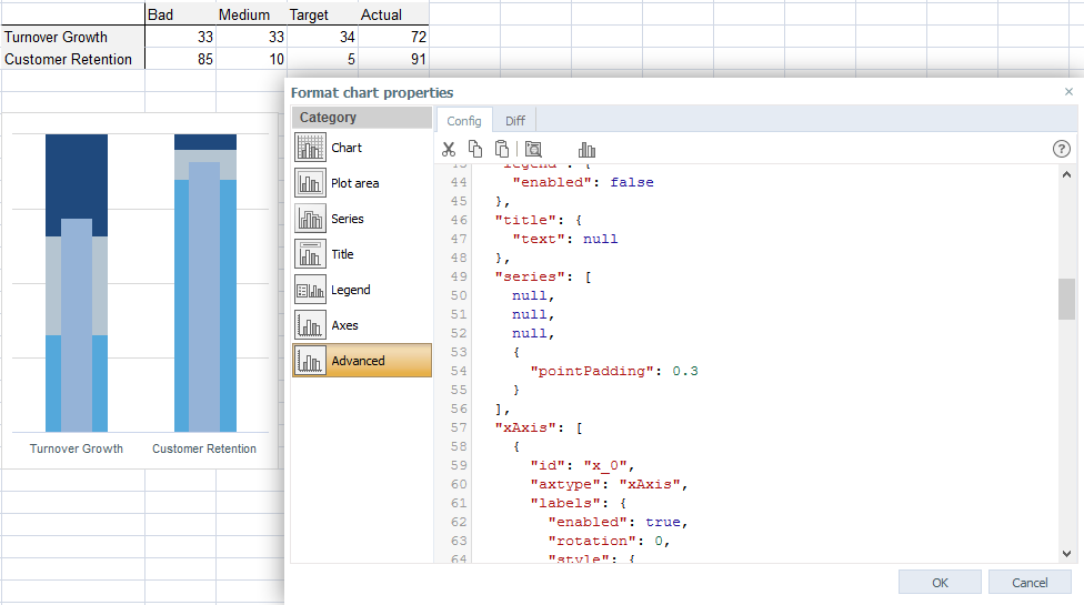
Converting a stacked column chart to a bullet chart
- Create a Stacked Column Chart.
- Change one series (in this case, "Actual") to a regular column and plot it on the secondary axis.
- In Format Chart Properties > Advanced, add the following property to "Actual" series[] object:
"pointPadding": 0.3This changes the width of the column.
Customized spacing
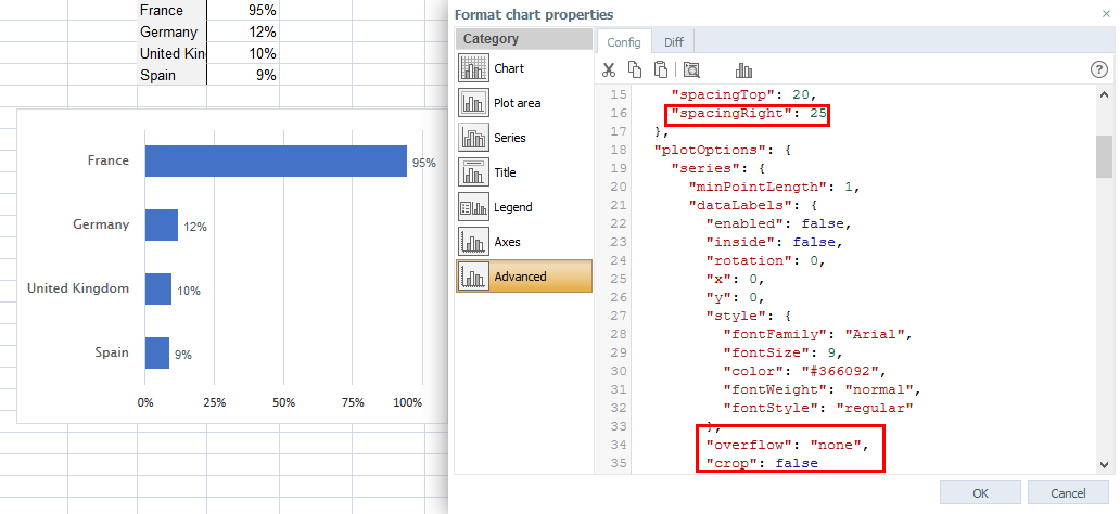
You can customize the label positioning by enforcing spacing in the advanced properties. This is useful in cases when the bar reaches the edge of a plot area and the label is displayed incorrectly.
- Insert a bar chart.
- In Format Chart Properties > Advanced, go to "chart" and add the following property:
"spacingRight": 25. This increases the right side of the plot area. - In plotOptions, add
"overflow": "none"and"crop": falseto the series. This forces the labels outside of the bars in all of the cases.
Right-To-Left text display
For individual objects in a chart, you can control the display of Right-to-Left text (for example, Hebrew, or Arabic) in a chart, by enabling the following property, e.g., on the labels{} object:
"useHtml": trueChart visibility
The visibility of charts can be dynamically changed in the chart properties. This, however, can sometimes conflict with the chart's visibility when defining Advanced chart properties. For example, some chart properties which are enabled via Advanced chart properties may stay visible even when the chart is dynamically hidden.
In these cases, the "visibility" property can be defined on the "style" object of the specific chart property to modify the behavior. For example, adding the code below on the "style" object will make the chart property have the same visibility as the chart itself and also be hidden when the chart is hidden.
"visibility": "inherit"Defining minimum / maximum values for the scaling of the value axis
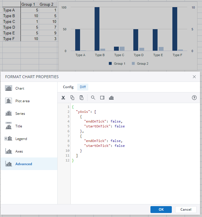
When defining a minimum and maximum value for the scaling of the value axis, the chart may, in some cases, still be plotted with a larger maximum axis value, depending on the size of the chart object. However, the defined minimum and maximum values can be enforced by setting the axis properties "endOnTick" and "startOnTick" to the value false. This is also possible for charts using multiple value axis, as shown in the image.
Formatting tooltips
It is possible to add custom prefixes or suffixes to the tooltips of data points in a chart. To do this define the "pointformat" in the tooltip{} object (in this example, the chart plots data points against the y axis):
"pointFormat": "${point.y} USD"This setting would make the numeric value 500 appear as "$500 USD" in the tooltip. It will override the number format from the chart itself; the numeric value would then be shown with the default number of decimals.
However, you can extend the setting with an additional number format, by extending the "point.y" entry:
"pointFormat": "${point.y:,.0f} USD"In this example, the comma character denotes that a thousand separator should be set; the character sequence ".0f" defines that zero decimal digits should be shown. The same characters would be used in any locale when defining the Advanced Chart Properties, but would be translated to end user's locale when the chart is displayed.
Updated March 30, 2026
