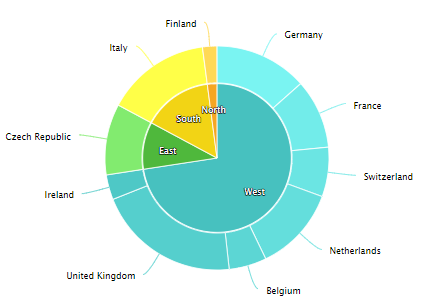
A doughnut chart is a variation of a pie chart where the center is removed, leaving a hole in the middle. This gives it the shape of a doughnut and allows for additional design or data visualization flexibility.
For Jedox users, doughnut charts can be particularly useful for (but not limited to) showing proportional relationships (e.g., market share, sales breakdown), highlighting a central figure or key metric in the middle, such as a total or a category label, or adding aesthetic appeal to reports and dashboards while maintaining functionality.
For example, here, a doughnut chart shows the relationship of parts to the whole. It can contain more than one data series, and each data series that is added to the doughnut chart adds a new ring to the chart.
Setting up a doughnut chart
To create a doughnut chart in the Designer, follow these steps:
-
Build a new Jedox Web Spreadsheet or open an already existing one.
-
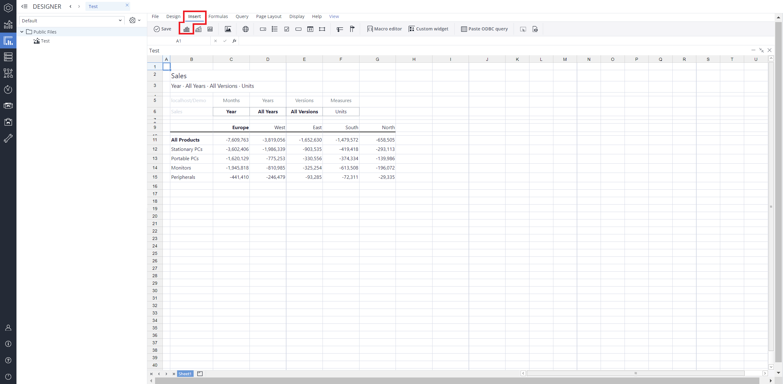
From the toolbar at the top of the interface, Click on the Insert option in the toolbar, and from the dropdown menu, select Charts
 . This will display a variety of chart types that are available for selection.
-
From the chart options, find and select the Doughnut charttype. You can choose between Doughnut , or Doughnut with categories , chart variations based on your needs.
-
Define the data series and dimensions for the x-axis (e.g., time or categories) and y-axis (e.g., values or metrics). To do this, you can use the Data Source section. In this section, you can select your Source type from Sheet range, Ad hoc View, Stored View, or SQL query.
-
Use the customization options to adjust labels, legends, size and position, and the chart's visibility.
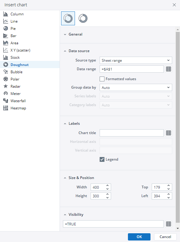
-
Click on OK to incorporate the chart into your report. You can now preview the final output to ensure it meets your requirements.
By following these steps, you can effectively create and customize a doughnut chart to visualize your data trends and insights. For more information on how to fill the Insert Chart menu, check the Creating a Chart article.
Doughnut chart types in Jedox
 Doughnut chart
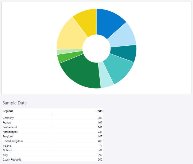
As mentioned in the introduction, the standard doughnut chart is the most commonly used type, featuring a single data series displayed as segments of a circular ring. This type is ideal for visualizing simple proportional relationships, such as sales distribution or market share, while leaving room in the center for key metrics or labels to enhance readability and visual appeal.
Using the Measures and Regions dimensions, the doughnut chart below shows the distribution of units sold in the selected countries.
 Doughnut chart with categories
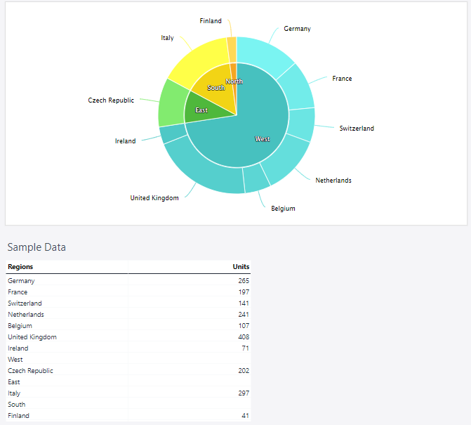
A doughnut chart with categories groups data into multiple rings, each representing a category or hierarchical level. This type is ideal for comparing proportions across different groups simultaneously, such as regional sales within product categories, providing a layered view of the data while maintaining clarity.
Using the Measures and Regions dimensions, the doughnut chart with categories below shows the distribution of units sold in the selected countries.
Updated March 30, 2026
