A column chart is a type of data visualization that represents data with vertical bars, where the height of each bar corresponds to the value it represents. Column charts are used to compare discrete categories or track changes over time. They are one of the most common and straightforward types of charts, making them ideal for visualizing data trends and comparisons at a glance.
For Jedox users, column charts can be particularly useful for visually analyzing and presenting data in planning, budgeting, forecasting, and reporting in scenarios like (but not limited to) comparing key metrics, visualizing time-series data, part-to-whole analysis, scenario analysis, or user-friendly reporting.
Setting up a column chart
To create a column chart in the Designer, follow these steps:
-
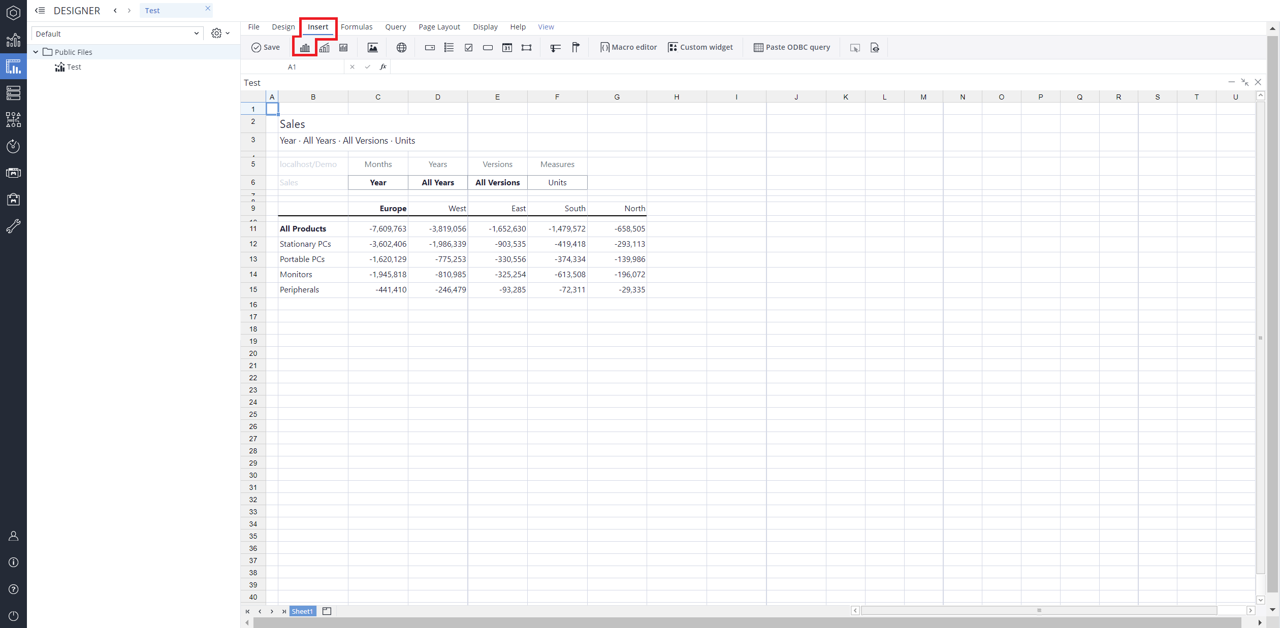
Build a new Jedox Web Spreadsheet or open an already existing one.
-
From the toolbar at the top of the interface, Click on the Insert option in the toolbar, and from the dropdown menu, select Charts
 . This will display a variety of chart types that are available for selection.
-
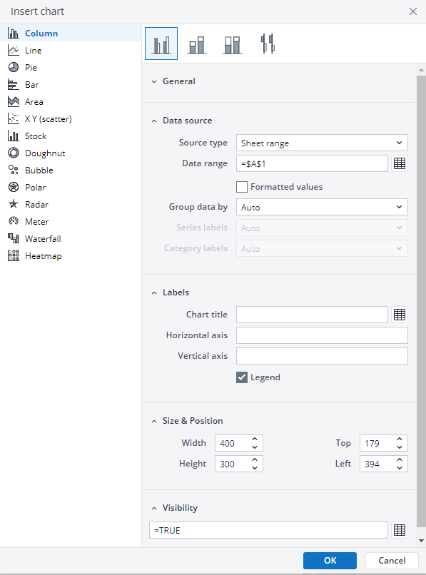
From the chart options, find and select the Column chart type.You can choose between Column , Stacked column , 100% stacked column , or Column range chart variations based on your needs.
-
Define the data series and dimensions for the x-axis (e.g., time or categories) and y-axis (e.g., values or metrics). To do this, you can use the Data Source section. In this section, you can select your Source type from Sheet range, Ad hoc View, Stored View, or SQL query.
-
Use the customization options to adjust labels, legends, size and position, and the chart's visibility.
-
Click on OK to incorporate the chart into your report. You can now preview the final output to ensure it meets your requirements.
By following these steps, you can effectively create and customize a column chart to visualize your data trends and insights. For more information on how to fill the Insert Chart menu, check the Creating a Chart article.
Column charts examples
 Clustered column chart
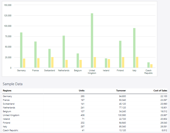
A clustered column chart is a type of bar chart where vertical bars (columns) are grouped together by category to compare multiple data series side by side. Each group represents a category on the x-axis, and within each group, columns represent different data series. The height of each column corresponds to its value, allowing for quick comparison between data series and across categories.
Using the Measures and Regions dimensions, the clustered column chart below shows the actual sales data.
 Stacked column chart
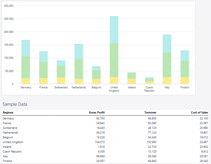
A stacked column chart is a variation of a bar chart where data is displayed in vertical columns, with segments of each column stacked on top of one another. Each segment represents a part of a data series, and the total height of the column reflects the cumulative value for that category. This chart type is useful for visualizing part-to-whole relationships and comparing totals across different categories.
Using the Measures and Regions dimensions, the stacked column chart below shows the actual sales data.
 100% stacked column chart
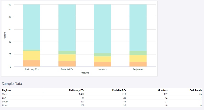
A 100% stacked column chart is a type of column chart where each column represents 100% of the data for a specific category, and the individual segments within the column show the proportional contributions of different data series to that total. Instead of displaying absolute values, it focuses on the relative distribution of components.
Using the product groups, the 100% stacked column chart below shows the amount of sold units in each region of Europe.
 Column range
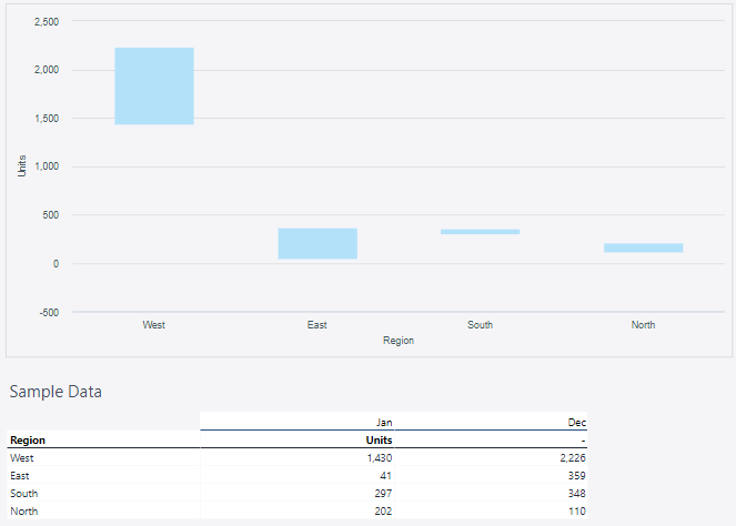
A column range chart is a type of data visualization that displays a range of values for each category along the x-axis, represented as vertical columns. Each column extends from a minimum value to a maximum value, visually illustrating the range or spread of data for that category.
Using the units of January and December with the Regions dimension, the Colum range chart below shows the range of units.
Updated March 30, 2026
