A bubble chart is a data visualization technique that represents three dimensions of data in a two-dimensional plot. It uses circles (or "bubbles") to display data points, where the position of the bubble on the x-axis and y-axis represents two dimensions, and the size of the bubble indicates the third dimension.
For a Jedox user, bubble charts can be particularly useful for analyzing and presenting multidimensional data in scenarios like (but not limited to) sales analysis, financial planning, performance metrics, forecasting and scenario planning, customer segmentation, or resource allocation.
Bubble Chart Basics
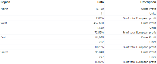
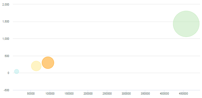
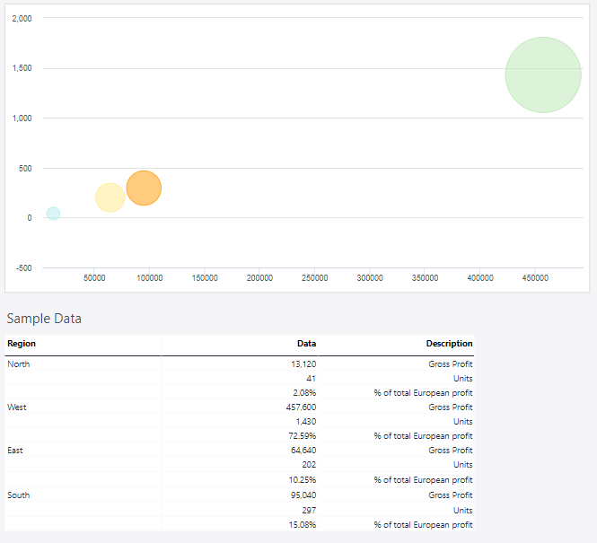
Every plotted data in a bubble chart requires three values: an x-axis, a y-axis, and a size. In the example below, the x-axis is the "Gross Profit," the y-axis is the number of Units, and the size of the bubble is, in this case, defined by "% of total Europe profit." Each region in the example represents a Series, and each Series consists of a single data point:
It is not possible to pass the labels for the x-axis and y-axis from the source data range. However, it is possible to define a label for each axis in the Axis Properties, which can be opened via the context menu of the axis in the chart.
It is also possible to plot multiple data points for each series. To do this:
-
Add another column to the source data range, containing the values for the second set of data points.
-
Extend the chart range to include this column.
Setting up an bubble chart
To create a bubble chart in the Designer, follow these steps:
-
Build a new Jedox Web Spreadsheet or open an already existing one.
-
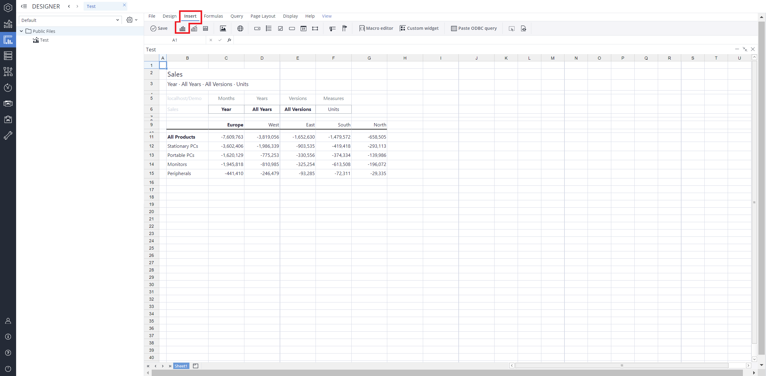
From the toolbar at the top of the interface, Click on the Insert option in the toolbar, and from the dropdown menu, select Charts
 . This will display a variety of chart types that are available for selection.
-
From the chart options, find and select the Bubble chart type.
-
Define the data series and dimensions for the x-axis (e.g., time or categories) and y-axis (e.g., values or metrics). To do this, you can use the Data Source section. In this section, you can select your Source type from Sheet range, Ad hoc View, Stored View, or SQL query.
-
Use the customization options to adjust labels, legends, size and position, and the chart's visibility.
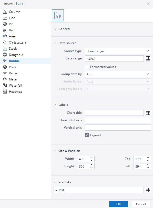
-
Click on OK to incorporate the chart into your report. You can now preview the final output to ensure it meets your requirements.
By following these steps, you can effectively create and customize a bubble chart to visualize your data trends and insights. For more information on how to fill the Insert Chart menu, check the Creating a Chart article.
Bubble chart example
Using the Region dimension, Gross Profit, and Units, the bubble chart below shows the sales data.
Updated March 30, 2026
