A bar chart is a graphical representation of data that uses rectangular bars to compare values across different categories or groups. The length or height of each bar is proportional to the value it represents, making it easy to visually compare data points. Bar charts can be oriented vertically (with bars extending upward from a baseline) or horizontally (with bars extending sideways).
For Jedox users, bar charts are a versatile tool for visualizing and analyzing data, making them valuable for a wide range of planning, reporting, and decision-making scenarios like (but not limited to) comparing performance across categories, tracking Key Performance Indicators (KPIs), analyzing trends over time, budgeting and forecasting, visualizing resource allocation, ranking and prioritization, part-to-whole analysis, comparing scenarios, visualizing survey results, or project management.
Setting up a bar chart
To create a bar chart in the Designer, follow these steps:
-
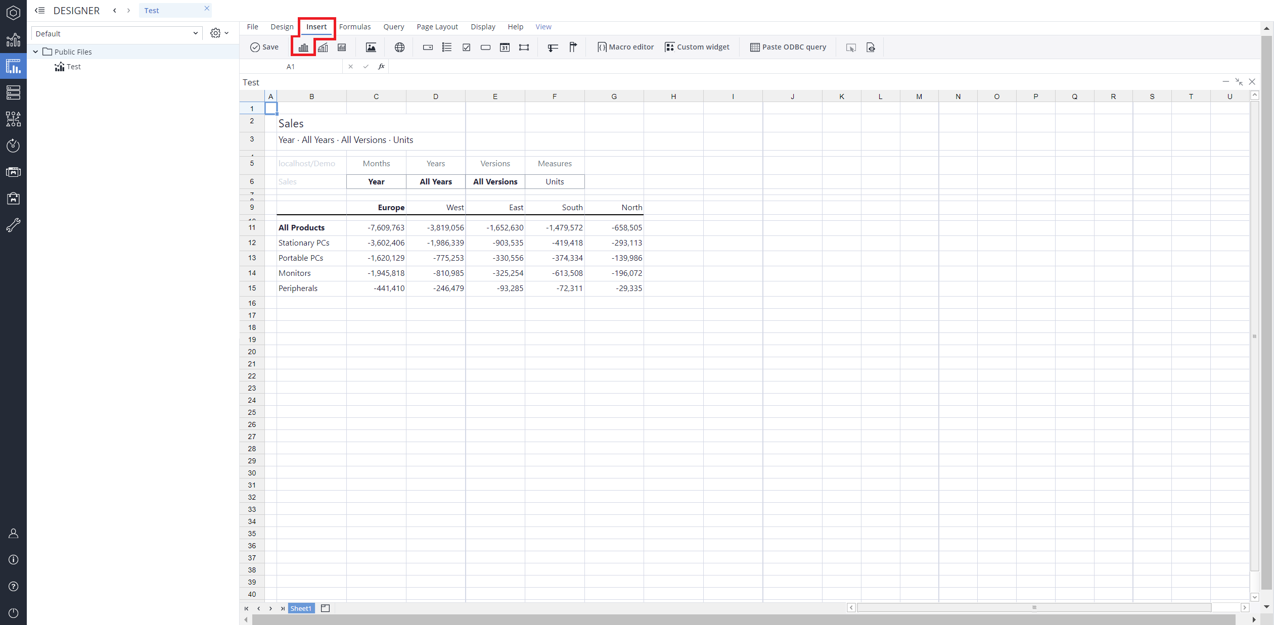
Build a new Jedox Web Spreadsheet or open an already existing one.
-
From the toolbar at the top of the interface, Click on the Insert option in the toolbar, and from the dropdown menu, select Charts
 . This will display a variety of chart types that are available for selection.
-
From the chart options, find and select the Bar chart type.You can choose between Bar, Clustered bar, Stacked bar, 100% stacked bar, or Bar range chart variations based on your needs.
-
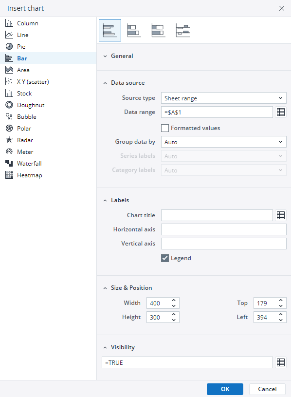
Define the data series and dimensions for the x-axis (e.g., time or categories) and y-axis (e.g., values or metrics). To do this, you can use the Data Source section. In this section, you can select your Source type from Sheet range, Ad hoc View, Stored View, or SQL query.
-
Use the customization options to adjust labels, legends, size and position, and the chart's visibility.
-
Click on OK to incorporate the chart into your report. You can now preview the final output to ensure it meets your requirements.
By following these steps, you can effectively create and customize a bar chart to visualize your data trends and insights. For more information on how to fill the Insert Chart menu, check the Creating a Chart article.
Bar chart types in Jedox
 Clustered bar chart
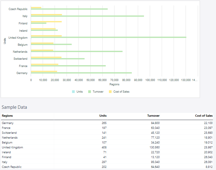
A clustered bar chart, also known as a grouped bar chart, is a type of bar chart used to compare multiple data series across categories. In this chart, bars for different data series are grouped together within each category, making it easy to compare the values for each series side by side. A clustered bar chart allows for detailed comparisons between multiple data series in the same category and is clear and easy to interpret when comparing a small number of data series.
A clustered bar chart can be used, for example, for:
-
Sales Data: Comparing sales of multiple products across different regions.
-
Performance Metrics: Displaying test scores for multiple students across various subjects.
-
Time-Series Comparisons: Analyzing quarterly revenue for several departments over a year.
Using the Measure and Regions dimensions, the clustered bar chart below shows the actual sales data.
 Stacked bar chart
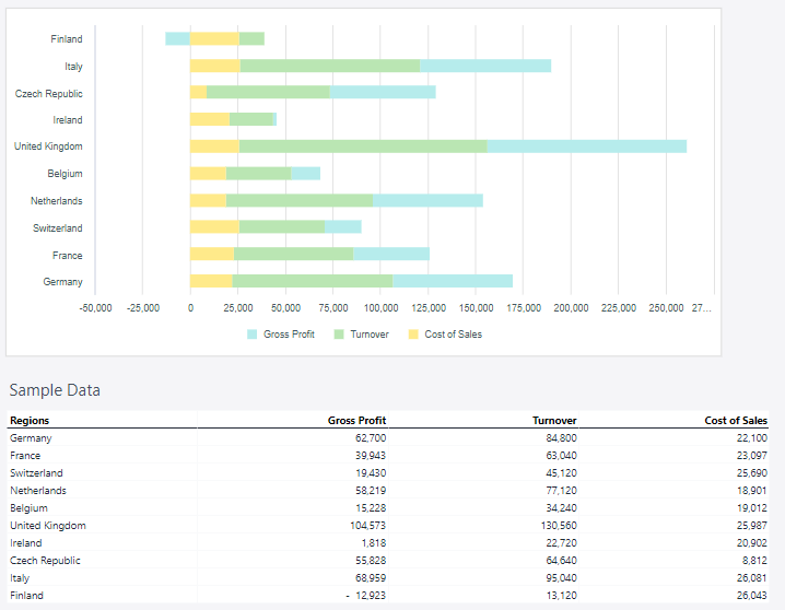
A stacked bar chart is a type of bar chart that displays data series as segments stacked on top of one another in a single bar. Each segment represents a portion of the total value for that category, allowing the chart to show both individual contributions and the cumulative total.
A stacked bar chart can be used, for example, for:
-
Financial Analysis: Breaking down revenue by source or expenses by category within each period.
-
Population Data: Showing demographic breakdowns by age, gender, or region.
-
Survey Results: Displaying the distribution of responses (e.g., agree, neutral, disagree) across multiple questions.
Using the Measure and Regions dimensions, the stacked bar chart below shows the actual sales data.
 100% stacked bar chart
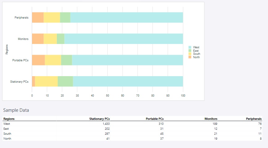
A 100% stacked bar chart is a variation of the stacked bar chart where each bar represents 100% of the total value for a category, with segments displaying the proportional contribution of each data series. Instead of absolute values, this chart emphasizes relative percentages, making it easier to compare the distribution of components across different categories.
A 100% stacked bar chart can be used, for example, for:
-
Market Share Analysis: Comparing the percentage contribution of different brands or products within a market.
-
Demographic Data: Showing the proportion of age groups, income levels, or other categories within a population.
-
Customer Feedback: Visualizing response distribution (e.g., satisfied, neutral, dissatisfied) as a percentage across multiple survey questions.
Using the Region and Product groups, the 100% stacked bar chart below shows the amount of sold units in each region of Europe.
 Bar range chart
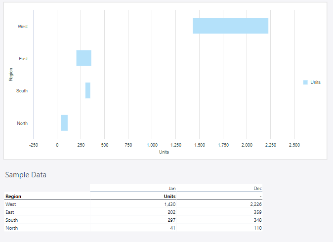
A bar range chart is a type of bar chart that represents a range of values rather than a single data point per category. Each bar extends between a minimum and maximum value, making it useful for visualizing variability, comparisons, or changes within a defined range. This type of chart is particularly effective for highlighting differences in data distribution and identifying trends over time.
A bar range chart can be used, for example, for:
-
Financial Analysis: Displaying price fluctuations of stocks or comparing budgeted vs. actual expenses.
-
Project Timelines: Illustrating the start and end dates of different project phases.
-
Temperature Variations: Representing daily high and low temperatures over time.
Using the Region and Measure dimensions, the bar range chart below shows the amount of sold units in each region of Europe.
Updated March 30, 2026
