An area chart is a type of data visualization that displays quantitative data graphically. It is essentially a variation of a line chart, where the area between the line and the x-axis is filled with color or shading, emphasizing the magnitude of values over a range.
For Jedox users, area charts are highly effective for visualizing and analyzing trends over time or across continuous data points. By combining the benefits of line charts and shading, area charts make it easier to interpret magnitude, cumulative values, and comparisons. Area charts can be particularly useful for (but not limited to) revenue and expense trends, budget vs. actual comparison, resource utilization, cumulative metrics, part-to-whole relationships (stacked area charts), forecasting and projections, scenario comparisons, or market or share trends.
Setting up an area chart
To create an area chart in the Designer, follow these steps:
-
Build a new Jedox Web Spreadsheet or open an already existing one.
-
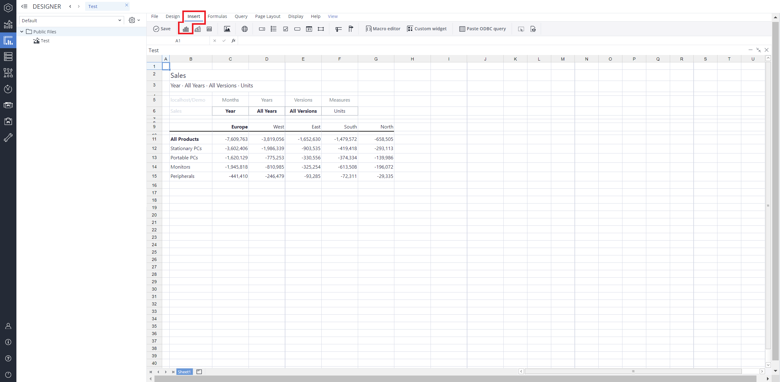
From the toolbar at the top of the interface, Click on the Insert option in the toolbar, and from the dropdown menu, select Charts
 . This will display a variety of chart types that are available for selection.
-
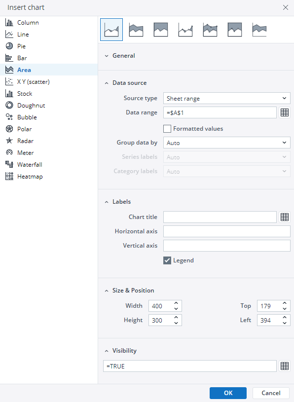
From the chart options, find and select the Area chart type. You can choose between Area, Stacked area, 100% stacked area, Area with markers, 100% stacked area with markers, or Area range chart variations based on your needs.
-
Define the data series and dimensions for the x-axis (e.g., time or categories) and y-axis (e.g., values or metrics). To do this, you can use the Data Source section. In this section, you can select your Source type from Sheet range, Ad hoc View, Stored View, or SQL query.
-
Use the customization options to adjust labels, legends, size and position, and the chart's visibility.
-
Click on OK to incorporate the chart into your report. You can now preview the final output to ensure it meets your requirements.
By following these steps, you can effectively create and customize an area chart to visualize your data trends and insights. For more information on how to fill the Insert Chart menu, check the Creating a Chart article.
Area chart types in Jedox
 Area chart
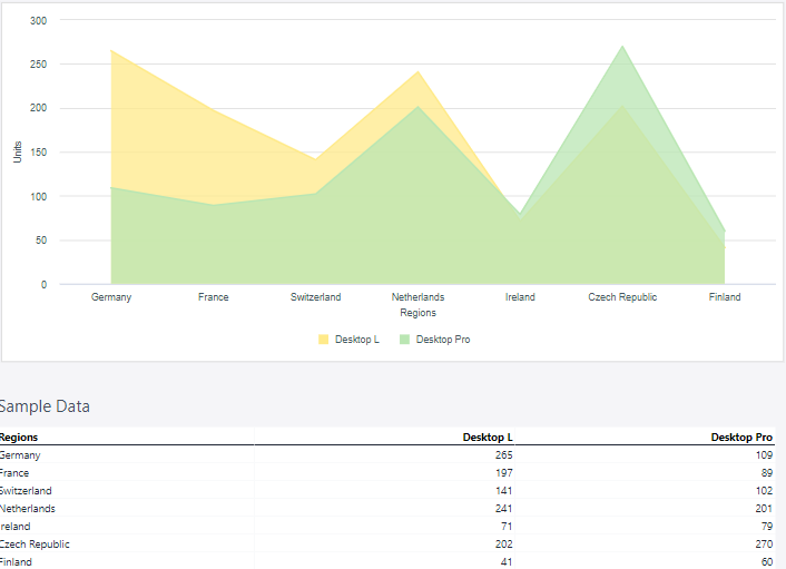
As mentioned in the introduction, a normal area chart is a variation of a line chart where the area between the line and the x-axis is shaded, emphasizing the magnitude of values over a range. This chart type is ideal for displaying trends over time or across continuous data points, making it easier to interpret overall magnitude and patterns in data.
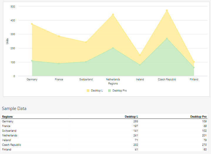
The area chart below displays the sold units of two products in certain regions.
 Stacked area chart
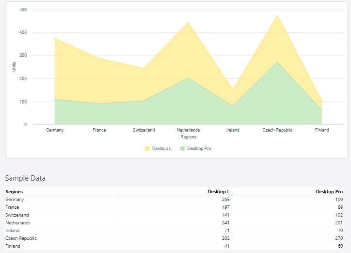
A Stacked area chart is a type of graph used to visualize data that shows the contribution of different components to a total over time or another continuous variable. It is an extension of a standard area chart, where multiple data series are plotted on top of one another (stacked) to represent cumulative values.
Each area represents a category or component, and the height of the stacked areas indicates the total value at any given point on the x-axis. The purpose of a stacked area chart is to make it easy to see how individual parts contribute to the whole and how those contributions change over time.
Using the Product and Region dimensions, the stacked area chart below shows the total sold units of two products in selected countries.
 100% Stacked area chart
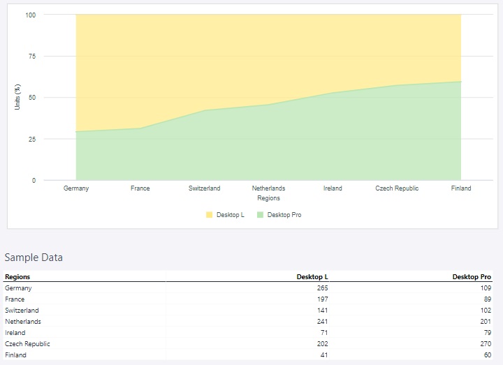
A 100% Stacked area chart is a variation of a stacked area chart where the data series are stacked one on top of the other, but instead of showing the raw cumulative values, the chart represents the relative percentage contribution of each series to the total. The entire height of the chart (the y-axis) always adds up to 100%, making it ideal for visualizing proportional relationships over time or across categories.
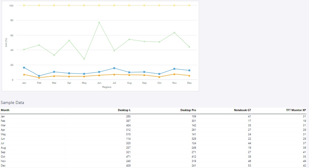
Using the Regions dimension and units, the 100% stacked area chart below shows the sales data.
 Area with markers chart
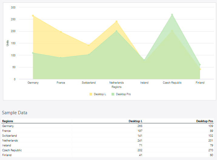
An Area with markers chart is a variation of a standard area chart that includes distinct markers (e.g., dots) placed at each data point along the line. These markers make it easier to identify and emphasize specific values within the dataset.
Using the Regions dimension and units, the area with markers chart below shows the sales data.
 Stacked area with markers chart
A Stacked area with markers chart is a type of data visualization that combines the features of a stacked area chart with markers to highlight individual data points. It is particularly useful for showing how individual values contribute to a cumulative total while emphasizing specific data points for better clarity and analysis.
Using the Regions dimension and units, the stacked area with markers chart below shows the sales data.
 100% stacked area with markers chart
A 100% stacked area with markers chart is a specialized data visualization that combines the features of a 100% stacked area chart and a line chart with markers. It displays multiple data series as portions of a whole, ensuring that the sum of all series equals 100% at any point along the x-axis. This makes it ideal for showing relative contributions of different categories over time or another continuous variable. The addition of markers emphasizes individual data points within each series, making specific values easier to identify and compare. This type of chart is especially useful for analyzing proportional relationships while maintaining clarity for individual data points.
Using the Regions dimension and units, the 100% stacked area with markers chart below shows the sales data.
 Area range chart
An Area range chart is a type of data visualization that represents a range of values for each point along the x-axis, rather than a single value. It displays two sets of y-axis values (typically the minimum and maximum) as boundaries, with the area between them shaded to illustrate the range. This chart is especially useful for showing variability, uncertainty, or confidence intervals in data.
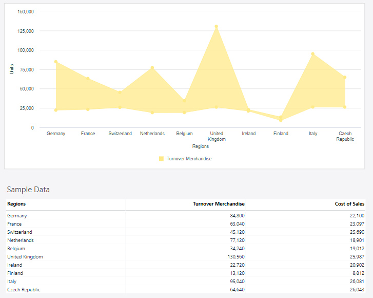
Using the Measure and Regions dimensions, the area range chart below shows the range of gross profit.
Updated March 30, 2026
