Charts are a powerful way to visualize data, making it easier to analyze trends, compare values, and communicate insights effectively. However, ensuring that charts function correctly and display data as intended requires careful attention to various factors. From formatting tooltips to managing exports and maintaining chart integrity within spreadsheets, a well-structured approach can prevent common issues and enhance usability.
This article provides key considerations for working with charts, including best practices for formatting, constraints related to XLSX import and export, and factors that may affect chart behavior in spreadsheets. Whether you're designing charts for internal reports or exporting them for external use, understanding these considerations will help you create accurate and visually consistent data visualizations.
General considerations
-
The default color palette that is used in new charts can be defined in Jedox Web Administration under Settings > spreadsheet > Default series palette. You can change the value of the key called
spreadsheet.charts.default_series_palette. Possible values are Shoal, Hydro, Copa, Office, Apex, Aspect, Chaplin, Jedox and Design System, representing the existing chart palettes. A change of the value will be applied in any new session in Jedox Web. For more information, see Jedox Chart Palettes. -
Dynamic charts should not be crossed by Freeze Pane borders. Freeze Pane borders may cause various display errors.
-
If a dynamic chart is inserted in a spreadsheet in an area with hidden columns or rows, the chart will change its dimensions after unhiding. This also affects the appearance of the charts after an export as PDF.
-
Charts will not be moved dynamically in the spreadsheet if a row or column is hidden, or if the width/height of the rows or columns changes.
Considerations for XLSX Import and Export
Charts from XLXS files are imported as dynamic charts in Jedox Web, and dynamic charts are exported from Jedox Web to XLXS files. However, there are some constraints regarding the import from or export to XLXS files that you need to consider:
- Unit formatting of chart series labels (thousands, millions, percentage) is not supported in XLSX exports. For axis labels, it is supported.
- For existing charts, the default title string ="" (which would be visible in the chart in an XLXS export) has to be removed in the chart properties dialog. All new dynamic charts will be created without this default title.
- Some Jedox chart types don't exist in Excel and cannot be exported (not even as image).
Considerations for charts with percent
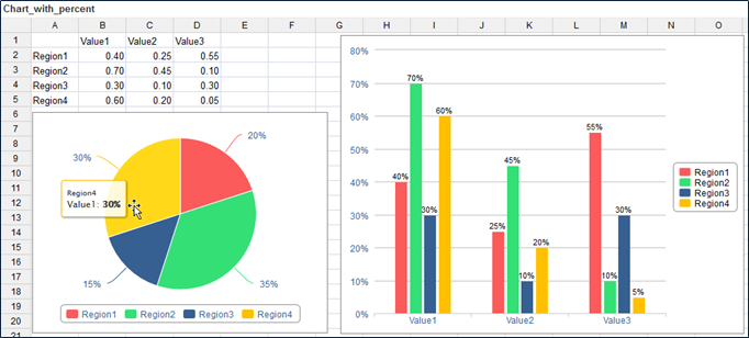
Regarding the display of percentage values for chart series labels, there are two ways that charts handle this:
- Some charts, such as pie charts, calculate percentage values on their own, based on the distribution of values in the chart source range.
- Other charts, such as the standard column chart, do not calculate percentages. You can still set these charts to show labels formatted as percentage, but they will simply re-format the raw value from chart source range. For calculating the proportions of the raw values up to 100%, please use the 100% Stacked Chart types.
- Stacked Bar Charts are designed for more than one data series. The sum of each bar segment is considered 100%. If you use only one data series, all the labels show 100%.
- The values between 0 and 1 are not automatically converted to percentages in Spark Pie charts anymore. If these values should be shown as percentages in the Spark Pie, they first need to be converted in the source (multiplied by 100).
Updated March 30, 2026
