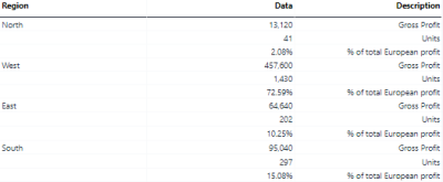
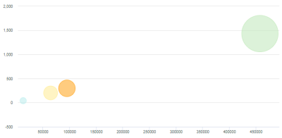
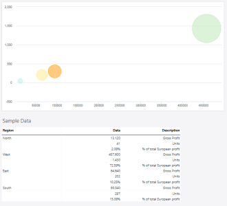
Every plotted data in a bubble chart requires three values: an x-axis, a y-axis, and a size. In the example below, the x-axis is the "Gross Profit," the y-axis is the number of Units, and the size of the bubble is, in this case, defined by "% of total Europe profit." Each region in the example represents a Series, and each Series consists of a single data point:
It is not possible to pass the labels for the x-axis and y-axis from the source data range. However, it is possible to define a label for each axis in the Axis Properties, which can be opened via the context menu of the axis in the chart.
It is also possible to plot multiple data points for each series. To do this:
-
Add another column to the source data range, containing the values for the second set of data points.
-
Extend the chart range to include this column.
Setting up an bubble chart
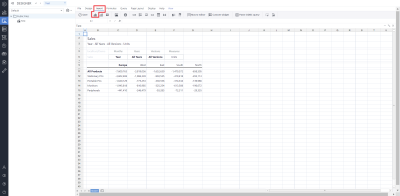
To set up a bubble chart, click on Insert in the Designer and then click on the charts  .
.
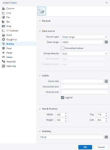
Choose bubble charts in the pop-up menu.
For more information on how to fill the Insert Chart menu, check the article Inserting a Chart.
Bubble chart example
Using the Region dimension, Gross Profit, and Units, the bubble chart below shows the sales data.
Updated September 25, 2024
