When you drag a new component onto a Canvas, it will be contained within a Stack. You can add the subsequent components to the existing Stack or create a new Stack. Dragging a component close to or on top of an existing one will create a group. With Stacks and Groups, you can create custom layouts and control the way reports behave on different screen sizes.
Inside a Canvas, components are grouped into Stacks. Each Stack has properties for its size, layout, and the positioning of content inside it. Stacks can also have Groups.
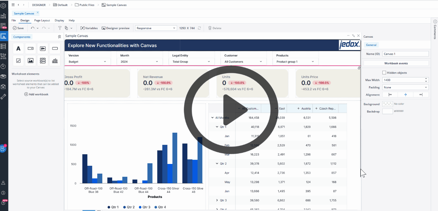
Within a Canvas, there are three hierarchical levels, ranging from the largest to the smallest.
- The Canvas itself, i.e., the "container" for the objects
- Stacks for grouping objects together
- Components which display the actual content
When you first add a component to the Canvas, the component is added together with a surrounding Stack. A dotted line indicates the Stack. Subsequent components can be placed within this Stack alongside the existing component , or you can place them on a blank area of the Canvas to build a new Stack.
Note that by default, the visibility of stacks and groups is an Expression with the value "=TRUE", but you can use a variable or another Expression, e.g., FALSE, to change (hide) it. When you hide a stack or group, the remaining components dynamically adjust to occupy the vacant space. If you wish to maintain the hidden stack or group’s space and preserve your Canvas layout, you can utilize the Keep space option.
Grouping objects within a Stack
When you drag a component onto the Canvas, highlighted areas will appear to assist you in positioning the component. Blue highlights and bars indicate the placement of the new object in the Canvas, and green highlights and bars indicate the placement of the new object inside a Stack.
Orientation
Depending on what is selected on the Canvas, the General tab (on the right side of the Canvas) shows the properties of the Canvas, Stack, or one of the components inside it.
To control a Stack's orientation, layout, and scrolling, you first need to select it in Canvas. When a Stack is selected, the General tab shows up. Now you can choose whether components within a Stack are positioned side by side (row) or underneath each other (column). When Row orientation is selected, components will wrap (by default) depending on the available screen space.
If you select the scroll option, a horizontal scroll bar will be added to the Stack when there is insufficient screen space to display all components.
Padding
Padding is used to create space around the components inside a Stack or Group. By default, the padding is set to “Extra small,” but you can change it to None, Small, Medium, Large, Extra large, or define Custom Padding.
Row and column Gap
Row and column gap settings set the spacing between components in a Stack. By default, the Gap is set to “Extra small,” but you can change it to None, Small, Medium, Large, Extra large, or define Custom Gap.
Alignment
The alignment of components within a Stack can be controlled using the horizontal and vertical alignment options.

Note that when the alignment is not defined for a Stack, the alignment selected at the Canvas level will be applied.
Visibility
The Visibility feature enables you to simultaneously control the visibility of all components within a Group or Stack. By default, the Group's visibility is an Expression with the value "=TRUE", but you can use a variable or another Expression, e.g., FALSE, to change it.

When you hide a Stack or Group, the remaining components dynamically adjust to occupy the vacant space. If you wish to maintain the hidden Stack's space and preserve your Canvas layout, you can utilize the "Keep space" option.
Pinned Stacks
When scrolling up and down your Canvas report, you can pin Stacks so that components within them remain visible at the top or bottom of the screen. This is useful to ensure report controls and filters can be easily accessed. Within a Canvas worksheet you can select one Stack to be pinned to the top and one to the bottom. In Designer, pinned Stacks are highlighted with a pin icon in the top right corner of the Stack.
To pin a Stack, first select the Stack and then click on the Pin to the top or Pin to the bottom buttons on the Property Inspector.

Notes:
-
Grouped or nested stacks cannot be pinned.
-
Canvas Reports do not support horizontal scrolling. However, certain mobile devices might incorporate internal touch functionalities that add a horizontal scrollbar to your report.
Updated March 30, 2026